


SCREENSHOT SESAME STREET (40TH ANNIVERSARY EDITION)
Posts


post=106254
When will people learn that it's the RTP that's boxy, not VX itself.
Yeah I said VX maps are boxy (Which is the RTP). I never said VX itself is boxy.

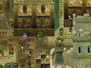
Blindmind: I love how you use those Suikoden chips. The flag doesn't really fit in, but th rest of the map is gorgeous.
Blindmind
these showed up way too late on that last page. everyone, please join me in informing blindmind how fucking awesome these screenshots are.
the flag is a bit out of place though. outside of that though, epic work, sir.

BM: I do not like the inconsistent wall/object shadows in the marketplace screenshot, you should either have shadows for every object, or don't.

Damnit Aznchipmunk! I need to make a game with you!

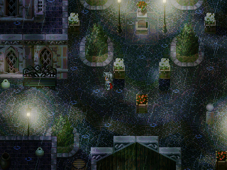
I was testing just for fun what it'd look like if I used portraits on my dialogues.

Considering I couldn't probably be arsed to do multiple expressions, it would probably be pointless, yeah?
At least I can still have them in menus.
ps. If I did it, I would probably see more effort to make a proper portrait.
Considering I couldn't probably be arsed to do multiple expressions, it would probably be pointless, yeah?
At least I can still have them in menus.
ps. If I did it, I would probably see more effort to make a proper portrait.


Looks pretty cool Rei, but I would definitely stick with the regular message box and save yourself a whole lotta work. Also, the portrait takes up way too much space.

post=106370
oh my god that looks awesome rei. seriously, mind = blown.
Man you get a boner from everything!
@Rei: The screen itself is pretty good, although it could be a smaller room - just a few tiles here or there- to make it more compact. Really nice custom stuff, though, as always. I hate the portrait. Like, I really really dislike it. It is the only thing to come from Asc that I haven't liked so far. I am glad you are only playing with the idea!
@BM: Looks good, although I never really liked the Suikoden chips. One thing that I noticed immediately was the lack of contrast and definition between the items in the first screen. I know it's sort of a byproduct of Suikoden rips, but it's very easy for the eye to lose immediately recognition of objects, which is kind of confusing and annoying, graphically. The second screen's contrast in terms of objects and walls to floor is much better. Though who would leave a crate of applies in the middle of the town square, I don't know...
I really hate Suikoden chips with RTP-sized charsets. It looks very out of proportion.

somewhere else
tardis I fucking love you

Okay, can the same 3-5 people not do that shit anymore (quotes, pictures, and large text). It's extremely annoying and a waste of space, thanks!
Anyway, I agree with what's been said, Blind. But I think the main issue with the first screenshot is the lack of direction. When somebody constructs a road, it's saying "HEY, GO THIS WAY". But you have 3 different ground tiles, and there isn't a clear direction of where everything is. That middle building is on all 3 ground tiles at once. If you posted the whole map it would probably make sense, but I have a feeling main points of interest will get lost in all of the mess.
Anyway, I agree with what's been said, Blind. But I think the main issue with the first screenshot is the lack of direction. When somebody constructs a road, it's saying "HEY, GO THIS WAY". But you have 3 different ground tiles, and there isn't a clear direction of where everything is. That middle building is on all 3 ground tiles at once. If you posted the whole map it would probably make sense, but I have a feeling main points of interest will get lost in all of the mess.
post=106281post=106151I honestly don't know how to get rid of them. VX does it whether I want them or not.
@Wing: I like the look of that! The shadows look ridiculous though, please make them go away.
You can get a script for Vx that eliminates the auto shadows.
post=106438
Okay, can the same 3-5 people not do that shit anymore (quotes, pictures, and large text). It's extremely annoying and a waste of space, thanks!
I second.
post=Neophyte
Okay, can the same 3-5 people not do that shit anymore (quotes, pictures, and large text). It's extremely annoying and a waste of space, thanks!
3rdeded
post=Neophyte
Anyway, I agree with what's been said, Blind. But I think the main issue with the first screenshot is the lack of direction. When somebody constructs a road, it's saying "HEY, GO THIS WAY". But you have 3 different ground tiles, and there isn't a clear direction of where everything is. That middle building is on all 3 ground tiles at once. If you posted the whole map it would probably make sense, but I have a feeling main points of interest will get lost in all of the mess.
This is very important and everyone should listen to it. The best way to make maps immediately navigable is to just have your tiles lead somewhere. The first thing I always do is lay out roads and pathways, and worry about making maps pretty secondly so that they have some immediately recognizable logic to them. BM's map isn't too bad, since I assume it's some sort of market square or something, but Suikoden's lack of definition means that you have to go out of your way to present the path to the player. The light-coloured road in the top right is really the only thing that confuses the screen, but it confuses the whole thing pretty well (especially since it leads into an alley!).

