


NEED INPUT ON TILES
Posts
Pages:
1

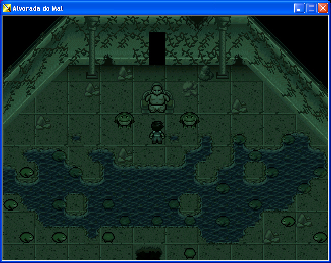
I'm making custom tiles for this big event-center map. I drew these from scratch (except for the borders), wanna know if they're ok (walls and floor):

It's not a real map, I just added random guys to see what it'd look like.
I tinted the screen red because it'll be tinted in the game.
So...?
It's not a real map, I just added random guys to see what it'd look like.
I tinted the screen red because it'll be tinted in the game.
So...?

It's okay, I guess. Something seems off about the walls, but I can't quite put it into words. Also the checkerboard tiles are probably too big.
Is it industrial? 2x2 tiles work well in a factory setting, but not so great if it's a house or something.
(Also, is it against the rules to turn the help forum into a screen shot thread?)
(Also, is it against the rules to turn the help forum into a screen shot thread?)

Hmmm. What I'd suggest is maybe raising the brightness of the floor tiles a little bit. You have the ceiling auto-tiles as black, and the floor comes very close to it. Also, the guy with the black suit camouflages there. I would also have ends for the walls. Perhaps making the red walls slightly darker also?

Maybe flip the walls upside down (or at least the gradient be brighter from the top)? I'm thinking it's currently creating an inverse depth effect. Like so:

I can barely see the floor, also the wall tile lacks a beginning and an end; making it look very flat.
Maybe you can make more variations on the floor, or make the colors brighter. At first sight I thought it's just plain black.
edit: moved to another computer and it looked so different now. Forget the floor stuff, it must be the monitor.
edit: moved to another computer and it looked so different now. Forget the floor stuff, it must be the monitor.
Ok... reversed the walls, like Liberty said, and made the floor lighter. It's still a bit dark because the screen is tinted dark, but I don't think it's too dark now. IMO looks much better. What do you guys think?
Before/After
Before/After

the After screen is 10x better, but the walls are still too...something. I want to say "saturated" but my recollection of color theory knowledge is fuzzy.
Maybe it'll look better with objects?
Also, I forgot to add a dark line to the side-ends of the walls, but I'll do that.
Also, I forgot to add a dark line to the side-ends of the walls, but I'll do that.


Pages:
1

