


NEED SOME THOUGHTS...
Posts

I see where you're coming from:
http://www.mobygames.com/game/dos/rules-of-engagement/screenshots/gameShotId,206784/
http://www.mobygames.com/game/dos/rules-of-engagement/screenshots/gameShotId,206794/
Having a grid out to help a lot to know where you are onscreen rather than having to deal with XY coordinates.
Other than it being Sci-fi, I'm still trying to figure out what kind of game you have in mind. Although, it would be nice to have something similar to ROE, since I don't think there is anything like it in RMN.

Ok that looks pretty awesome, but I still think maybe it's a little too pink heavy. Try accenting the heavy pink blocks with some other color to break it up somehow? Maybe yellow? I think you have a very red color scheme going here. Maybe even blue...I'd try a few color combination.
Like, take that bottom bar for instance:
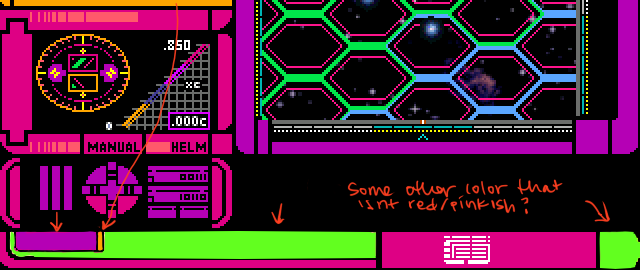
just as an example of how I might approach breaking it up...Sorry that I colored over your awesome screenshot. ;__; But I thought visuals would help a bit. But~ I actually like the layout a lot more now that I get a better idea of how it'd look finished. :3
Edit// oh my lovely handwriting says: Some other color that isn't red/pinkish?
hahah I scribblewrite.
Like, take that bottom bar for instance:
just as an example of how I might approach breaking it up...Sorry that I colored over your awesome screenshot. ;__; But I thought visuals would help a bit. But~ I actually like the layout a lot more now that I get a better idea of how it'd look finished. :3
Edit// oh my lovely handwriting says: Some other color that isn't red/pinkish?
hahah I scribblewrite.

post=137959post=137940Don't change anything. This screen shot is the best thing I've seen in months.
.

I completely agree. That's a rockin' menu(ish) screen.

I always loved those LCARS consoles on TNG, so this looks really badass to me. Is it an actual Star Trek fangame? Or are you just borrowing the design?
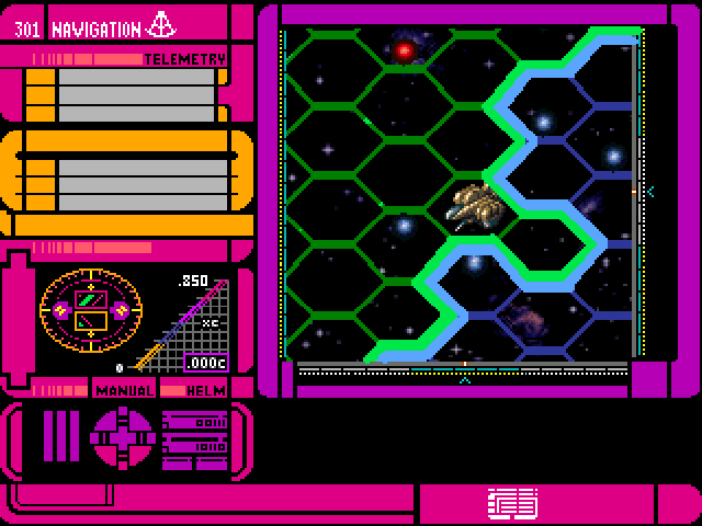
Just a little thing though, do you need those thick green lines on the map? I can see how a grid is useful, of course, but I think it would be a bit better just to have the thin pink lines separating each block (and make the blocks closer together). It's not a big deal when it's just a small part of the window but when it's the whole screen it's hard to focus on what's actually IN the hexagons.
Just a little thing though, do you need those thick green lines on the map? I can see how a grid is useful, of course, but I think it would be a bit better just to have the thin pink lines separating each block (and make the blocks closer together). It's not a big deal when it's just a small part of the window but when it's the whole screen it's hard to focus on what's actually IN the hexagons.

I think they're marking color-coded territories of some sort.
Ah yeah, I didn't notice that at first. Well in that case, I would say that neon green and neon blue are way too similar for two different faction colours! I just thought it was some kind of fake gradient effect to make it look bluish-green. I also think it would make sense to me to have the thick lines just on the borders rather than all over the place.
EDIT: Something like this:
Excuse my piss-poor MS Paint editing but I think it looks pretty good like that, and clearer as well. I was going to make the darker grid lines one pixel wide but there's no quick way of doing that in Paint that I know of, so I made the border lines extra thick instead. But you get the idea, I think!
EDIT 2: Blargh, don't we have spoiler tags on these forums? That's annoying, I didn't mean for this to take up so much space.

Sorry I haven't been on for a few days... it's really hard for me to get on the net on weekends. Anyway I've got a few more concepts and I'd like to answer a few questions/comments everyone has.
Okay, well I hate to turn you back to moby, but when I was a little kid, I fell in love with one game that I still think would do well in today's market if it got a graphics/sound makeover, and that game is Megatraveler. I want to make a game LIKE that, where planets have stories behind each one, and you can land on them and explore the surroundings. Or travel through space and face space pirates. Thats actually where I got my hex space travel system.
Will the story be similar to Megatraveler? No... I don't like making fan games, but I like taking great ideas from old DOS games and making them refurbished. Paint better graphics, give it that sound makerover as well, and put in a original story and BOOM, old DOS game on steroids. lol
I could mix it up a bit... I don't like that green though, it just stands out a bit... I choose that neon pink because it fit overall, having a neon green there stands out. I will consider mixing it up a bit though.
Well a few things to comment here... One, no, it's not going to be a TNG fan based, I don't like making fan based, I find I have more fun coming up with original stories. However, I did want the screens to look something like LCARS since it is a great system atheistically, so in that regard, it looks very similar, and more futuristic.
As far as the grid goes... let me tell you a little about it. I have to use both an over lay and under lay. (Both sides of the chip set) to make it fit. Thus why it looks like the borders blend. The reason behind this is because of the HUGE eventing that is going into this map and I need free event space for that. I want to be able to keep track of each tiny event because they will be controlling the ship... You'll see what my hell looks like below soon enough though. To sum it up, it would be difficult to have an event pic of the grid over and over and at the same time, keep track of where my events are.
As for a larger boarder... It would also be a bit difficult because I had to do some math to make the grid fit, I just don't want to rewrite my math for a grid border. Plus, I'm dealling with limited space with an RM2K3 Chip, so I need to be a bit conservative in that regard as well. I'm sorry to shoot this idea down, but I hope you understand my reasons behind it. Overall, it would just be too difficult.
post=137960
I see where you're coming from:
http://www.mobygames.com/game/dos/rules-of-engagement/screenshots/gameShotId,206784/
http://www.mobygames.com/game/dos/rules-of-engagement/screenshots/gameShotId,206794/
Having a grid out to help a lot to know where you are onscreen rather than having to deal with XY coordinates.
Other than it being Sci-fi, I'm still trying to figure out what kind of game you have in mind. Although, it would be nice to have something similar to ROE, since I don't think there is anything like it in RMN.
Okay, well I hate to turn you back to moby, but when I was a little kid, I fell in love with one game that I still think would do well in today's market if it got a graphics/sound makeover, and that game is Megatraveler. I want to make a game LIKE that, where planets have stories behind each one, and you can land on them and explore the surroundings. Or travel through space and face space pirates. Thats actually where I got my hex space travel system.
Will the story be similar to Megatraveler? No... I don't like making fan games, but I like taking great ideas from old DOS games and making them refurbished. Paint better graphics, give it that sound makerover as well, and put in a original story and BOOM, old DOS game on steroids. lol
post=138098
Ok that looks pretty awesome, but I still think maybe it's a little too pink heavy. Try accenting the heavy pink blocks with some other color to break it up somehow? Maybe yellow? I think you have a very red color scheme going here. Maybe even blue...I'd try a few color combination.
Like, take that bottom bar for instance:
just as an example of how I might approach breaking it up...Sorry that I colored over your awesome screenshot. ;__; But I thought visuals would help a bit. But~ I actually like the layout a lot more now that I get a better idea of how it'd look finished. :3
Edit// oh my lovely handwriting says: Some other color that isn't red/pinkish?
hahah I scribblewrite.
I could mix it up a bit... I don't like that green though, it just stands out a bit... I choose that neon pink because it fit overall, having a neon green there stands out. I will consider mixing it up a bit though.
post=138288
I always loved those LCARS consoles on TNG, so this looks really badass to me. Is it an actual Star Trek fangame? Or are you just borrowing the design?
Just a little thing though, do you need those thick green lines on the map? I can see how a grid is useful, of course, but I think it would be a bit better just to have the thin pink lines separating each block (and make the blocks closer together). It's not a big deal when it's just a small part of the window but when it's the whole screen it's hard to focus on what's actually IN the hexagons.
Well a few things to comment here... One, no, it's not going to be a TNG fan based, I don't like making fan based, I find I have more fun coming up with original stories. However, I did want the screens to look something like LCARS since it is a great system atheistically, so in that regard, it looks very similar, and more futuristic.
As far as the grid goes... let me tell you a little about it. I have to use both an over lay and under lay. (Both sides of the chip set) to make it fit. Thus why it looks like the borders blend. The reason behind this is because of the HUGE eventing that is going into this map and I need free event space for that. I want to be able to keep track of each tiny event because they will be controlling the ship... You'll see what my hell looks like below soon enough though. To sum it up, it would be difficult to have an event pic of the grid over and over and at the same time, keep track of where my events are.
As for a larger boarder... It would also be a bit difficult because I had to do some math to make the grid fit, I just don't want to rewrite my math for a grid border. Plus, I'm dealling with limited space with an RM2K3 Chip, so I need to be a bit conservative in that regard as well. I'm sorry to shoot this idea down, but I hope you understand my reasons behind it. Overall, it would just be too difficult.
This post is below the last because this is all the stuff I worked on during the weekend. I took some opinions to heart (everything on page one, because page 2 of the topic didn't exist at the time) and I hope you like some of the changes. As well as some new concepts I'm working on.
Command Screen - remember that command screenshot... actually it was for my fleet from STO called Jupiter Force. I revamped it and here's the new look.

Ship to ship combat will look something like this... Keep in mind that the background space scrolls and the ship is bobing up and down so it looks like it's moving.

Before anyone comments, I've tried having the ship facing forward, and have it seem like it's coming at you. but I don't have great monster sets that are similar to Front Mission: Gun Hazard (which all ships are done in, even the player ship is Gun Hazard, and they just look awesome) So it does look a bit cooler when the background scrolls. If anyone wonders how I did this, I used frames, and set the background to scroll.
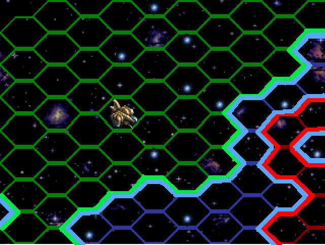
The Navagation pic... the little 10001 11111, ect, they scroll up and down! And the numbers in the little wheel WORK! They show what grid your pointer is in. OH and you have a pointer (the little orange hex in the nav map) You click on an adjacent grid and the ship moves there!

Oh, this is my version of hell... the Nav map will take me at least a week to finish... It's complex, but manageable, you won't see the letters or numbers there. They are just place marks for me.

One last thing, since Edchuy asked what kind of game it would be, I thought I'd give him the screen shot of what the inside of an apartment looks. It's the players apartment, The diagonal walls need to be touched up a bit, and I'm not sure I like the carpet color... but it will generally have the same look.

Command Screen - remember that command screenshot... actually it was for my fleet from STO called Jupiter Force. I revamped it and here's the new look.
Ship to ship combat will look something like this... Keep in mind that the background space scrolls and the ship is bobing up and down so it looks like it's moving.
Before anyone comments, I've tried having the ship facing forward, and have it seem like it's coming at you. but I don't have great monster sets that are similar to Front Mission: Gun Hazard (which all ships are done in, even the player ship is Gun Hazard, and they just look awesome) So it does look a bit cooler when the background scrolls. If anyone wonders how I did this, I used frames, and set the background to scroll.
The Navagation pic... the little 10001 11111, ect, they scroll up and down! And the numbers in the little wheel WORK! They show what grid your pointer is in. OH and you have a pointer (the little orange hex in the nav map) You click on an adjacent grid and the ship moves there!
Oh, this is my version of hell... the Nav map will take me at least a week to finish... It's complex, but manageable, you won't see the letters or numbers there. They are just place marks for me.
One last thing, since Edchuy asked what kind of game it would be, I thought I'd give him the screen shot of what the inside of an apartment looks. It's the players apartment, The diagonal walls need to be touched up a bit, and I'm not sure I like the carpet color... but it will generally have the same look.

Thanks for sharing all that cool stuff, WX and for sort of answering my question. This is definitely one time I approve of the use of diagonal hallways.
post=138561
Thanks for sharing all that cool stuff, WX and for sort of answering my question. This is definitely one time I approve of the use of diagonal hallways.
The only other thing I can think of is it's going to be story oriented and driven, I can't tell you about the story though because most of it's just in the works and everything story-wise changes when I'm building the game. Keep in mind, all this work is just from less than a weeks worth of work, so I can't really go too much into the game itself.
Plus, this thread needs to be keeping with this forums section rules, so I'm mostly showing off my concepts and getting feedback from them, which is the main intent. I WILL have this game in a game blog for itself on RMN started in a week or two, so keep your eyes out for that too. You'd probably get more information on that there than you would in this concept section anyway.
The only other place I can suggest you take a look at to see what this is about is a sub blog located here: http://rpgmaker.net/games/2085/blog/

