


GRADIENTS RM2K3 HELP
Posts


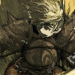
Okay, top one is the actual file. Bottom one is what RPG Maker makes it look like. I've tried lots of stuff like blurring it and sharpening it but still no avail. I am using Photoshop and have tried all sorts.
I've come to the conclusion that it's just not possible to make it as clear as it actually is. So I'm posting on here to see if any of you guys could possibly know a solution or fix. Thanks guys.


I've been looking for a solution for this myself so I can add it to the Goliath Patch. I haven't found anything so far.... Looks like EB programmed the images to be indexed in a certain way, (its almost the same way they are done in FF6, except they go horizontally in FF6).
@Aten; I think you're right there bud. EB must have made it only use certain colours to be displayed. :( I can't think of anyway to get round this. It would look dull just one colour.
@Anz; I think I can speak for Sqauresoft/enix when I say "find a corner, and go have a word with yourself mate" Haha. It's the FF7 Main Menu window without the frame. An exact rip.
Also Aten, I raised an eyebrow when you mentioned the Goliath patch. Have you added your own stuff or something?
@Anz; I think I can speak for Sqauresoft/enix when I say "find a corner, and go have a word with yourself mate" Haha. It's the FF7 Main Menu window without the frame. An exact rip.
Also Aten, I raised an eyebrow when you mentioned the Goliath patch. Have you added your own stuff or something?
have you ever used it before? I made it a long time ago, (2 years I think, first released on GW). Since then I added 120 pictures to it (which I named Overdrive), I currently have an update on which you can break the DEFAULT HP/MP/stat/money limits, and disable testplay while still making it openable in the editor, but i'm keeping it unreleased for now. (Goliath Maximum Overdrive(I'm gonna run out of names soon xD))

Depending on where you ripped it from I'd say it looks exactly like FF7's window anyway.
And I mean the imported version. Of the graphic.
And I mean the imported version. Of the graphic.
Dude, I had no idea you made that! Haha. It was an awesome patch. I must thank you for making some of my RPG experiences much easier. The 120 pic patch...woooo. lol.
I lost it though in the end. Had to emergency reformat. Is there still a download link for it?
@SoceressKyrsty; what imported version do you mean? I got it off the ePSXe, using NTSC iso's. But yea, you're right, it's far to recognisable :)
EDIT: How about SUPER GOLIATH OVERDIRVE!!?
I lost it though in the end. Had to emergency reformat. Is there still a download link for it?
@SoceressKyrsty; what imported version do you mean? I got it off the ePSXe, using NTSC iso's. But yea, you're right, it's far to recognisable :)
EDIT: How about SUPER GOLIATH OVERDIRVE!!?
post=150555
Dude, I had no idea you made that! Haha. It was an awesome patch. I must thank you for making some of my RPG experiences much easier. The 120 pic patch...woooo. lol.
I lost it though in the end. Had to emergency reformat. Is there still a download link for it?
But... the readme... D:
Ah well, yeah, I have the link. It's in my locker. You can go there directly or through the "Master rpgmaker helpful things topic".
post=150550
@Anz; I think I can speak for Sqauresoft/enix when I say "find a corner, and go have a word with yourself mate" Haha. It's the FF7 Main Menu window without the frame. An exact rip.
Yeah, uh, FF7 is pretty much ugly as shit.
(so is the system set for pretty much the rest of the series)
The reason for this is that RM2k/3 run in 16-bit color for performance reasons. You will never be able to get as crisp of a gradient in those engines due to this.
You can see this effect in numerous RM2k/3 games. Whether you are able to handle it not determines if you stick with those engines. The more modern engines all run in 32-bit color so you wouldn't see this kind of thing.
You can see this effect in numerous RM2k/3 games. Whether you are able to handle it not determines if you stick with those engines. The more modern engines all run in 32-bit color so you wouldn't see this kind of thing.

I can see some uniform banding on the right one, but really...who cares? Is it really that big of a deal to get the gradient juuuuust right? At this point, I would say just deal with it and actually get some work done. Rather than worry about a gradient BG.
post=150642
I literally cannot tell the difference between those two images.
are you running your graphics on 16 bit? XD
post=150634
The reason for this is that RM2k/3 run in 16-bit color for performance reasons. You will never be able to get as crisp of a gradient in those engines due to this.
Damn :/
Thanks for your informative reply anyway.
P.S. I don't suppose you could give it a go for me? Seeing as you seem to know the limits to RM2k3. I would greatly appreciate it!


