


SUBMISSION MODS
Posts


Alright I'll take the kid gloves off since you want to go, Chair.

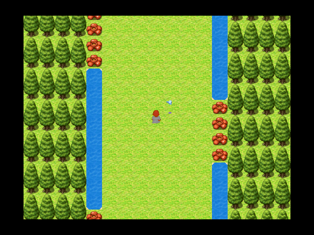
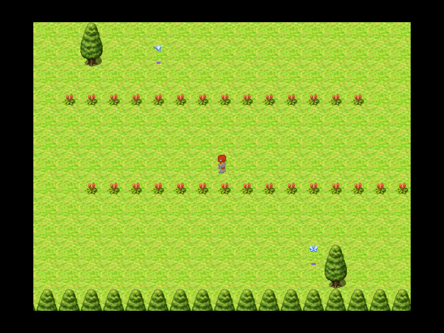
1) None of these look like a ghetto. There are no details. Ghettos have details, as has already been stated.
2) Regardless if they look like a ghetto or not, they are poorly made. The world is not symmetrical. Trees don't grow in convenient lines. Mountain cliffs are not in convenient lines. Etc etc your mapping is horrible.
3) Your custom characters do not fit the style of the RPG MAKER VX RTP (known for its amazing graphical quality as-is).
If you want me to keep dragging your game through the mud, please let me know. Otherwise, tuck your tail between your legs and suck it down.
EDIT: Max, we have been denying shitty looking games for years.
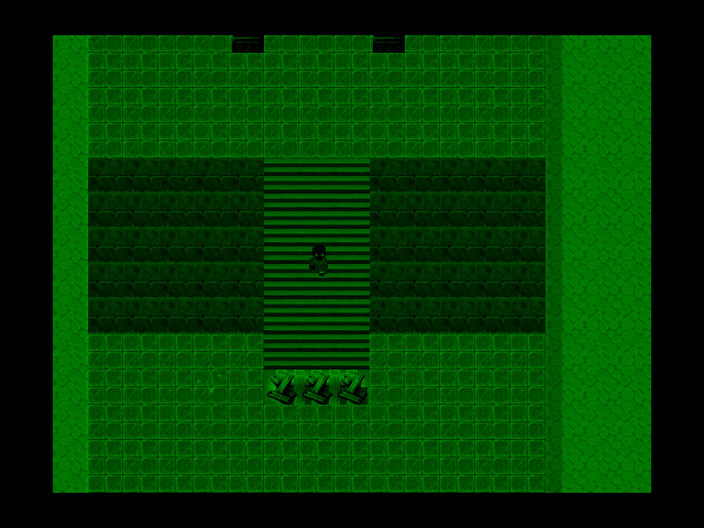
1) These are taken at different areas of the game. The whole game is not in a ghetto. There is an explaination for each part of the game.
2)You cannot tell any of this from the screenshots I posted.
3)The custom graphics look JUST LIKE the RTP character in terms of graphic qulity except said main character being a darker tone.
Edit: Oh and the green one. He is using Night-vision goggles.
Edit: It also looks better than a lot of game accepted here. Including my opponents.
1) I don't care.
2) Still don't care.
3) No they don't. Your shading is completely different.
Since you neglected to discuss your shittacular maps,
4) Your maps are shittacular.
EDIT: Stop calling people your "opponents". Your game looks like absolute garbage.
EDIT: Fun enough, Magi tried to help you improve by being positive in his denial message. You will get no such graces from me. You make subpar quality work and it will continue to be denied unless it meets our already low standard of acceptance here.

author=WIP
1) I don't care.
2) Still don't care.
3) No they don't. Your shading is completely different.
Since you neglected to discuss your shittacular maps,
4) Your maps are shittacular.
EDIT: Stop calling people your "opponents". Your game looks like absolute garbage.
This comes from one who has accepted many horrible games into the site. The game looks fine. It is a Decent looking game, It's clear what's there, and I don't use ceiling tiles as floors.
I'm just saying the game looks fine is all.
edit: Also, I clearly said earlier OPPONENT so when I sent OPPONENTS I meant HIS. Learn to read.
Oh, I know all about Mega Man GX 2, Chairman. And if this project is on the same level (which it looks like it is), the staff has every right to refuse it. A right they have exercised EIGHT TIMES IN A ROW.

author=Otokonoko
Oh, I know all about Mega Man GX 2, Chairman.And if this project is on the same level (which it looks like it is), the staff has every right to refuse it. A right they have exercised EIGHT TIMES IN A ROW.
It is not related to Gx2 in anyway.
It's hard to understand GX2 without GX1
Shut up.
I'm just saying the game looks decent.
You all are changin it to thinking I'm saying it is the best.
author=kentona
*ahem*
I was the one who accepted many horrible games thankyouverymuch.
Some good games to probably.

author=Chairmandrekauthor=WIPThis comes from one who has accepted many horrible games into the site. The game looks fine. It is a Decent looking game, It's clear what's there, and I don't use ceiling tiles as floors.
1) I don't care.
2) Still don't care.
3) No they don't. Your shading is completely different.
Since you neglected to discuss your shittacular maps,
4) Your maps are shittacular.
EDIT: Stop calling people your "opponents". Your game looks like absolute garbage.
I'm just saying the game looks fine is all.
edit: Also, I clearly said earlier OPPONENT so when I sent OPPONENTS I meant HIS. Learn to read.
I know how to read, thank you. And what I am reading is a horseshit. Your game looks like trash and it takes a lot more than NOT USING CEILING TILES AS FLOORS.
Again I will reiterate: your work is subpar and it will continue to be denied until you are able to reach the site's already low standard of acceptance. And continuing to harass post on peoples' game profiles complaining and causing a ruckus will result in you being removed.
Thank you and shut the hell up.

