


THE SCREENSHOT TOPIC RETURNS
Posts
@Dragol: Loving that ship
@Rhyme: Cool battle system, the GUI looks real nice.
@Dookie: Nice looking planets there.
@Rhyme: Cool battle system, the GUI looks real nice.
@Dookie: Nice looking planets there.
Yo guys check out Supercow's fantastic mapping and tileset which I am using for my game. This map was made by him which I am using for my Combat Specialists.
Cisko Bridge
Under Cisko Bridge
Cisko Bridge
Under Cisko Bridge
LockeZ

I'd really like to get rid of LockeZ. His play style is way too unpredictable. He's always like this too. If he ran a country, he'd just kill and imprison people at random until crime stopped.
5958
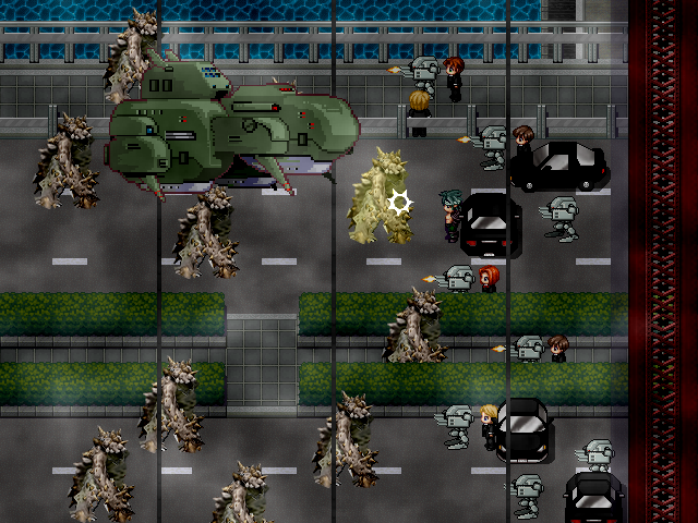
Top screenshot of those two has a major resolution problem with that big green tank; this is major and makes the screenshot look awful, but if it's animated and extremely fast moving then it might be okay in the game. Also, try staggering the movement of some of the brown monsters by 0.1 or 0.2 seconds so they don't all step at exactly the same time; this is minor and looks fine in the screenshot, but I bet it'll cause a noticable improvement in the game. Maps look good, and are good spots for alien invasions or whatever is going on there.

author=Mr_Detective
A logo that I just made with Fireworks... It doesn't look very fancy, so should I stick with the default ?

That text is really hard to read... I'd suggest giving it a black outline or something to make the text stand out more. Also consider lightening and desaturating the colours a little.

author=Mr_DetectiveA logo that I just made with Fireworks... It doesn't look very fancy, so should I stick with the default ?
DIS... never happened !
LockeZ
I'd really like to get rid of LockeZ. His play style is way too unpredictable. He's always like this too. If he ran a country, he'd just kill and imprison people at random until crime stopped.
5958
@mrdetective Use white text on that title bro. With an outline. Or some other color with a white outline. The picture is fitting.
@hereisnowhy It is a common belief that having puzzles on your map excuses the map from following the same quality rules that it'd follow without the puzzles. I disagree with this belief, though. I don't think maps with puzzles should get to look any less pretty or any less realistic than normal maps. Try putting the same puzzle on a map that doesn't look like a butt, and I think it'll help your game. But based on a forum topic I started about the issue a few weeks ago, apparently I'm the only one who thinks this, and everyone else thinks that if your map is interactive then it doesn't matter how it looks, so whatever.
@dookie Not so sure about the outer space "overworld", consider just letting the player move the cursor between planets to choose a destination instead of flying slowly around in a featureless void. The indoor is great though, don't stop doing what you're doing

I'd still personally scrap that title screen altogether.
Really, it is a very trivial aspect of the game creation process.
Dont stress too hard about a title screen if it isnt coming together, you have time.. Unless you're finished the game, I guess.
Lockez, yeah I see what you mean abiout the space map. Maybe ill increase the speed or try what you suggested. I added some more layers, holograms, and tried to detail up the engine room.
Anyone have any cool ideas of stuff to add or try for a space ship?
you get sliced if you walk into the turbine, and if you open the door without the airlock you get sucked out into space lol

Been working a bit on that dog rpg I posted a while ago. Here's some progress screenshots:
 I personally think this one could be better, but I'm not sure how exactly.
 Not quite done. (Still need to add events and stuff.)
 A forest, in between the first town and a mansion.
I've also been trying out Mode 7 with the map rotation addon. Here's a comparison shot where I use events for the mountains:
and one where I don't use events for them:
I think the top one looks better, but what do you guys think? (Ignore the messed up castle in the background, I already know.)
I've also been trying out Mode 7 with the map rotation addon. Here's a comparison shot where I use events for the mountains:

and one where I don't use events for them:

I think the top one looks better, but what do you guys think? (Ignore the messed up castle in the background, I already know.)

author=Arandomgamemaker
I've also been trying out Mode 7 with the map rotation addon. Here's a comparison shot where I use events for the mountains:
One question.
How?
author=CyberDagger
One question.
How?
Do you mean how did I make them pop out like that? Or how I made the map rotate?
For the Mode 7 script, I found it here. You need to get the scripts along with the dll files needed to make it work.
For the mountains, I changed the tileset so Overworld A_2 was also in the B-E sections. That way, I could use the mountains in events.
Building the obligatory hero's village of obligatory black elves.

Test clones; don't worry.
The tileset is an edited form of http://downloads.rpg-palace.com/index.php?cmd=8&page=1
And lol, after a quick google search, I found an Ace version already made. Welp.
Test clones; don't worry.
The tileset is an edited form of http://downloads.rpg-palace.com/index.php?cmd=8&page=1
And lol, after a quick google search, I found an Ace version already made. Welp.

Oh my, CC.. that is beautiful! Your contrast of colours with the darkness is just delightful! Mebbe you could use an overlay instead of (what I think is) autoshadow, though? The darkness cast by the building is a bit too squared looking with that lamppost by there, kinda throws the perspective off a little.
I really love how saturated that looks though. *eats deliciously bright colours*
(oh and dunno if mapping error or possibly tileset wangup, but the tower on the right has an unusually squared bottom where the top suggests it would be far more rounded.)
I really love how saturated that looks though. *eats deliciously bright colours*
(oh and dunno if mapping error or possibly tileset wangup, but the tower on the right has an unusually squared bottom where the top suggests it would be far more rounded.)
Thanks, Caz. I fixed/tweaked the things you bought up.

You don't see it a lot in this pic, but I'm trying to give the illusion of a big town/city without creating useless space that yields nothing to the player and takes up MB. Also, town-building clutter is hella fun. =3
And yes, you can walk on those lily pads. You're forced to do it if you want 70% of the town/field/dungeon's treasure.
Damn elves are too good for normal bridges.
LockeZ
I'd really like to get rid of LockeZ. His play style is way too unpredictable. He's always like this too. If he ran a country, he'd just kill and imprison people at random until crime stopped.
5958
What's with the panes of glass covering some of the lilypads? Doesn't seem normal for panes of glass to be in the middle of the fields.
The lilypads are so thick that I had to study it to make sure there was water underneath, they look like they're growing on dry land. I was about to ask why some of them were growing on dry land but then I looked really carefully and I think that is water underneath. I don't think that's a bad thing, though, since it sounds like you want the player to realize he/she can walk on them. They definitely give the impression that they are walkable ground tiles.
The lilypads are so thick that I had to study it to make sure there was water underneath, they look like they're growing on dry land. I was about to ask why some of them were growing on dry land but then I looked really carefully and I think that is water underneath. I don't think that's a bad thing, though, since it sounds like you want the player to realize he/she can walk on them. They definitely give the impression that they are walkable ground tiles.

I think you should fix the lily pads personally. They are nice, but sometimes it is fun to accidentally realize you can walk on something. They also just look really out of place as they are. Like LockeZ said, they look like ground tiles or panes of glass and it stands out far too much.
I finally got passed the lily pads and noticed the rest of the map. It is pretty and the clutter that you can't access strongly reminds me of games like Secret of Mana and such, it is very nice.
Aesthetically it's very pleasing, it's well designed and the art is nice...I just can't get over the random panes of glass....
Okay, thanks guys. I'll remove most of the walkable glass on the map. I will, however, keep that single tile on the top right. I want it to catch the player's eye, without overwhelming him/her. It'll be important for another map~
@ Dookie
Keep adding those instant kills for my sadistic satisfaction. As long as the player is warned not to do something, I'm okay with it. >:D
The tilesets are great, and that city you made is inspiring.
@ Dookie
Keep adding those instant kills for my sadistic satisfaction. As long as the player is warned not to do something, I'm okay with it. >:D
The tilesets are great, and that city you made is inspiring.
author=DookieWow, you've got so many little cool things in there. Would a medical bay fit? Only common transport space ship thing I could think of missing.
Anyone have any cool ideas of stuff to add or try for a space ship?
you get sliced if you walk into the turbine, and if you open the door without the airlock you get sucked out into space lol
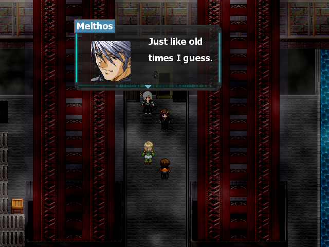
Right outside the final boss, progress!:
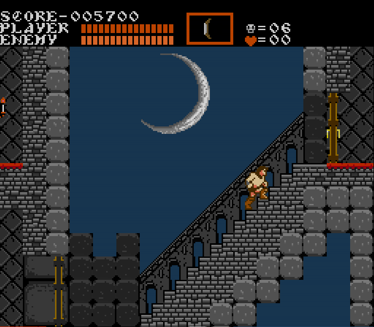
I really like that CRT overlay, or whatever TV overlay that is supposed to be.

