


THE SCREENSHOT TOPIC RETURNS
Posts
LockeZ

I'd really like to get rid of LockeZ. His play style is way too unpredictable. He's always like this too. If he ran a country, he'd just kill and imprison people at random until crime stopped.
5958
Uh, just edit the tileset, not that hard. Like 15 minutes of work tops to make the bottom edges of those cliffs either transparent or dark.
If you can't make a good-looking ramp, use a ladder.
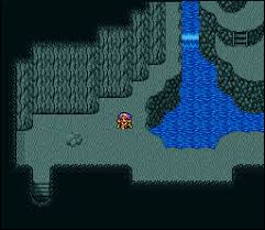
I don't just mean the colors in the northeastern corner, I also mean the cliff heights. They don't line up, you have a cliff going from ground level to the UPPER part of the cliffs that's only four tiles high instead of eight tiles high. I can't actually TELL for sure what sections are supposed to be the first, second and third floor. Also, I have no idea what's going on with that weird part that--- ugh, I can't describe what I mean, here.

I put an arrow going from height 0 to height 1, and then another arrow going from height 1 to height 2, so you can see that the spot with the third arrow in the northeastern section really is going from height 0 all the way up to height 2 and needs to be twice as tall.
The !! part needs to just be changed so that the player is climbing down a ladder or ramp, because whatever you're trying to do there with the side-view isn't working. The ??? part needs something done to it to make it make sense, because I have no idea what it's supposed to be, possibly make it height 2 so you can't walk on it?
If you can't make a good-looking ramp, use a ladder.
I don't just mean the colors in the northeastern corner, I also mean the cliff heights. They don't line up, you have a cliff going from ground level to the UPPER part of the cliffs that's only four tiles high instead of eight tiles high. I can't actually TELL for sure what sections are supposed to be the first, second and third floor. Also, I have no idea what's going on with that weird part that--- ugh, I can't describe what I mean, here.
I put an arrow going from height 0 to height 1, and then another arrow going from height 1 to height 2, so you can see that the spot with the third arrow in the northeastern section really is going from height 0 all the way up to height 2 and needs to be twice as tall.
The !! part needs to just be changed so that the player is climbing down a ladder or ramp, because whatever you're trying to do there with the side-view isn't working. The ??? part needs something done to it to make it make sense, because I have no idea what it's supposed to be, possibly make it height 2 so you can't walk on it?

Ah, that little cliff thing. That was me trying to figure out how to do the ramp thing on a side view (I did something similar in an earlier dungeon, but that one used all of the same color and was handled differently than that). Perhaps I should make that part seem more...stair-like? Hmm...though if I CAN'T get it to look right with the ramp, then I will go with the ladder approach I suppose. Ramps are surprisingly tricky to pull off for me for some reason...trying to think of a game I could base a ramp off of but none come to mind (none of the FF games actually really USE ramps that much IIRC...).
Oh....OH! Somehow I never noticed that I did that...whoops! I'm usually more careful about those kinds of things x_x;;
EDIT - And another thing I didn't realize is that the tiles I'm using for the bottom of the diagonal cliffs are also on the upper layer already...and are the exact same thing but with transparency, which is what I was using on the bridge. Go figure >___>;
LockeZ
I'd really like to get rid of LockeZ. His play style is way too unpredictable. He's always like this too. If he ran a country, he'd just kill and imprison people at random until crime stopped.
5958
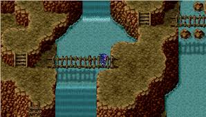
Ramps only really work when the upper and lower sections are the same color. They make a smoother transition than stairs or ladders, so of course when you have different ground tiles they look awkward. I don't recommend making your ground tiles all the same color on this map, though, because of the way the area is set up. I just recommend not using ramps.
When I do make a ramp I typically make it like this, basically just like I make stairs except without the steps:

But with two colors it looks like this, which is ugly:

When I do make a ramp I typically make it like this, basically just like I make stairs except without the steps:
But with two colors it looks like this, which is ugly:
Ah yes, that's how I handled a ramp in one of my other dungeons.

This is an example of the sideways ramp in another dungeon I did earlier. Also has that styled ramp you're showing me (it was done much earlier than even this though). I guess I'll just have to stick with using ladders or something (even though that seems odd to have in a random cave but...gotta do what you gotta do I suppose).
Also of note, this ramp was done completely backwards from the one you showed me (and the one that I did). Dunno if this way works just as well or not.
LockeZ
I'd really like to get rid of LockeZ. His play style is way too unpredictable. He's always like this too. If he ran a country, he'd just kill and imprison people at random until crime stopped.
5958
Both ways work.
Ladders in random caves aren't that odd. It's not like no one's ever been in there before. Someone put the treasure chests there, right?
Please tell me that's not a finished in-play dungeon though. :(
Ladders in random caves aren't that odd. It's not like no one's ever been in there before. Someone put the treasure chests there, right?
Please tell me that's not a finished in-play dungeon though. :(
Hmm...I suppose that is true.
Referring to the recent screenshot? That it is, though it's cropped from the full version. Would you rather see the full version instead?
Like I've said many times, mapping is NOT my strong point at all. ^^;;
Referring to the recent screenshot? That it is, though it's cropped from the full version. Would you rather see the full version instead?
Like I've said many times, mapping is NOT my strong point at all. ^^;;

Tis seems to be a recurring issue with my maps I'm told. The most I can do with these kinds is just add a bunch of random rocks and stalagmites everywhere really. *shrugs*
LockeZ
I'd really like to get rid of LockeZ. His play style is way too unpredictable. He's always like this too. If he ran a country, he'd just kill and imprison people at random until crime stopped.
5958
I really wouldn't. I don't think I could take it.
First it's completely barren. I know you have doodads. Pebbles, stalagmites, boulders. Use height differences and cliffs not just to shape the area but also to add variety.
But even more imporantly! Condense it. It's three times as big as it needs to be. Remember the player's screen is 20x15 tiles. There are places where the player could be standing where he couldn't see almost anything. Make it small enough that he can clearly see the path almost all the time. Here's an actual FF4 map, notice the size difference:
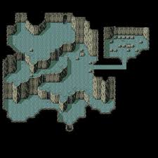
When taking a single screenshot the player can easily see enough of the area to recognize it. Even though FF4 maps are pretty bare, they do a good job of creating a very traversable layout (as long as you pretend the hidden paths aren't there). Even the shittiest screenshots of FF4 maps have numerous features of the cave visible in them. They do this, and almost all games do this, by condensing the area down. When the player can see more things at once on his screen, the area has more of an identity to the player, is less frustrating to navigate, is more interesting, and is more memorable.

Inb4 FF4 sucks ass. I know it does. Not trying to turn you into the Da Vinci of RPG caves here. One step at a time, and FF4 is an example of a game that does this part of mapping correctly while still having most of the same other problems that you have, so it's actually a good way of showing you how to fix this problem because you can focus on the few things that are different.
First it's completely barren. I know you have doodads. Pebbles, stalagmites, boulders. Use height differences and cliffs not just to shape the area but also to add variety.
But even more imporantly! Condense it. It's three times as big as it needs to be. Remember the player's screen is 20x15 tiles. There are places where the player could be standing where he couldn't see almost anything. Make it small enough that he can clearly see the path almost all the time. Here's an actual FF4 map, notice the size difference:
When taking a single screenshot the player can easily see enough of the area to recognize it. Even though FF4 maps are pretty bare, they do a good job of creating a very traversable layout (as long as you pretend the hidden paths aren't there). Even the shittiest screenshots of FF4 maps have numerous features of the cave visible in them. They do this, and almost all games do this, by condensing the area down. When the player can see more things at once on his screen, the area has more of an identity to the player, is less frustrating to navigate, is more interesting, and is more memorable.
Inb4 FF4 sucks ass. I know it does. Not trying to turn you into the Da Vinci of RPG caves here. One step at a time, and FF4 is an example of a game that does this part of mapping correctly while still having most of the same other problems that you have, so it's actually a good way of showing you how to fix this problem because you can focus on the few things that are different.
(I think FFIV is just fine personally. Easy, but fine).
I'm assuming you mean like these maps? (Yes, these are also in-game playable maps. Second one is on a mountain...just don't have much else going there but oh well right now)


That cave map though was inspired from a FFII map so maybe that's why it looks better (barren still yes, but I'm not worrying about barreness at this time. If I spent all my time on mapping, I'd never get anywhere else with this game x_x;;).
I was thinking of taking inspiration from Chrono Trigger's maps as well since I was looking at those recently and those were handled pretty nicely. My main issue is I try to keep it well...realistically sized. And because of that, they end up as big as they are. If I were to go back and compress all of the maps I made, it'd never get done. x_x;; I dunno, I'm just not very good at making paths that are small like that for some reason. @_@;
I'm assuming you mean like these maps? (Yes, these are also in-game playable maps. Second one is on a mountain...just don't have much else going there but oh well right now)
That cave map though was inspired from a FFII map so maybe that's why it looks better (barren still yes, but I'm not worrying about barreness at this time. If I spent all my time on mapping, I'd never get anywhere else with this game x_x;;).
I was thinking of taking inspiration from Chrono Trigger's maps as well since I was looking at those recently and those were handled pretty nicely. My main issue is I try to keep it well...realistically sized. And because of that, they end up as big as they are. If I were to go back and compress all of the maps I made, it'd never get done. x_x;; I dunno, I'm just not very good at making paths that are small like that for some reason. @_@;

Heh, FF4 sux ass.
It depends on what you're going for.
A typical map should be small (I always regret it after I draw a map, because either it's too small, and I have scrunched graphics, or I make it too big even though it doesn't look that way on the draw and I have alot of empty space).
That said, a maze map, or at least one with a branched path should not be small, as you don't want the user to readily know where the exit is. Someone like me (photographic or nearly photographic memory) can probably get it right on the second try even still, short of an immense twisting maze (I made one myself that was a 500x500 monstrosity). But for the average person, having a 3x3 square of 20x15 (60x45 that is) would be enough to obscure most of the stuff enough.
The point of the matter is not that you must work only with 20x15 (that's awfully limiting, especially since maps can go about 20x that). It's that unless you want areas to look very stretched out, you should fill in each 20x15 area as though it's the entire map (in other words, avoid making 500x500 to start with, since you won't have much actual filled area). To make this sort of thing, do small areas at a time. Map 2 is a good example of this, map 1 is a bad.
I really should make a screenshot, but my highlights tend to be technical stuff (custom events), and mapping tends to be my weakest point. I'll think of something.

Modified version of that original map (since I lost the original one). The ramp idea isn't going to work here it seems...ho hum...and it feels really tiny for a room that's meant to be a maze-like area (note though, that this is just one of many rooms. There's meant to be a lot of rooms in here, and there isn't any random encounters aside from fixed map encounters, which is only for the first visit. Second visit has a second part to it that's also maze-like, but will have random encounters).
Opinions? Suggestions? I didn't add any decoratives to the map since this was just to test the mapping itself.
@bulmabriefs144: I got what you're getting at. I've made plenty of maps where it doesn't seem like it'd be THAT big, but in game they ended up being pretty large. One of the main issues I have with mapping in general. Actually, I wonder if I couldn't get someone to take a look at other maps. Might make some people cringe though...
EDIT - For those curious, map #1 in previous screenshot was modified from one of the floors in Pandaemonium in FFII. Yeah...
EDIT #2 - Actually, looking at it now, I think I misread it. Only the wall that went to the third floor in the original had to be double height, and not the other walls. Am I correct? If so, then I need to refix the walls again in this screenshot (I made the map a lot smaller too, but dunno if THAT was a good idea or not either...)


I agree with Craze; FF4's dungeon design is some of the best inspiration for RPG Maker style games.
Anyway, I think that the map is looking better Xenomic, and I think you were wise to get rid of the ramps; ramps just don't look right in this kind of forced perspective, imo. There are still some issues, however; there are parts where the ledges are oddly miscoloured, the section without a ledge looks like a graphical error, and, while the rock bridge is an interesting idea, it doesn't look right next to the rock walls. The base of the rock walls also has a rather jarring outline, and should match the floor in colour.
Having said that, it does look better and I like the more concise feel to the area. It's a bit plain, but you can always change that later.
If you're referring to the top ledges of spots, that's the upper layer (it's the same tile as the lower layer, so no need to worry about those). The base outlines is something I can also deal with. Not sure what to do about the bridge though. There's really not a whole lot that I can think of to deal with it. x_x;;
Though I dunno where this graphical error may be that you see o_o;
Though I dunno where this graphical error may be that you see o_o;
Ah, I see; I'm used to editing in VX Ace.
The top right corner appears to have a ledge without an edge, and it looks rather jarring to me.
The top right corner appears to have a ledge without an edge, and it looks rather jarring to me.
Oh that, I didn't even notice it x_x;; Got that fixed, and I think I have this map set up the way it can best be done for now...
It's either Eternia's Promise, nothing, or Chained Revolution, seeing as icons are fucked up there, no real point. But End Love: Seafarer is converted by Ace now, properly work on that. I seem to be having a messing Armor Equipment Type placement. Only because I converted from VX to Ace.
Boring concept if I actually work on something that isn't going to be cancelled, end of. Seem to be having alot of script errors.
Boring concept if I actually work on something that isn't going to be cancelled, end of. Seem to be having alot of script errors.

I'm trying to go back to a simpler message system to give my project a more consistent UI. Thoughts?
old

new

old
new


