THE SCREENSHOT TOPIC RETURNS
Posts
Here's something from a VXAce project I just started today.

(Sorry for JPEG quality! Forgot to save it as a PNG)
(Sorry for JPEG quality! Forgot to save it as a PNG)

What are those dark spots supposed to be? It looks like burn marks.
I dunno if you're trying to make it look aged or worn down, but everything being in tip-top shape except for the occasional crack isnt helping.
I dunno if you're trying to make it look aged or worn down, but everything being in tip-top shape except for the occasional crack isnt helping.
To be honest with you, if I knew how to sprite then that probably wouldn't be a problem. However it is supposed to be the house of an elementalist who casted way to many Fire and Earth spells.
Change the tileset to something less fancy looking then, at least. I doubt this elementalist would want to cast spells in a expensive as hell house. Those carpets, especially.

author=0range00
^ looks wicked. Looks very "different" in a good way :) those green haired girls are creepy.
Thank you! Ahh, that makes me relieved, I wasn't sure if it would look good to other people. Aha thanks, they're meant to be creepy :)

author=Doodlegirl863I've been at a loss for motivation recently;;...but I'm slowly making progress. This is related to an event in-game that I'm working on right now.
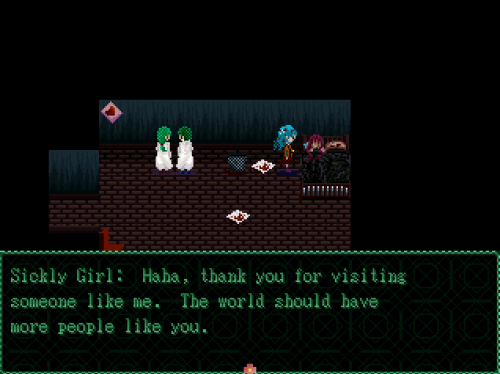
Bah, my sick girl is better. (It's a stock pic, I just converted it to 256 color, 320x240)

'Cept for the faceset. The eyes I changed by using Blue to Green on iDraw, but I always mess hair up so I'm leaving it blondish.
I've decided to do transparent text only on scenes like this with a picture BG cutscene.
I got the house creation thing to work.

Bam! Instant house.

Well, more of a barn...
The BG switches between black (dead trees) and white (green trees) every 10 secs.


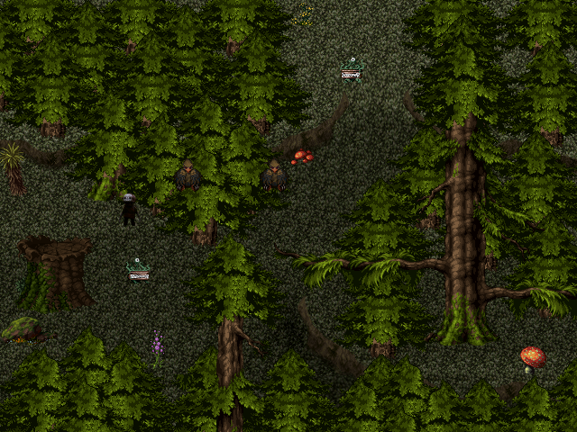
Working on a huge lost city.
This big map will be split in about 10-12 smaller maps and contain some kind of sewer levels.

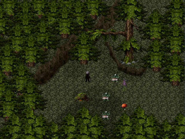
Didn't you already post an image like that? Has it changed since then?
I don't really like the layout of the tiles. I assume it's meant to portray a city falling apart, but it looks sloppy and unappealing to me. It's too busy and too random.
I don't really like the layout of the tiles. I assume it's meant to portray a city falling apart, but it looks sloppy and unappealing to me. It's too busy and too random.

author=Link_2112
Didn't you already post an image like that?
So the answer would be yes.
That image has more logical structure, but why would a city build wooden buildings if they can build stone buildings? And even if they did, why would they merge them together like that? And trees taking root on the second floor of a stone building, grass growing...I can picture vines making it up the lower walls, but single blades of grass up there seems off.
The individual tiles do look good.

author=Link_2112
why would a city build wooden buildings if they can build stone buildings?
I think it just works as a method to make the area look more varied and interesting. The colours of the two tiles work together with the foliage and basically just make everything more visually appealing.
I don't think logic is the most important in fiction. Especially in fantasy settings.
But even for that I can give you some reasons:
Maybe the bricks are too rare or too expensive? So not everyone can afford them. It's still a swamp, so it might be difficult to move them from the quarries to the construction sites.
They might just have added them whenever they wanted to expand a house, just like old churches have ben expanded.
And plants do what they want just to make a place look awesome.
I am not trying to make a perfectly realistic picture of some real ancient city. This is fantasy. If you meet dragons, fairies and fireballs, deal with trees that can grow on buildings. :D
Please keep that in mind. :)
But even for that I can give you some reasons:
author=Link_2112
That image has more logical structure, but why would a city build wooden buildings if they can build stone buildings?
Maybe the bricks are too rare or too expensive? So not everyone can afford them. It's still a swamp, so it might be difficult to move them from the quarries to the construction sites.
They might just have added them whenever they wanted to expand a house, just like old churches have ben expanded.
And plants do what they want just to make a place look awesome.
I am not trying to make a perfectly realistic picture of some real ancient city. This is fantasy. If you meet dragons, fairies and fireballs, deal with trees that can grow on buildings. :D
Please keep that in mind. :)
I was going to bring that stuff up but I didn't want to presume why you designed what you did. It's the kind of stuff that should only bother you in a setting which is trying to be realistic.
I don't think everything has to be perfectly logical, but you obviously made it resemble real life. Even in a fantasy world there are rules like gravity, things grow from the ground, and the elements are the same like wood and stone. So it's based on real world logic. Even though it's "fantasy" there is something to be said about creating a realistic environment. It helps with immersion in most cases.
But yeah, it's not that important.
But yeah, it's not that important.
I don't mind the trees growing from stone or whatever, but in the first picture I honestly can't tell what's supposed to be ground and whats supposed to be walls.
That is not good, realism or not realism.
That is not good, realism or not realism.

Interiors surely aren't my strong point, but since I wanted a farm on a map I made, I had to make one... This is the house of a blind farmer (don't ask, he's a guy returning from my 1st game). Upstairs is his bedroom. South is the front door, and leads to a small veranda. The door on the left leads to the farmland. Is it any good?

That's quite possibly one of the best RTP interiors I've ever seen. As long as it keeps the shape of the outside of the building then it's fine.

This is my initial layout of a police station interior. Any tips on making it more interesting? I tried many different ways, but they just ended up looking boring and bland. :(

I'm having an issue with the chair tiles as well. I only have the RTP blue chairs facing up and down, but not sideways. The ones I have facing sideways are bigger than one tile, or they don't look well with the map's color. :O
I'm having an issue with the chair tiles as well. I only have the RTP blue chairs facing up and down, but not sideways. The ones I have facing sideways are bigger than one tile, or they don't look well with the map's color. :O