


THE SCREENSHOT TOPIC RETURNS
Posts

Whatever is going on there, Rhyme, it seems pretty cool. Lovely ink swirlies at the top~ Maybe make the battler faces a little bit smaller when they're in-combat? It looks like floating heads are attacking the monster chest instead of them just being portraits XD They also make the text seem super-tiny by comparison...
LockeZ

I'd really like to get rid of LockeZ. His play style is way too unpredictable. He's always like this too. If he ran a country, he'd just kill and imprison people at random until crime stopped.
5958
Rhyme, I have to be honest. That screenshot is giving me a seizure.
Everything clashes really badly. You've got at least three, possibly four distinct art styles going on there (enemy, facesets, black swirly mist, and background), and the enemy and faces in particular are not compatible at all. Some of your text has a shadow, some has an outline + shadow, and some has no shadow at all but is glowing. I think it's in two different fonts, but the random use of small caps make it hard to tell. There's a window background behind some of the text but not behind other bits. The timeline bar is shaded differently than the HP/MP bars and doesn't have a black border.
If you fix all these problems, the only problem left will be the tie-dye background, which is fairly disgusting and hallucinatory on its own, and probably worse when animated... but forgivable since it reminds me of Earthbound.
I purposely withheld judgment on graphics because I figured it was a mock-up with placeholders. I could be wrong? but I have faith that it'll go through more changes and look better~
(By the way, my game uses hallucinogenic acidvomit backgrounds. I can't wait to fry your brain. I'LL FRY WITH YOU)
(By the way, my game uses hallucinogenic acidvomit backgrounds. I can't wait to fry your brain. I'LL FRY WITH YOU)
LockeZ
I'd really like to get rid of LockeZ. His play style is way too unpredictable. He's always like this too. If he ran a country, he'd just kill and imprison people at random until crime stopped.
5958
It's possible. Even if she's still deciding on graphics, I figure feedback on what she's got so far might help her make the decisions. I don't mean to sound SUPER DISCOURAGING, I just want people to know how they can improve their games. I have been told it helps if you imagine everything I say in House's voice.
author=LockeZ
I have been told it helps if you imagine everything I say in House's voice.
Wow, that...works really well.
I would start telling people to do that but it would make no sense. But imagine everything I say in Ursula's voice.


@liberty:
pretty decent stuff lighting-wise! that window in the room on the left should be casting a fair sight more fill light out into the room, especially considering it's (i assume) natural light. you also might want to tone down the fireplace light, or make it more orange/red-biased. at present, it looks tonally more like light you'd see from a lamp.
pretty decent stuff lighting-wise! that window in the room on the left should be casting a fair sight more fill light out into the room, especially considering it's (i assume) natural light. you also might want to tone down the fireplace light, or make it more orange/red-biased. at present, it looks tonally more like light you'd see from a lamp.


I thought about it and...scratch that, your rad dog game looks leet and I want to see moar.
and i didn't even notice the pipes until you mentioned it, then I had to look for it.
Thanks tardis, I'm still looking at the lighting. I may just end up leaving it until the end. ^.^; It's so troublesome.
Newbles: I've got some edits for that chipset if you want them. XP Looking good so far, though!
Newbles: I've got some edits for that chipset if you want them. XP Looking good so far, though!
Those futuristic chipsets always have such ridiculous lighting. If liberty didn't already offer that I might have went ahead and fixed it up a notch.
author=Liberty
Thanks tardis, I'm still looking at the lighting. I may just end up leaving it until the end. ^.^; It's so troublesome.
you ought to send me a PM or hook me up with your IM info or something. i'll hook you up with some trade secrets that should make your LFX!! job easier. B)
author=Liberty
Newbles: I've got some edits for that chipset if you want them. XP Looking good so far, though!
Chapsets = Do want :)
I have 3 at the minute though to be faaair and I'm greyscaling ERRTING.

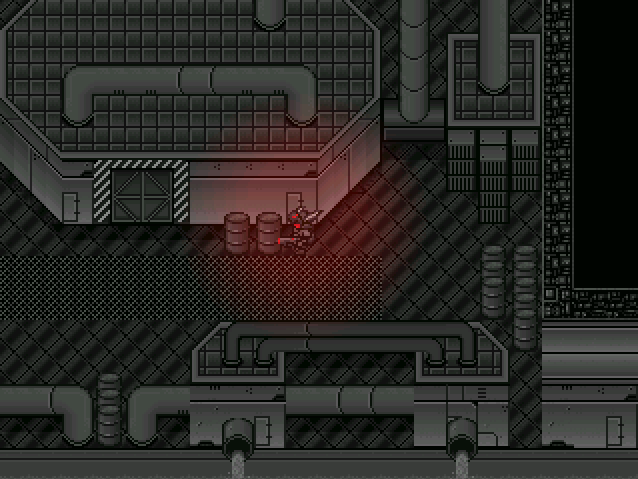
The problem with that chip, is that it's one of the few "futuristic" chips besides maybe ff6 magitech factory and CT domes. The only problem is that it's very limited, and lackluster, but it does provide a sufficient base to build off of. It has a lot of unsaturated grey, which doesn't help readability of your similarly colored sprite. It also has a bunch of gradients/colors that don't really add depth because they are too similar, so it lacks contrast too. I know it's custom somewhere down the line, (idk who orig made it) but I would reconsider using it at all or consider some hefty edits.
I also happen to have a bunch of edits to those sets, which, I might add, came from the sample game ABYSS-DRIVER for rm2k (later the same people made Knight-Blade and such, which is very similar, graphically). Now if I could only get my hands on my old PC and I'd post them immediately (and maybe even post a screenshot or two) but unfortunately, it's broken.

Almost Real Kioku by Mastervlad, a promising project.
Game is currently in French but will be translated.
Game is currently in French but will be translated.

author=tardisauthor=Libertyyou ought to send me a PM or hook me up with your IM info or something. i'll hook you up with some trade secrets that should make your LFX!! job easier. B)
Thanks tardis, I'm still looking at the lighting. I may just end up leaving it until the end. ^.^; It's so troublesome.
I smell TUTORIAL

I've never once posted here in the screenshot thread ( or on this forum at all ), so I'll show a screen from my upcoming VX game, Enelysion.

I love parallax mapping. :)
I love parallax mapping. :)


