


CONCERNING THE GAME FRONT-PAGE DOWNLOAD UPDATES
Posts
Well, I don't want to go swimming thru a whole ton of pages just to find information.
It should all be right there.
I don't mean pages of a book, that is a lot more convenient then what I think you are going for, Darken.
It should all be right there.
I don't mean pages of a book, that is a lot more convenient then what I think you are going for, Darken.

author=kentonaauthor=Darkenbut so many pages do it! Look at Newgrounds or TSN.ca or gamejolt, or even MSN!
Too much stuff on the frontpage to the point where you can scroll down forever really makes the info itself less important and more jarring. It's called subtractive design.
I would not use gamejolt or annoying news sites as a good examples. Newgrounds is a lot less wider and is more compact, it has a less lot content than it looks. Everything seems focused to a degree.
Look at http://www.pixeljoint.com/ the only thing that makes the page seem long is the news updates, but other than that you pretty much have 2 spots of interest, the navigation bar, and the pixel art being showed in the newest/weekly/halloffame. Everything else is minimized nicely. https://8bc.org/ has the same deal, except "newest" is more important.
It's not so much the overflow of information but the overuse of "LOOK HERE THIS IS REALLY INTERESTING" everywhere on the page that bothers me.

LockeZ

I'd really like to get rid of LockeZ. His play style is way too unpredictable. He's always like this too. If he ran a country, he'd just kill and imprison people at random until crime stopped.
5958
author=kentonaauthor=Darkenbut so many pages do it! Look at Newgrounds or TSN.ca or gamejolt, or even MSN!
Too much stuff on the frontpage to the point where you can scroll down forever really makes the info itself less important and more jarring. It's called subtractive design.
Man. Those are all such fucking horrible examples that I have to assume you're being sarcastic.
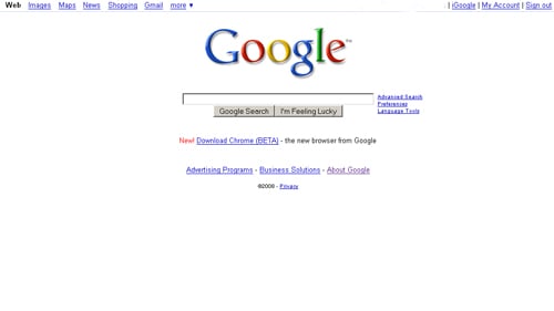
Guess what the front page of the most popular website on the internet looks like?
Not like I really care that much, since my bookmark goes straight to the forums, I guess. Haha.
To toss my opinion into the mix anyway, because I always have an opinion I seem to want to share about everything, because I am insufferable: I do totally love having tons of information. But I also don't think it looks attractive for your front page to look like my World of Warcraft guild leader's custom interface with 50 mods. You want to look attractive to newcomers, right? You want them to be able to find stuff easily? More information is definitely useful, but it doesn't have to all be in the same place. There could be seperate places that aren't the front page, where you post, say, for example... everything except the login button, the navigation bar, the search box, and the game of the month. You've got a lovely navigation bar at the top of the page (unless you moved it to the left in RMN4), why not use it?
Now way man. I love those pages! I visit TSN.ca every day multiple times a day. And MSN I visit at least once a week. (I don't visit newgrounds, but just because the content doesn't interest me). I was not being sarcastic. I fucking love info-jammed pages (when the content interests me). (also, counter-example to google's minimalism - facebook is the fastest growing website at the moment, and that site's pages are filled with content)
To each his own, I suppose.
In any event, I really like the frontpage we have going now in RMN4. I think it is a good blend of latest content, interesting stuffs, random stuffs and whitespace.
People will hate on it of course. In fact, no one will be happy with RMN4 (calling it here first!)
To each his own, I suppose.
In any event, I really like the frontpage we have going now in RMN4. I think it is a good blend of latest content, interesting stuffs, random stuffs and whitespace.
People will hate on it of course. In fact, no one will be happy with RMN4 (calling it here first!)

Am I the only one here who likes the current main page? Aside from the problems addressed which honestly aren't that bug of a deal I think it's great.
There's no problem with the current main page, it's rather a problem with content... But hey it is RMN4 we need to make it look new or something.

