


TITLE SCREEN REQUEST: REVELATIONS OF GAIA
Posts

I am looking for a talented graphic artist to help me create a new title screen for an older project.
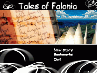
I have since named my game Revelations of Gaia. In terms of the Title Screen I would like a brand new one. The art style of the older title is a little more light hearted, I would like something a bit more dark but containing the same Screen Style with the pre-writen text "New Story", "Bookmarks", and "End Story".
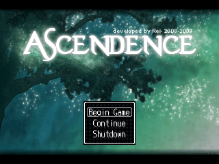
Stylistically I would like something resembling the Ascendance title screen.
A centralized Logo over the background image as well as a black cut scene bar on the up and bottom areas of the screen. A mix of green, black, and white are colors that I would like to use in the title screen and in terms of the background image I would like some dark yet mysterious image of a world or sky.

Your text to link here...
I have since named my game Revelations of Gaia. In terms of the Title Screen I would like a brand new one. The art style of the older title is a little more light hearted, I would like something a bit more dark but containing the same Screen Style with the pre-writen text "New Story", "Bookmarks", and "End Story".
Stylistically I would like something resembling the Ascendance title screen.
A centralized Logo over the background image as well as a black cut scene bar on the up and bottom areas of the screen. A mix of green, black, and white are colors that I would like to use in the title screen and in terms of the background image I would like some dark yet mysterious image of a world or sky.
Your text to link here...

I'm going to accept this request. I'd like to know more, though. I'll go over this later and see what I can come up with. :D
Can you explain in detail what you wish to see for the Title Screen? The only thing that's clear to me is that you would prefer it to be similar to screenie 2, and that it should contain three options - "New Story", "Bookmarks", and "End Story".
Can you explain in detail what you wish to see for the Title Screen? The only thing that's clear to me is that you would prefer it to be similar to screenie 2, and that it should contain three options - "New Story", "Bookmarks", and "End Story".


Hey guys I thank you for the interest in the Title Screen. I have a few updates and information that I feel will make it easier to make.
@Kevin: Thank you for the title, but I am making an RM2k3 game, thus the dimensions must be 320x240.
Request Updates:
Name: The games name will now be Revelations, due to some feedback from the community.
Dimensions: 320x240
Appearance: Utilizing the background image presented or a better, I would like the "Revelations" to utilize a white color similar to the font of Ascendance also I would like the title of the game to be centered. Utilizing the same position as I have presented in the old Title Screen I would like the "New Story", "Bookmarks", and "End Story"


I didn't even get to start my version and I don't know if I anymore have to. Nessy's is pretty good!

With a very dark blue, like that, I would choose : yellow, black and white, or, better : pink, and white, but not green. Nessy chose to make it all white, which was actually a good option, imo (leaving out the green).
I can't see any logic in that, but in either case, RM2k3 still supports only 256 colors, so if you pick multiple colors for image with a gradient like that, it'll show...
As colors go, don't you think this :
http://rpgmaker.net/media/content/users/4243/locker/1000000139_large.png
is better than this :
http://rpgmaker.net/media/content/users/4243/locker/1000000139_large12.png
http://rpgmaker.net/media/content/users/4243/locker/1000000139_large.png
is better than this :
http://rpgmaker.net/media/content/users/4243/locker/1000000139_large12.png
Im using Nessiah's since she did it despite all she has on her plate. Im not a graphic artist so I think she would know best in terms of color combination. Once again Ness thanks for the help. As for the rest of you thanks for the post, happy that requests are completed so fast around here.
Sure, Nessy's beautiful, but, considering the inspiration was Ascendence's title screen, I was looking for something a little similar in the originality of the mix of colors ( not considering my size and style of font of course), anyways..

I thought this was an Iron Gaia request topic. I guess the word Gaia shouldn't be associated in my mind. Oh well.
The reason I picked white is because the comet is overpowering any other colors because of its white tip..
If you want here's an example:

I tried it with green and it doesn't work well. And I actually started with yellow first but it...doesn't look right. Either way, I feel like the balance is being thrown off and makes it hard for me to concentrate on a singular point, in this case the title itself.
And if you guys want to fiddle with the title screen, here's the PSD file: http://rpgmaker.net/users/Archeia_Nessiah/locker/ashley_titlescreen.psd
If you want here's an example:
I tried it with green and it doesn't work well. And I actually started with yellow first but it...doesn't look right. Either way, I feel like the balance is being thrown off and makes it hard for me to concentrate on a singular point, in this case the title itself.
And if you guys want to fiddle with the title screen, here's the PSD file: http://rpgmaker.net/users/Archeia_Nessiah/locker/ashley_titlescreen.psd


Kev, that style is beautiful. I really like it. It screams 'get ready for awesomeness!'
It just doesn't go with that background. It's gazing up at a starry night. When I see that background, I think serenity. That's why Ness's quiet and soft white lettering is a better match.
It just doesn't go with that background. It's gazing up at a starry night. When I see that background, I think serenity. That's why Ness's quiet and soft white lettering is a better match.
I really love both of these screens. They look quite amazing. Ness' looks better on that screen though, but I definitely think Kevinds' title is awesome. I think it would even look really good with just a black background.


