


 Add Review
 Subscribe
 Nominate
 Submit Media
 RSS
RSS
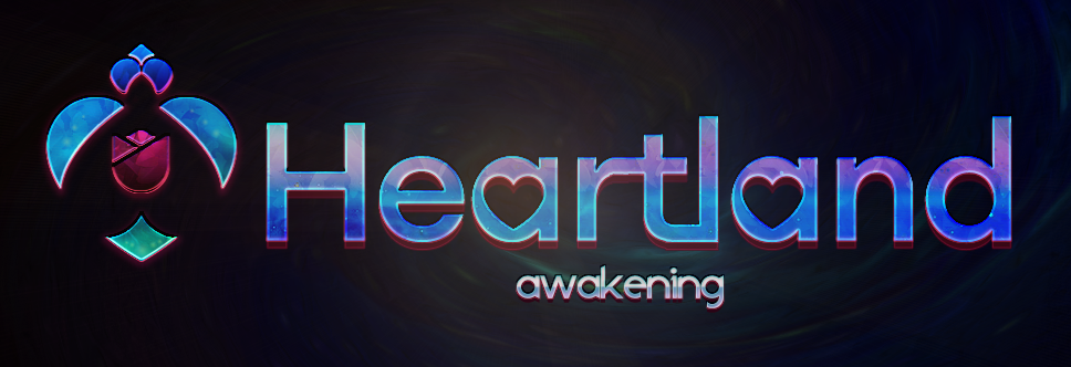
Heartland: (A Visual) Awakening
 Faye
Faye- 10/24/2019 01:38 PM
- 714 views
Yes! Finally an update. Took me long because of reasons and because of bad internet.
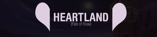
One aspect that I seemed to ignore on the Heartland's changelist was a visual revamp. While its style was just OK being minimalist, mainly black and white colors, I didn't wanted it to stay like that for a future remake. It just doesn't feels like the vibe Heartland should be giving. Back then, when I finished the game, I had to make a logo and the presentation overall, and so I understood quickly that just black and white wasn't going to work. But I had to keep it minimalist, so I went for the safe go and just made a minimalist, kinda soft pink coloured logo. It was OK, but nothing so special. Oh, and I did put an ending scene as the background. Very dark, but it's still there.

That was it, yeah.
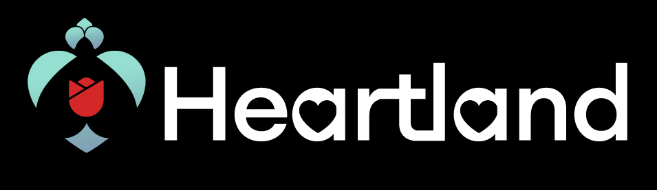
But it was remake time already and I needed a whole new fresh image for Heartland. Something more impactful, vivid, vibrant, intense. Something that felt like "oh this is nice" more than just "eh ok *keeps scrolling*". And I must say, It wasn't easy at all.
But it was remake time already and I needed a whole new fresh image for Heartland. Something more impactful, vivid, vibrant, intense. Something that felt like "oh this is nice" more than just "eh ok *keeps scrolling*". And I must say, It wasn't easy at all.
The first challenge and main problematic was the logo itself. *What* in this god-forsaken world represents Heartland? Its thematic, its plot, its vibe? What is it? Just a heart? Come on! I broke my mind to pieces when I tried to come up with ideas. The old logo featured a heart split in two at the both far sides of the text (which reads Heartland). If you ask me, it looks OK (which is not awesome, or nice) but it doesn't *tells* you anything. It's like, just a picture there. Bland, meaningless, empty. And it wasn't even stylish!
So this friend o' mine comes to me and says that, if the protagonist is called Rose, I maybe should play with that. Some petals and stuff perhaps. And I just went "oooh". Kind of an epiphany. Long-short story, I came up with many different concepts for it:
So this friend o' mine comes to me and says that, if the protagonist is called Rose, I maybe should play with that. Some petals and stuff perhaps. And I just went "oooh". Kind of an epiphany. Long-short story, I came up with many different concepts for it:

This one I still like, but its just too weird. I like it 'cuz it's weird, but it doesn't have any meaning. It's just... a thing.

Unbeknownst to me, this was the prototype for what was going to be the future, definitive logo for Heartland. I made this iteration even before my friend advised me.

Second winner overall. A lot of people liked this, and some perhaps may still think this is better than the current one, but it has problems when you take it out of just being a white-on-black logo and start giving it shape and colour.
]

Yeah. Don't ask.

Winner! It's still basic but it has more meaning to it. It has the rose, its an abstract heart and, if you look well, in fact there are *two* hearts. The second one is background--what makes the figure be split. The second one is just upside-down :)
Before deciding to go full vibrant, intense and colorful, I made this trying to keep the minimalism. Comments were all the same: it looks good but it *needs* something*. I couldn't agree more. It's just bland.
So then I had a logo that worked but a style that didn't. And If I wanted to go for a more impactful style, I had to go *deep*. That'd mean changing the whole UIs, graphics and all the looks of the game. Because one thing I hate is a logo that doesn't fit the thematic of the game, and that its style isn't reflected on the user interface (call it menus, text and whatever else).
Long-story short, I changed everything just the necessary for it to fit and to stand out, but to keep it simple as well. Not minimalist, just simple. Results?

Versus

Notice something? I've also had changed the character graphics! I used gradients area by area to enhance graphics and make it look not only more coloured and vibrant, but also more alive. Here's a quick comparative.
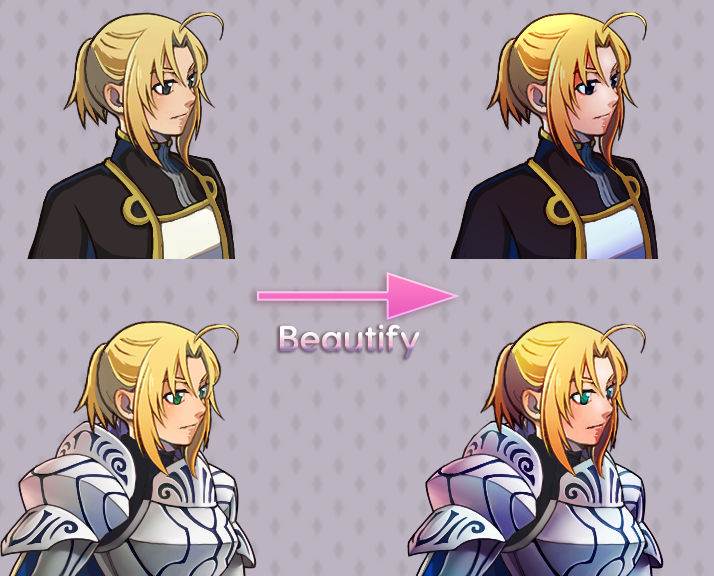
Beautify magic! I enjoyed the process of doing this. I still have many to go, but I'll make 'em come alive when its time for.
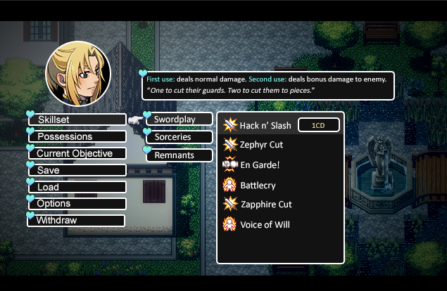
Next current objective is re-designing the menu concept I was working on for the Custom Menu System (CMS) that Heartland will feature!
For now, I'll leave a screenshot of the previous concept I had:
Character graphics from:
Rose: Sorejanai.blog.shinobi.jp
Valerie: Makapri/Kingdom Kohsheng (ameblo.jp/makapri)
Posts 

Pages:
1

Pages:
1

