Add Review
Subscribe
Nominate
Submit Media
RSS

MKID232- Added: 08/19/2010 03:26 PM
- Last updated: 01/26/2026 10:07 PM
- 8486 views
Posts 

comment=40941comment=40938Excellent. And now I wait (for the next demo of this, of the other game I'm looking at, and my own game)
Indeed, the plot thickens. This is going to be one interesting tale, to say the least.
What's the other game? ;)
Hehe, we appreciate your support. :)
EDIT: I am really looking forward to this game! Although... it has clowns... I'm still downloading it!
Did you use that GIMP program?
No, I use Photoshop. But GIMP can do the same thing, if only a little differently (and a lot cheaper, LOL)
*Throws out concept art*
Don't do that! Concept art is just that, for concepts. Even if it doesn't work, you'll have fodder for future projects. Sometime I look at the crap I've done and suddenly see a way to tweak it.
The guy on the title screen is not the main character.
Hmmm. Well he's fine as he is. It would be easy to add main character portraits later on, if you ever found them. Anyways, don't spend too much time on this, you've got more important sections to work on. I just thought I'd give you some pointers while you're still impressionable. :)
lol, we have all been affected by the clown
Bart Simpson: "Can't sleep, clown will eat me."
The Amazing Jonathan: "Did you ever blow bubbles as a kid? Well he's back in town!" (points to creepy clown on the balcony)
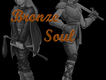
Here's a little somthin I came up with; I tried to give it a good "bronze-y" look:
http://rpgmaker.net/media/content/users/8496/locker/bronzesoulidea.png
I only used the font I did because I don't have any script-style fonts that are bold enough to work.
Here's a screenshot of the bevel settings I used:
http://rpgmaker.net/media/content/users/8496/locker/bronzesoulbevelsettings.png
Note the contour shape, highlight/shadow modes, and shadow color. This gives it that metallic sheen. I chose green because I thought it looked nice, but you could use any color really.
..and to get the chrome reflection effect I did this:
-Create a new layer. Put in a few bands of white-to-transparent gradients. Rotated/shifted it around until it fits over the text the way I want it to.
-Ctrl+clicked the text layer in the layers window (which "magic-wands" the text).
-Contracted the selection by 5 (1+the size of my bevel, 4).
-Invert selection.
-Making sure I'm on the layer I made the gradients, delete selection (this erases everything outside the contracted text).
-Set layer to Color Dodge.
-Decreased the lightness of the gradients to make it orange-ish (or I could have just made the gradients grey to begin with).
Also, note the placing of the individual letters. There's something kinda cool in there...


