 Add Review
 Subscribe
 Nominate
 Submit Media
 RSS
RSS
Posts 

Pages:
1
Jpeg pain!
Also this game sort of superficially and thematically reminds me of an old game called "Chaos".
(IE: you dueled wizards!)
Also this game sort of superficially and thematically reminds me of an old game called "Chaos".
(IE: you dueled wizards!)
What does jpeg pain mean?
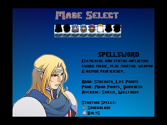
This image is a PNG screenshot of a PNG panorama with PNG tilesets and PNG charsets on it.
No jpegs were harmed (or used) in the making of this image.
This image is a PNG screenshot of a PNG panorama with PNG tilesets and PNG charsets on it.
No jpegs were harmed (or used) in the making of this image.
The portrait of the guy looks awful like he was ripped from a JPG. It even has a white border around it. Also that font is simply awful. It looks like it was poorly resized never mind that the typography is just crappy for a label and text font.
I LOVE that font. It is not changing. It looks awesome to me.
Anyway I have done all of my image editing in a horrible combination of irfanview and MS paint since like 2001.
I am really bothered by the white outline too, but the amount of tedious effort it would take to fix it is very daunting. Still, maybe I should try.
EDIT:
I just tried to remove the white outline in MS paint by painting over it with blue. It did not go well. Basically it was just making him have a shitty blue outline. Advice?
>Download GIMP
>Use layers
>Pretties!
Also, even if you like the font, be consistent. Use your text font for ALL the text.
>Use layers
>Pretties!
Also, even if you like the font, be consistent. Use your text font for ALL the text.
Ugh, Gimp makes my computer lag like hell and I feel like it would take me 30 years to learn how to use it.
To be fair:
This looks much, much, much better in game, with the motion and sound and animation. It just makes for kind of a crappy static image.
To be fair:
This looks much, much, much better in game, with the motion and sound and animation. It just makes for kind of a crappy static image.
Upload the standalone portrait-picture and font and I'll try to make a mockup of what looks better and how to do it. (Paint can't do alpha channels which PNGs use so that is probably the cause of the white border)
This is bad typography. Labels and block text follow different rules when you select a font for easy readability. Using one font and turning on cruise control is not the proper way to do it.
Craze
Also, even if you like the font, be consistent. Use your text font for ALL the text.
This is bad typography. Labels and block text follow different rules when you select a font for easy readability. Using one font and turning on cruise control is not the proper way to do it.
author=Max McGee
What does jpeg pain mean?
This image is a PNG screenshot of a PNG panorama with PNG tilesets and PNG charsets on it.
No jpegs were harmed (or used) in the making of this image.
Well my notices say "choose3.jpg"
Character portrait looks much nicer (although I was just commenting on the format the screenshot was saved in, rather than what the other guys pointed out). The font is kinda cool stylistically but readability isn't amazing (although it's not a huge deal really, there's always a trade-off on these sorts of things).
Edit: Although to be fair it is an improvement on how the text looked in the original.
Edit: Although to be fair it is an improvement on how the text looked in the original.
Okay. My girlfriend has been helping me out with these since she knows her way around photoshop; the Abjurer was the best to begin with, it's the other ones that REALLY need fixing.
I just wish this bullshit was less important to people, but I guess we live in the world we live in and we can't change that. : )
I just wish this bullshit was less important to people, but I guess we live in the world we live in and we can't change that. : )
Re: readability, what I said before about TEXTFONT that GRS refuted was kind of what I meant - ideally, games have a TAGFONT, a TEXTFONT, and a NUMBERFONT.

Notice how "En" is yellow and has various heights in it, compared to the mono-height and white numbers? The tag sticks out, the numbers are readable and different. You can also do this just with bold vs. not-bold:
Good: Shield, Willforce
Good Shield, Willforce
Re: graphics, they're not bullshit at all. You have to look at it, it should not be fugly.

This is not the difference between "fugly" and "not fugly".

I mean obviously the latter image is moderately more sexy. But still. It's the difference between MSPaint and Photoshop. It's a difference that;s significantly subtle that you have to have a fairly granular metric of evaluation to even note, in my opinion. All I'm saying is that one is not inherently a better game or more deserving of attention than the next. This is not a HUGE DIFFERENCE.
(My game uses that font only for titles, by the way, and for the mage select screen. The entire rest of the game uses the default RMVX font. So far, anyway. I actually rather like typography and enjoy playing with it!)
Speaking as a fan, not a dev, the character portraits did not even blip the list of things I was paying attention to with this game. Yes, they can look sleeker and sexier, but spending dev time on this instead of scripting new classes, or progressing the plot, or adding new mechanics, or even bugfixing does the whole project a disservice.
Most of my experience is with writing fiction, but I think the same basic principles apply. Finish first, and then edit. Bug-test the same way you would use spell-check. Go back and worry about content after you're done.
Again, speaking as a fan, I would rather see a completed project with some issues to iron out than a game finished several years later that runs silky smooth.
Well it is done, and the images have been prettied up. So now, in theory, I can work on mechanics and stuff...until the next comment. : )
Pages:
1


