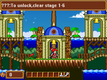
Avee, THANK YOU SO MUCH!! This is exactly what I needed (kinda reminds me of some of the Castlevania games). That way, The bottom can be viewed at all times and all info is at the top. Those boxes were starting to get on my nerves. I'll edit the HUD and the credit goes to you. I also plan on adding upgrades and equipable items that increase MAX HP, MP and Power. Increasing the MAX increases the length of the bar(s).
I plan on adding a SHOP where you can trade in your points for Money and buy potions, swords,new skills and various other things. This game is still in early development, and thanks to you, I can finally fix the HUD and take it a step further. Thanks again.
One more thing, I was thinking of removing the TIME so people can enjoy the levels instead of being rushed, I don't know if i should do it, but it is in consideration.

 Add Review
 Subscribe
 Nominate
 Submit Media
 RSS
RSS XBuster


