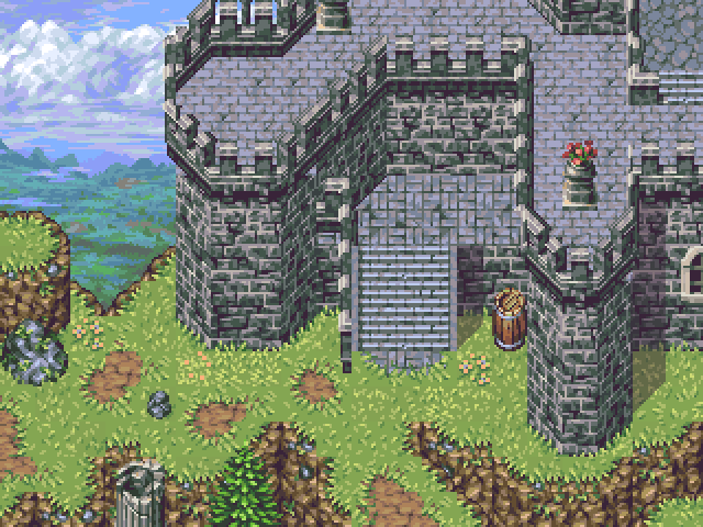
I've spotted some issues which I've highlighted below.
Going from left to right:
1. There are a few instances where the ramparts cut off incorrectly. Perhaps the tileset isn't complete and these small errors will be ironed out, but they stuck out for me, at least. As a matter of fact, the most glaring seems to be in the backdrop.
2. I see what you're going for here, but it doesn't necessarily work.
3. Again, the ramparts have details missing. This corner in particular is missing its interior.
4. This is a double whammy. For one, if the stairs are supposed to be going up, I don't see how one tile gives them enough height to go much of anywhere. If they're going down, only the tops of the stairs should be visible. And again, the tiles for the walls don't line up.
I'm giving the missing joints in the cliffs a pass because - as someone with your quality - surely its a stylistic choice.


 Add Review
 Subscribe
 Nominate
 Submit Media
 RSS
RSS