


MIRACLE'S PROFILE
Miracle
1044
∧_∧
( ͡° ͜ʖ ͡°)
⊂ つ
(つ ノ
(ノ
\ ☆
| ☆
(⌒ ⌒ヽ /
\ (´⌒ ⌒ ⌒ヾ /
(’⌒ ; ⌒ ::⌒ )
(´ ) ::: ) /
☆─ (´⌒;: ::⌒`) :; )
(⌒:: :: ::⌒ )
/ ( ゝ ヾ 丶 ソ ─
Excuse me sir, do you have a moment to talk about Wii Fit Trainer?


( ͡° ͜ʖ ͡°)
⊂ つ
(つ ノ
(ノ
\ ☆
| ☆
(⌒ ⌒ヽ /
\ (´⌒ ⌒ ⌒ヾ /
(’⌒ ; ⌒ ::⌒ )
(´ ) ::: ) /
☆─ (´⌒;: ::⌒`) :; )
(⌒:: :: ::⌒ )
/ ( ゝ ヾ 丶 ソ ─
Excuse me sir, do you have a moment to talk about Wii Fit Trainer?


Search
Filter
 Guess that game!
Guess that game!
Heheheh :> This should be ridiculously easy (who is it coming from xD)
"Girls do their best and are preparing. Please wait warmly until it is ready."
"Girls do their best and are preparing. Please wait warmly until it is ready."
Guess that game!
Not really new...
 HALLOWEEN TEASER!
Hahaha awweeesome :D Teasers are good! It was completely fine, I enjoyed it thoroughly.
THIS JUST IN !!
What happens when famous people get infected????

Screw the afterlife. The President has some campaigning to do !!
Tune in next week to see Rosie O'Donnell (actually, don't) Good job on releasing this in time !! :D
THIS JUST IN !!
What happens when famous people get infected????
Screw the afterlife. The President has some campaigning to do !!
Tune in next week to see Rosie O'Donnell (actually, don't) Good job on releasing this in time !! :D
 The Screenshot Topic Returns
The shadows in your screenshot look totally fine. I don't think anybody will say "Hey this shadow is 2.7 degrees off D:<", especially because most people will be focusing on the monsters or how much HP/MP they have left anyways XD
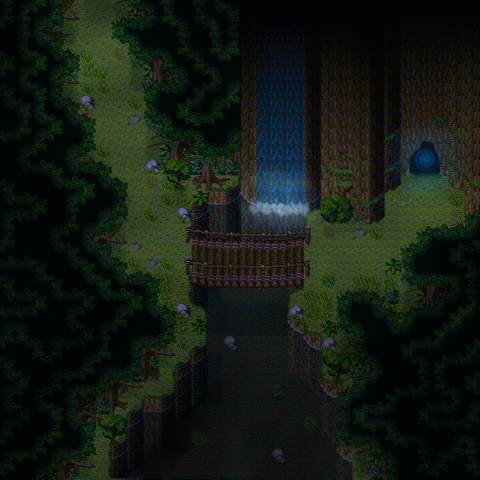
Latest screenshot was my guinea pig for special effects (although admittedly it's still pretty old xD)
Latest screenshot was my guinea pig for special effects (although admittedly it's still pretty old xD)
 titleupdate.PNG
Well, as much as I like the monochrome-ish theme for the game I have to say it doesn't really work for this title screen... I mean it's okay, but by removing the bloody red you're also removing the cleverness of having blood dripping into a cityscape too. Not to mention that having an all-black title screen is sort of boring!
If you thought that the red stood out to much on its own, then you could have a black-to-red gradient as the sky/blood instead. :D
If you thought that the red stood out to much on its own, then you could have a black-to-red gradient as the sky/blood instead. :D
ChelisMarket.PNG
Wow I've got to say your mapping has improved a lot from your earlier work! Good job. It's important not to forget edges. I notice that the bottom cliff looks sort of barren. It'd look better if you used the long grass tile, break up the blandness of it. :> It looks like you have a pretty decent eye for space too >>b
RMN bugs (v4)
It also happens if you had begun your subject with the ":" character, which is unfortunate for me as I usually can't think of anything for the subject and end up using a smiley face instead Dx
Don't know if you fixed this in addition to the 'r' so I thought I'd just bring this up anyways :>
author=ankylo
Oops! Fixed.
Don't know if you fixed this in addition to the 'r' so I thought I'd just bring this up anyways :>

