


THE SCREENSHOT TOPIC RETURNS
Posts
@Killer Wolf: Nice angel there, I feel that the cross on the floor takes a lot of attention away from the rest of the screenshot.
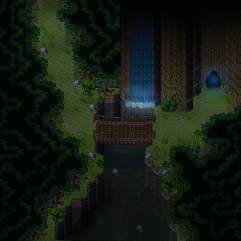
@tpasmall: I read your previous posts and you said it's supposed to be inside a cave. When it comes to inner maps usually they are filled with a dark or black tile surrounding the walls and inner tiles that's usually what gives that inner cave feel.
Example: A cave map from the game, The Burning Grail.


@Supremewarrior: http://rpgmaker.net/media/content/games/1446/screenshots/schoolGroundFloor.png
Man, those are some brilliantly sprited tiles! I really like what you've done with that map; I only wish it wasn't so monochromatic... Have you tried using some color for like the walls or something? The floor specially, it needs to be at least a darker shade of gray. - Also, try to do more things with the blood, like trails on the floor, smudges, and stuff like that.
@tpasmall: http://rpgmaker.net/media/content/users/17733/locker/compare2.png
Not bad, but it still looks like an outdoor area. You need to 'close' the ceiling a lot more, if you know what I mean. I also liked the wooden stairs better but that's not an issue... Aside from this you're on the right track, just keep adding details as LockeZ suggested you and you're set.
@Killer Wolf: http://rpgmaker.net/media/content/users/224/locker/shot1ab.png
Hey, that's pretty cool, specially for an old screen. Does that angel by any chance have anything to do with the other one you posted in the "Watchu workin' On" thread? In any case, it shows how much you've improved. Keep it up!
Well in response to that I've been experimenting with the wall colours. I think it looks alright, I'd like to create more variety in the chipset.
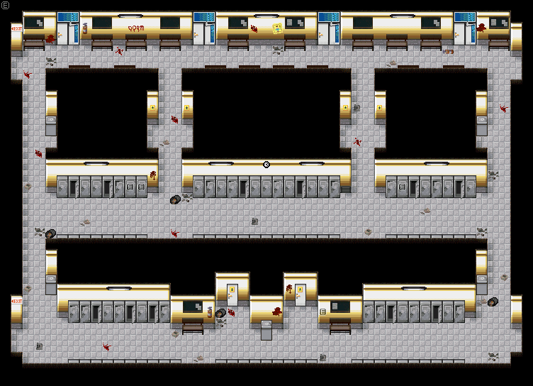

Supreme Warrior - I like the yellow walls. It gives some contrast to the map and actually makes the lights look a little more functional. I think in another screen shot, you show the map darker in game though, so I'm not sure if the effect the yellow walls seem to give the lights would carry over well.
Alterego - They're from the same game, although the sprites were made about three and a half years apart. I'm still not quite where I would like to be with them, but it is nice to see that I am making some improvements!
Alterego - They're from the same game, although the sprites were made about three and a half years apart. I'm still not quite where I would like to be with them, but it is nice to see that I am making some improvements!
@Killer Wolf: The lights are off btw and your right. I switched back to the white, I don't think the yellow walls look as good as the white in the dark. Just for testing purposes I only tiled some of the walls yellow.

You might try adding a couple of broken variations of the light fixtures in. With stains and broken stuff all around, it seems a little weird that all the florescent bulbs are in such pristine condition.

I would say all of them, as for the greens, I may be wrong, but Id say they're all good, plants are different from one another, and I find that variety, real and interesting.
author=supremewarrior
I read your previous posts and you said it's supposed to be inside a cave. When it comes to inner maps usually they are filled with a dark or black tile surrounding the walls and inner tiles that's usually what gives that inner cave feel.
author=alterego
Not bad, but it still looks like an outdoor area. You need to 'close' the ceiling a lot more, if you know what I mean. I also liked the wooden stairs better but that's not an issue... Aside from this you're on the right track, just keep adding details as LockeZ suggested you and you're set.
I'm torn between which set of stairs I like more, the one has a more rugged look which fits the scene better, but the wooden ones are more visually appealing.
author=chana
I would say all of them, as for the greens, I may be wrong, but Id say they're all good, plants are different from one another, and I find that variety, real and interesting.
I know that not everyone will think the map is the best it can be, but I like the idea of having the black tops for the interior rooms. I might add some more of the wall greens that were in the old picture and some of the floor divits as well. As far as closing the ceiling in more, I'll see what I can do on that, maybe add some stuff around the outside and a pillar or two in the middle of it. Thanks for the feedback!
EDIT: Ok so here is the recent update. Top is version 2, bottom is version 3.

LockeZ

I'd really like to get rid of LockeZ. His play style is way too unpredictable. He's always like this too. If he ran a country, he'd just kill and imprison people at random until crime stopped.
5958
I like the black around the outsides as it makes this finally look like an indoor area. The tops of the lower ledges that don't extent up to the ceiling should probably be dirt, though. Version 3 definitely looks more like a cave. I suddenly don't mind the small bits of greenery now that the outer border has been added.

Yeah, the black border has been used so often in RPGs as an indicator of being indoors that it's almost subconscious.
I was recently working on monster sprites and noticed that the flat circular shadows looked off, both because they were in no way realistic and because they didn't deform in the same ways.
So, I tried to make 'dynamic' individual shadows, all positioned for the light source to be coming from the front right. Here are the results so far for a few random monsters:

One problem with this sort of thing is that the shadows can only approximately be on the same angle due to the various different sizes of the sprites. I have checked through a lot of 2D RPGs and none seem to overcome this problem (most don't bother with it at all by just having 'generic lighting'). So far I don't think it's very noticable, but please tell me what you guys think.
I was recently working on monster sprites and noticed that the flat circular shadows looked off, both because they were in no way realistic and because they didn't deform in the same ways.
So, I tried to make 'dynamic' individual shadows, all positioned for the light source to be coming from the front right. Here are the results so far for a few random monsters:
One problem with this sort of thing is that the shadows can only approximately be on the same angle due to the various different sizes of the sprites. I have checked through a lot of 2D RPGs and none seem to overcome this problem (most don't bother with it at all by just having 'generic lighting'). So far I don't think it's very noticable, but please tell me what you guys think.

The shadows in your screenshot look totally fine. I don't think anybody will say "Hey this shadow is 2.7 degrees off D:<", especially because most people will be focusing on the monsters or how much HP/MP they have left anyways XD
Latest screenshot was my guinea pig for special effects (although admittedly it's still pretty old xD)
Latest screenshot was my guinea pig for special effects (although admittedly it's still pretty old xD)
That's what I was hoping, but it's good to hear it from other people.
That effect is quite neat! How are you going to use it in game?
That effect is quite neat! How are you going to use it in game?
LockeZ
I'd really like to get rid of LockeZ. His play style is way too unpredictable. He's always like this too. If he ran a country, he'd just kill and imprison people at random until crime stopped.
5958
Well, I posted a screenshot of this section of my game once before, back before I created the enemy graphics. But now I actually have enemies, so here you guys go. Sewer surfin'.

James riding on a shark, while fighting sharks riding on surfboards and crocodiles. The background is a looping panorama that rapidly scrolls by during the high-speed battle.
I know you guys are sick of sharks by now. As tempting as it is to make an entire game about nothing but sharks, this is actually the last shark battle in the game. After this battle the hero gets to the end of the sewer and is launched out a drain pipe into the city.
Also, these enemies can use a clone of James's Chakra ability. The version they use is called Sharkra. I'm a horrible human being.
Hey, I love sharks! They don't all have to be the same kind of shark; they could be hammer heads, goblin sharks, etc.
Or how about a mutant shark with three heads!
Er, anyway, the screenshot looks pretty neat. I think I might just steal your level idea too. :)
Or how about a mutant shark with three heads!
Er, anyway, the screenshot looks pretty neat. I think I might just steal your level idea too. :)
LockeZ
I'd really like to get rid of LockeZ. His play style is way too unpredictable. He's always like this too. If he ran a country, he'd just kill and imprison people at random until crime stopped.
5958
If I have done nothing but inspire other people to make surfing levels in their RPGs, my life is complete.
I hate making enemy graphics though. I had been putting these off for like two months. In my defense, they're animated. But even if they weren't animated, I just hate doing graphics and always procrastinate them until my games are in danger of becoming vaporware.
I hate making enemy graphics though. I had been putting these off for like two months. In my defense, they're animated. But even if they weren't animated, I just hate doing graphics and always procrastinate them until my games are in danger of becoming vaporware.
That is absolutely great, apart from the hilarious part, those clothed sharks are really neatly done.

Adon237 - It looks really nice, but something with the fences is bothering me. In some places, it looks like you're using the fence graphic as the sides of a hill, but in others it looks, well, more fence like. I'm not explaining it very well, but it gives an almost M.C.Escher-like effect to the upper right quarter of the screen.

