NOTOH'S PROFILE

Search
Filter
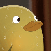
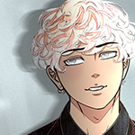
 Sprite Showcase #2
Thank you both for your kind words!
I can't wait to see the reaction to him in-game! Some of my favorite dialogue comes from him >:)
I realized after I added him in-game that he slightly looks like Eddie from Angels of Death... but he's pulled from an old scrapped project of mine! :)

author=NoBody13
Perry is my favorite as well :))
I can't wait to see the reaction to him in-game! Some of my favorite dialogue comes from him >:)
author=Miremira
I really like Archer because i loooove bag-over-the-head characters heehee, but they all look really good!
(the images are kinda massive btw, i have to use the horizontal scroll bar to see the whole thing. not a big deal just thought id mention it)
I realized after I added him in-game that he slightly looks like Eddie from Angels of Death... but he's pulled from an old scrapped project of mine! :)
 DriftedAwayCovere.png
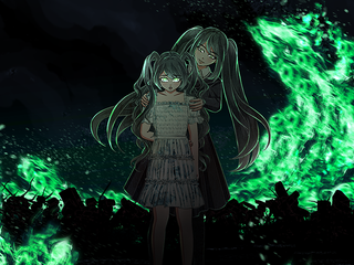
author=NoBody13
Uuuh what's with big Melrose? She looks evil here... I like the background with the blurred flames. As for the quality, I'm not sure, is it rpgmaker that makes it low quality? Or maybe it's just me, idk.
It’s not just you, I had to resize it to fit the screenshot size on RMN :( (You may have gotten a barrage of notifications bc I kept resizing it) I’ll update this comment in a few with a link to a bigger version for reference >:)
EDIT: Higher resolution version here.
 Chapter 0: "I Remembered Everything" Scene
Chapter 0: "I Remembered Everything" Scene
output.gif
 The Respawn Banter
I remember seeing your game on reddit! I love the concept, looking forward to the banter.
I made sure to wishlist :)
I made sure to wishlist :)
Stalker.png
author=NoBody13
You should probably make it brighter. I barely managed to see something with max brightness. Other than that, good job in making that thing look creepy like that.
author=Frogge
I kinda agree, I can see it okay on full brightness but on anything lower its really hard to spot. I don’t think it needs to be significantly brighter, just a touch
I actually rebuilt this image/screenshot in photoshop because when I resized the original screenshot the quality wasn't great. That may have something to do with it.
I think it looks better with the higher resolution in-game. Please reach out if it still looks too dark in-game when Ch. 0 releases, I just would like to rule that out first. I'll adjust this screenshot for other platforms :)
UnexpectedMeeting.png
author=Frogge
This new graphical style is very different. I'm super intrigued to see more of it!
It's been awhile in the making! Hoping to share some more screenshots soon.