


PIZZA'S PRODUCTS
Posts

I just bought Pyxel Edit, as I'm planning to start practicing my pixel art more now that I have the time off from work to do so. So I'll just dump it here whenever I make something, and I'll try to not be horrifically lazy about practice as I usually am.
EDIT: ALSO I'm just posting all my art here fuck off
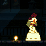
A couple of characters that I did up today. Wanted to practice a style similar to Cave Story+, but without just completely copying it. I think I did alright.

I gotta say, using new software is nice. It sure as hell makes me want to pixel, as opposed to Character Maker 1999 making me want to off myself.
EDIT: Sort of crappy self portrait GO

EDIT: ALSO I'm just posting all my art here fuck off
A couple of characters that I did up today. Wanted to practice a style similar to Cave Story+, but without just completely copying it. I think I did alright.
I gotta say, using new software is nice. It sure as hell makes me want to pixel, as opposed to Character Maker 1999 making me want to off myself.
EDIT: Sort of crappy self portrait GO

I'm waiting for him to sprite a pizza.
Nice stuff, dude! Aren't the two characters above from your RMVX game?
Nice stuff, dude! Aren't the two characters above from your RMVX game?
Yeah, they're two of the planned characters for that project, which has since moved on from VXA. We wanted to do it in a 2D style like Cave Story, we just aren't 100% sure yet.
I did sprite Pizza. Did you not see the self-portrait?
ha ha HA
EDIT: Tried to make something halfway realistic with space backgrounds. Really the main focus was getting a decent lighting effect on the bigger star. Colours are no good, go home Pizza

I did sprite Pizza. Did you not see the self-portrait?
ha ha HA
EDIT: Tried to make something halfway realistic with space backgrounds. Really the main focus was getting a decent lighting effect on the bigger star. Colours are no good, go home Pizza

I think the space background looks beautiful :P
It's really nice how you have the subtle dark blue/grayish stars in the background there, too.
Green-haired dude up there is charming, and your beard, of course, is magnificent.
It's really nice how you have the subtle dark blue/grayish stars in the background there, too.
Green-haired dude up there is charming, and your beard, of course, is magnificent.
Thanks. I used a specific segment of the Fornax Cluster as a reference. It was hard to mimic the strange colours distant light is distorted into by satellite photos, but I guess it came out alright in the end.
I suppose I need to practice making sprites a little more feminine or somesuch, since green-hair is the female companion to the hero on the left.
I suppose I need to practice making sprites a little more feminine or somesuch, since green-hair is the female companion to the hero on the left.
lol, I actually did think she was a girl at first... Whoops.
Looks fine as a tomboyish girl, really =D
Looks fine as a tomboyish girl, really =D


Another part of the face graphics I was doing up.

Also, a Pokemon HG/SS Styled map I made for a little in-joke/project thing me and my friends have been going on about for a few years now. Not really that impressive but I figured I may as well throw it on here too:

"The Cando Region"
Also, a Pokemon HG/SS Styled map I made for a little in-joke/project thing me and my friends have been going on about for a few years now. Not really that impressive but I figured I may as well throw it on here too:
"The Cando Region"
Those look pretty dang cool, Pizza. I'm especially impressed with the girl and the map. The girl has a lot of charm with her facial expression and hairstyle (that curl!), and the simple clarity of the map is really appealing.
One thing you could consider improving for the map is the mountain shading, as they look kind of bubbly with the way colors progress from lightest>lighter>light>dark>darker. Putting more edges with light and dark colors next to each other can help give the mountains a sharper look.
The explorer guy looks pretty cool, too!Inb4 he's secretly handsome underneath those glasses
One thing you could consider improving for the map is the mountain shading, as they look kind of bubbly with the way colors progress from lightest>lighter>light>dark>darker. Putting more edges with light and dark colors next to each other can help give the mountains a sharper look.
The explorer guy looks pretty cool, too!
Yeah, the map is a little messed up. If I had done it with my own set of colours or in my own style (or in the right scale) it would have come out better, but I was attempting to make it in the style of HeartGold and SoulSilver. (And then I failed!)
The explorer came out okay I guess, just not as good as the girl. I know that I'll be going back to clean it up during the development of the game though.
The explorer came out okay I guess, just not as good as the girl. I know that I'll be going back to clean it up during the development of the game though.
Thought I'd upload some stuff I recently happened upon in my "archives". Dump:
Part of a panorama for a desert planet.

The hub area of an old project (or part of it at least).

A monster from that same project.

A town chipset from a game made in 2k3.

A digital world chipset.

An unfinished area from an ancient 2k3 thing.

A title screen that I liked a bit.

Part of a panorama for a desert planet.
The hub area of an old project (or part of it at least).
A monster from that same project.
A town chipset from a game made in 2k3.
A digital world chipset.
An unfinished area from an ancient 2k3 thing.
A title screen that I liked a bit.
Wow, those are awesome! Nice contrast and colors. Both the style and the way the edges of the landmasses are shaped and shaded really make me think of Earthbound and Mother 3.
Also, I just now realized that the pink-haired girl doesn't have crazy eyebrows, but that those are the tops of her eyes! You might want to consider adding a bit to the side of the eye at the outer corners, and/or coloring the whites of her eyes (if you're even using that for anything anymore).
p.s.: I'm actually rather interested as to what this canceled project was. Or were, if more than one.
Hot damn, these look great.
The digital world chipset is my fav of them all! You pick some really pretty colors and do good things with them. Those geometric crumbly side walls are gorgeous. I'd like to see more of this style!
The digital world chipset is my fav of them all! You pick some really pretty colors and do good things with them. Those geometric crumbly side walls are gorgeous. I'd like to see more of this style!
author=TungerManU
These would make awesome RPG game graphics.
They were once intended to. One time, long ago..
author=turkeyDawg
p.s.: I'm actually rather interested as to what this canceled project was. Or were, if more than one.
Oh, everything I just posted is either from a cancelled game or something that was scrapped from a current idea. That's how I roll. Unfortunately all of these concepts are still being worked on and re-tooled, so I can't really share the information on what they are.
author=accha
I'd like to see more of this style!
I don't really know if I'm gonna go back to that idea anytime soon, though, To be honest I wasn't a huge fan of how that stuff turned out, but I guess I did something right if you liked it.
Thanks for all the feedback guys!
A piece I did today based on a screenshot I took of Skyrim. In particular, this is Solitude as viewed from the marshes north of Morthal. Took me about 3 hours, on and off throughout the whole day. I tried doing a more realistic look, but I don't think I'm cut out for it. I'm much more comfortable using block colours and shit.

The aformentioned screenshot:
The aformentioned screenshot:


It's pretty cool, but the mountains in the back are too bright.
And I'm quite unsure what the white sphere in the back is supposed to be. Flowing directly into the pathway, too.
And I'm quite unsure what the white sphere in the back is supposed to be. Flowing directly into the pathway, too.

