SCREENSHOT SURVIVAL 20XX
Posts


author=BizarreMonkey
That is a hot gif!
Also here's a bit of rewriting I did in PFC, along with new Esperia portraits, which are still placeholders.
More here:
http://imgur.com/a/lZndH

Two problems. One, her feet are somehow standing on his head. And two, the outfit is wrong.
author=InfiniteThe only thing you did wrong with this is not adding the following caption:
"EAST PENINSULA HOLDS A SECRET."

Felt like doing some parallax mapping

Wake me up when this is picture of the moment(never).
Wake me up when this is picture of the moment(never).

To be honest, I was always kinda better at parallax mapping anyway, but thanks Libby :,) Yeah I can't believe how my maps used to be so bland and empty just a year ago.

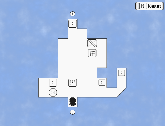

@toadee - nice atmosphere, although i'm not sure about the map just being a square
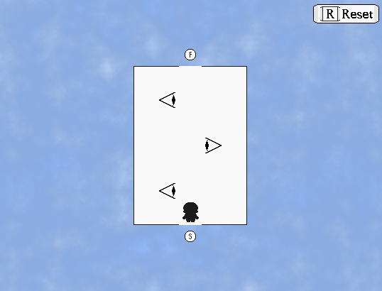
@cash - would be cool if the eyes looked up and down depending on your position
i done did a cave

@cash - would be cool if the eyes looked up and down depending on your position
i done did a cave

author=bulmabriefs144Sharp eye! As it turns out, both the sprite and the bust will be replaced in due course.
Two problems. One, her feet are somehow standing on his head. And two, the outfit is wrong.
Her standing on his head is actually intended. She likes ruffling up his fur even more than it usually is. She's a little silly like that sometimes!
I got super into developing Intelligence again.

Yes, that guy is poopin' healing rocks for the players.
He's trolling his battle partner.
After her ascension Tristy unanimously becomes the party leader.
Meanwhile Limbo is off just soloing bosses.

Might actually have this ready for release before Christmas. Then I can finally close Intelligence as a game and chapter. This will be the final progressive content patch.
The color of Limbo's gown doesn't contrast well with the color of the windowskin. You might want to pick a different color for either the character or the windowskin.
I agree with Ratty on this one, you might want to change the windowskin a tiny bit.
@ESBY, that looks really nice and cutesy. I like it :)
Speaking of which, I tried out Parallax Mapping for the first time, mostly to get some lightning effects to my maps and everything.
This is all experimenting.

I still feel as if it looks pretty horrible, but on the other hand, I think it looks pretty decent for a first try.
I'm going to have to cancel my game when I'm actually becoming decent with parallax mapping.
@ESBY, that looks really nice and cutesy. I like it :)
Speaking of which, I tried out Parallax Mapping for the first time, mostly to get some lightning effects to my maps and everything.
This is all experimenting.
I still feel as if it looks pretty horrible, but on the other hand, I think it looks pretty decent for a first try.
author=Ratty524I agree with you there, now the window skin, while still the same sort of color, has a dark gradient rising from the bottom.
The color of Limbo's gown doesn't contrast well with the color of the windowskin. You might want to pick a different color for either the character or the windowskin.
Like so.

I changed it as this was also problematic for characters like Noir. I also discarded the transparency because it just looks horrid.
Oh! So now his HAT IS BARELY VISIBLE!? GOD DAMN IT! D:
Here's a character you won't have seen before!

Part of me really wants to tell you all about it!
The other part...
REALLY WANTS THE MYSTERY TO KILL YOU!
NYAHHAHAHAHAHAHA!
(yes well, *cough* you get the idea)
@Skyrocket: That is a nice parallax map, the lighting is noteworthy for being logical.
Better, but now you have a new problem. The color of Limbo's hat still blends in with the top, brighter part of the gradient.
You might be better off trying the dark shade of purple used in the lower parts of the gradient, since that actually helps your characters pop out.
You might be better off trying the dark shade of purple used in the lower parts of the gradient, since that actually helps your characters pop out.
This might work, though I've found another problem.
There's a one pixel overlap on all corners. I could edit MA's enormous Message script to correct it. Or I could try removing a pixel from the inlay and see if that works.
FIXED IT! Yeah I could easily change the padding variable but I'd have to get up to this point from the beginning because the ATS doesn't renew data when changes are made in the script, hell the only reason I was able adjust opacity is because there's a script call for that.

I like this thinner border anyway. Also yes that is 16 party members.
There's a one pixel overlap on all corners. I could edit MA's enormous Message script to correct it. Or I could try removing a pixel from the inlay and see if that works.
FIXED IT! Yeah I could easily change the padding variable but I'd have to get up to this point from the beginning because the ATS doesn't renew data when changes are made in the script, hell the only reason I was able adjust opacity is because there's a script call for that.
I like this thinner border anyway. Also yes that is 16 party members.
Feel free to praise me und my leet rtp skillz xp

I think it's bland. Functional, but bland.
I'm not sure what else to add (spare the event-related stuff, which I'll add later), because I might end up making it messy.
Thoughts?
I think it's bland. Functional, but bland.
I'm not sure what else to add (spare the event-related stuff, which I'll add later), because I might end up making it messy.
Thoughts?
@Karins, I really like it, although I do feel as if the bits of desert feel way too bland for my personal taste, so that might be a part of focus, I suppose.
Also, still trying to figure out how to parallax map, although I think that I'm headed into the right direction;

Also, still trying to figure out how to parallax map, although I think that I'm headed into the right direction;


@Sky-You might want to make the screen more blue and darker if you are going for a night time map. It looks a bitty too dark, but I really love the map. It's amazing for someone who is in beginning level.
@Tuomo-I like how the name is at the right side of the screen instead of left. The map looks good too, but it's a little suprising to have wood floor in an ice cave.(also, tiny map error near the bed)
@Tuomo-I like how the name is at the right side of the screen instead of left. The map looks good too, but it's a little suprising to have wood floor in an ice cave.(also, tiny map error near the bed)
author=Frogge
@Tuomo-I like how the name is at the right side of the screen instead of left. The map looks good too, but it's a little suprising to have wood floor in an ice cave.(also, tiny map error near the bed)
What's the map error?