


SCREENSHOT SURVIVAL 20XX
Posts

@JosephSeraph . Yeah I'm still looking for a tutorial for it for rm2k3...
@Infinite Yeah youre right, I should fix that. Nice catch
@ Kaempfer yeah It think we're kindred spirits there.
Thanks for the comments !
That red cat guys really stands out compared to the woman/maid/ mom ? and other sprites. ( the tile-sets as well) If that's intentional it's fine I guess, but looking at the portrait and message box it almost seems like the game is begging for a more lighthearted / simpler look. The shot as it is though is still pretty solid though. looks good !
@Infinite Yeah youre right, I should fix that. Nice catch
@ Kaempfer yeah It think we're kindred spirits there.
Thanks for the comments !
author=BizarreMonkey
Just a small one today, dearies.
Adding flavor text around thine house.

That red cat guys really stands out compared to the woman/maid/ mom ? and other sprites. ( the tile-sets as well) If that's intentional it's fine I guess, but looking at the portrait and message box it almost seems like the game is begging for a more lighthearted / simpler look. The shot as it is though is still pretty solid though. looks good !

Well, I did a bit of game dev for IGMC and all I got was some lousy screenshots. This game won't be finished for the deadline, but it will probs be finished later on. Maybe it was better this way.
IMAGE DUMP IN SPOILER.
edit: The name of the game is Paper Thin.
IMAGE DUMP IN SPOILER.
edit: The name of the game is Paper Thin.

author=SalOMacThe portrait is a placeholder, I have not just one, but two artist's currently on the job! It will meld in better when they look more like this.
That red cat guys really stands out compared to the woman/maid/ mom ? and other sprites. ( the tile-sets as well) If that's intentional it's fine I guess, but looking at the portrait and message box it almost seems like the game is begging for a more lighthearted / simpler look. The shot as it is though is still pretty solid though. looks good !

author=CashmereCat
Well, I did a bit of game dev for IGMC and all I got was some lousy screenshots. This game won't be finished for the deadline, but it will probs be finished later on. Maybe it was better this way.
IMAGE DUMP IN SPOILER.
edit: The name of the game is Paper Thin.
Wow Cash, that looks super cool! I'm guessing fast times at something something high is in hiatus now? Oh and that menu is adoreable.

Yeah, that game looks awesome, Cash! I'll be looking forward to it when you're done ^_^ What are you making it with?
I gotta hand it to you cash, that's some good shit, bruddah.

@BizarreMonkey
Ah yeah I see now. That definitely works then!
@CashmereCat
Nice! I have to agree with everyone else. What really makes this come together is the consistency. Very much looking forward to seeing how this turns out.
Ah yeah I see now. That definitely works then!
@CashmereCat
Nice! I have to agree with everyone else. What really makes this come together is the consistency. Very much looking forward to seeing how this turns out.

Don't usually have anything noteworthy to post here, but since we had a big discussion about shop screens a while back, I'd figure I'd post this here for feedback. How do y'all think of this screen?

(Made with the Knytt Stories level editor.)
(Made with the Knytt Stories level editor.)
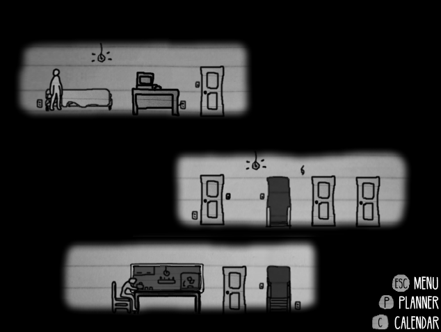
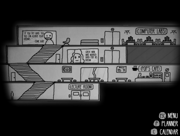
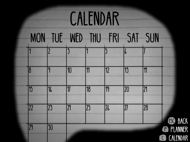
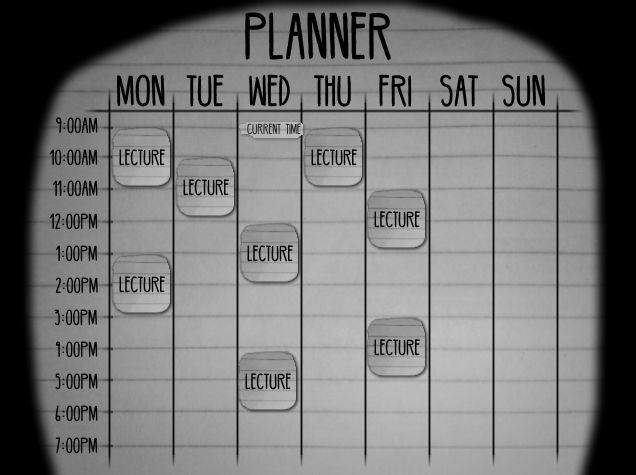
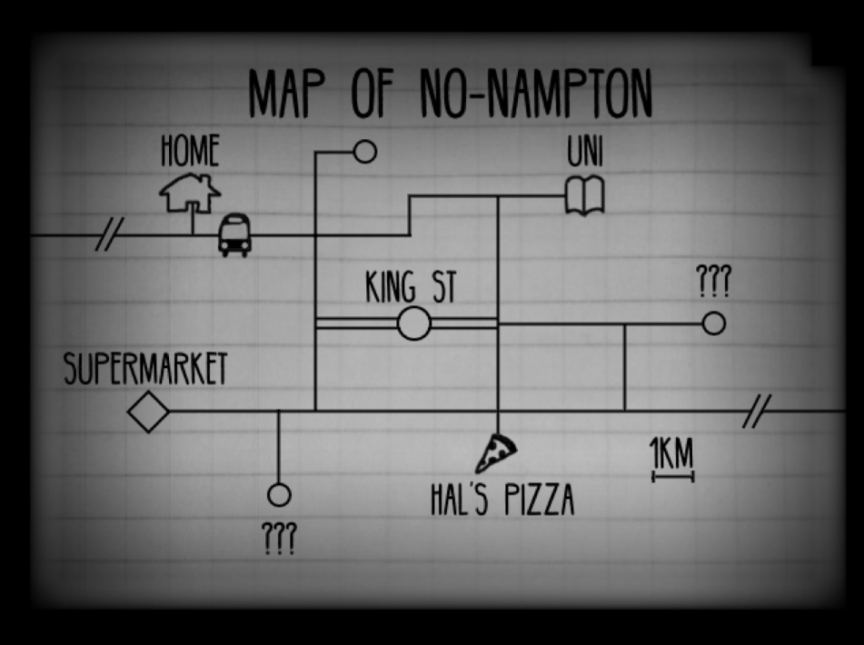
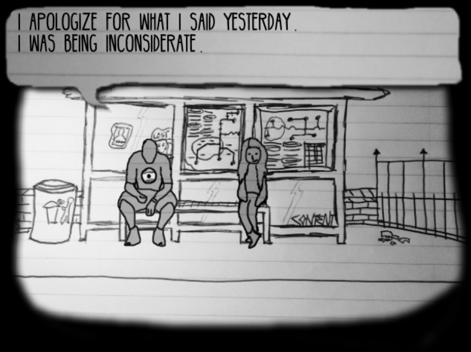
@ExtremeDevelopment Well, to tell you the truth, I envisioned Fast Times to be at least a little similar in gameplay - life simulation with story additions - but that Paper Thin was just to see if the concept was viable. Think something like Heartache 101 minus the kawaii anime style, but sidescroller and a time system where you can attend/miss events based on your punctuality and organisation using a calendar/planner. But as of the moment, I will probably finish this short game and then move on to Fast Times, which is another short game. They're both experiments, really.
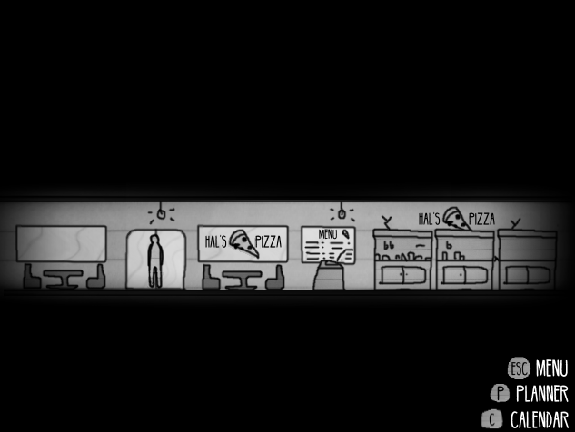
@unity I'm making it with RPG Maker VX Ace. Hint: pictures are used. ;) Although initially I was hoping to surprise you judges with it... hahaha. But I guess the secret's out.
edit: just clarifying, it's not going to be an IGMC entry. not that it will matter anyway since i don't think you guys will be anticipating judging it anyway, heh
@BizarreMonkey Much gratitude, my friend.
@charblar Cheers, char, and thanks for the PM. Although each of us have our own styles and I admire what you put out also. The feeling is mutual. :)
@SalOMac Much appreciated, mate. I will try to have something released soon.
@Healy I love how impractical it is, how there's beds and TVs and lampstands just sitting on top of what seem to be cabinets. I think this just reaffirms that not everything has to approach realism in games to be artistic, and that functionality and representation will often win over something that may approach realism but is actually clunky when you play it in the game. In short, love it. Reminds me of Spelunky shops.
(Also, I just love Knytt Stories. :3)
author=Healy
Don't usually have anything noteworthy to post here, but since we had a big discussion about shop screens a while back, I'd figure I'd post this here for feedback. How do y'all think of this screen?
(Made with the Knytt Stories level editor.)
What kind of game is this ? like a platformer?. Otherwise I don't think I have that much to say. It evokes a very retro feel with he black lines and simple colors. .. I have no complaints really =)


First screenshot-Omg Luchi that map is so not you. It is spacious and plain, something I wouldn't expect from the queen of mapping :(
Second Screenshot-That definetly looks better than the first one, but you may want to change that carpet, it looks different in perspective. Anyway I had to do this.....
YOUR ART IS SO CUTE OMGGGGGGGGGGGG <3
Second Screenshot-That definetly looks better than the first one, but you may want to change that carpet, it looks different in perspective. Anyway I had to do this.....
YOUR ART IS SO CUTE OMGGGGGGGGGGGG <3

author=Luchino
Been doing some more pixel work for Tristian:
Did you actually manage italics or is it my imagination?
@ED: The first scene is supposed to be pretty spartan. Sir Bedivere does not care much for throne room luxury, after all. And the portraits aren't mine. They're edits. =)
@bb: Yes, you can get italic text with an ATS script ( Advanced Text System ). There's one for Ace as well.
@bb: Yes, you can get italic text with an ATS script ( Advanced Text System ). There's one for Ace as well.

@Luchino
Very nice, although I've noticed one thing about your characters; they are all very "stiff" in their pose. I guess this is true for alot of characters that have the "XP look", but maybe just try to make the legs look less like they are perfectly straight. The guy with the moustache got armor on his legs, so that helps his case, I guess.
Very nice, although I've noticed one thing about your characters; they are all very "stiff" in their pose. I guess this is true for alot of characters that have the "XP look", but maybe just try to make the legs look less like they are perfectly straight. The guy with the moustache got armor on his legs, so that helps his case, I guess.
author=Luchino
@ED: The first scene is supposed to be pretty spartan. Sir Bedivere does not care much for throne room luxury, after all. And the portraits aren't mine. They're edits. =)
@bb: Yes, you can get italic text with an ATS script ( Advanced Text System ). There's one for Ace as well.
Well that makes more sense I guess, and I wasn't talking about the portarits I was talking about the tilesets >_<

Experimenting with a sprite I made trying to use less of a black outline on the inside of the sprite as much as I can. Based off of this which I haven't drawn like this since like October it actually came out ok... (Under spoiler cause it made the post longer then it should be. Also scrappy scan cause I'm away and this place happened to have a scanner my laptop installed soooooo)

This is where you complement my art <3333333333
Been a really long while since I posted any screenshots here but since I've practicing a more retro style I thought I might as well share it and see if it works. These are just for practice, and I probably won't ever use them in a game.


author=SnowOwlWowz Snow, I knew you were good with art but I never knew you could do pixel art so well O.o Since you are not gonna use them, mind them submitting as a resource so we can? :3
Been a really long while since I posted any screenshots here but since I've practicing a more retro style I thought I might as well share it and see if it works. These are just for practice, and I probably won't ever use them in a game.

