


SCREENSHOT SURVIVAL 20XX
Posts
LockeZ

I'd really like to get rid of LockeZ. His play style is way too unpredictable. He's always like this too. If he ran a country, he'd just kill and imprison people at random until crime stopped.
5958
All the arguing about general writing philosophy is well and good, but in the interest of also providing actionable advice instead of just theoretical advice, I would suggest changing his dialogue here to:
Gib Goldtooth
I see people buy rubbish and say "At that price it's a steal!" Well, I just go steal it. Beat that price, you ass-for-brains!

author=VersaliaLol, I posted that screenshot more or less as a "hey I can make ships too!" and now it's become the new corfaisus ship. :P
edit: just to be ABSOLUTELY CLEAR I am not arguing for the literal inclusion of 'yarr harr harr' but I think the majority of the time, when it comes to game design, you need to play to recogniza..bil..ity more than you need to play to real world source material that most people aren't actually familiar with
I mean, you guys have provided some great insight and I'll answer why the dialogue is like it is. But in spoilers because this goes fairly deep, I also may change it in the future since it does sound a little weird. Right now though my focus is on P:A.
The Space Pirates of tekerlek are'nt particularly unintelligent, they aren't educated, Jammi is the only one who is known to write, though it's possible others can, but ultimately they are from all sorts of planets, and the most of them are monkeys for a reason that prior to recently I couldn't have given, however the Tale of Simopia goes into the genetic code of the Universe, and the primodial form of warm-blooded beings is a monkey, because that just has to be the way it is, this not only makes it easy to explain why monkeys are fucking everywehere, but why humans and human-like creatures appear on all sorts of planets as well.
In billions of years past, there was only one planet which had life, and it was known then as "Simopia", these days its known as Haven. it is on this planet that two clans of monkeets became, one of curiousity, the Bizjala, and one of complacency, the Havenians.
In time the Bizjala would leave their home world to explore-- while some settled on planets, others would keep travelling without rest. From these primordials Earthen Humans, Nadinean Humans, Dwarves and later elves would arise. Billions of years later, 16 halfbreeds, of monkey and man would find each other through serendipitous means, and from them would from the crazy chimp collective, or to some-- Corporation XVI.
The sixteen half-breeds were still never feeling at home in the Universe, and this started the plot for current Simopia, which is a story set in 2048-2088.
It's likely that a lot of the Bizjala sought a life of adventure and/or freedom, thus they banded together to manufacture Tekerlek (which means literally "The Wheel" in Turkish, and it also plays well into that they are taking 'the wheel' on their desires and being very literal while doing it".
Being inventors without peer, it's a wonder it's as simple as it is, Tekerlek is the hub of space pirate activity, it's a massive space station (that you can visit in Menagerie btw) and this is where Crikey and his crew often hang out.
They all have their strengths, while Crikey isn't good at subtlety or particularly intelligent, he's an amicable driver, and is an inspiring steadfast leader who'll go through hells, an abyss and lots of dragon meat to find the prize for himself and his crew.
Jammi is an exceptionally skilled inventor, making the ship Crikey flies as well as being a fierce combatant, he's also one of the few able to read and often keeps paperwork for the crew when there is some (which is rarely.) That said Jammi is also very quick to anger, and seems to possess a short fuse.
Gib Goldtooth is the established moron, but he's at least self-aware, often making fun of himself, he knows his weaknesses, which are many, he's absolutely hopeless when confronted with womanly company, and behind the ships' wheel is truly a new definition of horror, however he's either an incredibly lucky gambligant, or very skilled at cheating, as he's on record for having never lost his bets.
Slinky is the sassy assassin of the group, and she seems very loyal to Crikey and seems to do a lot to please him. She and jammi are on a pretty level playing field, and the two often get into squabbles, while she's not an inventor, she's a very skilled alchemist. She's rarely seen without daggers coated in a self-engineered poison of some sort.
Treksi is a more rational nurse, fairly weary by appearance, and while she seems to doubt a lot of Crikey's decisions and is always fairly skeptical, she supports the crew to the end. Being on a level playing field with Crikey, the two get into arguments a lot.
Zinyi is the sapper of the group, he can teleport with his silly crystal ball and he speaks in an offensively corny german accent, he is rarely seen not dressed in a Zirkovian costume.
Finally, Sod is the peaceful, dainty Skeletopian scout, he rarely does battle, but enjoys all the sightseeing, Crikey happily hired him since he never asks for gold or riches, just the pleasure of exploration.
Alright, there we go! So basically the characters are all very fleshed out, and utilizing piratical slang is done, but in moderation.
I actually don't have anything to show you, i did that all last-last post so... I uh, alright. :/

it's become the new corfaisus ship
let's not make "several people discussing differing opinions" a thing. it's not a thing it's rational discourse. i'm probably to blame for being long-winded but i don't like having my statements taken out of context or wildly misinterpreted
in other news, you guys maptools is great

Doing a """ tabletop """ game makes for a truly challenging and rewarding creative environment; every map, sprite, dungeon and enemy has to stand solely on its own merit, and you get to make changes and adjustments on the fly as you experience the game right along with the players. Everybody should do it once
Lol it was a joke Vers.
Also, decided to redesign sappers since blue djinn with turbans aren't great, and this means I can do crazy religious shit instead.

Demyzel

Born from the fires of their own fanaticism, Demonic Zealots (or Demyzel shorthand) are the result of mortals fervor in the Heldathian powers, their threat while dangerous, is atleast only a one time threat. If confronted by armies of them, you may be in strife! Demyzels are fragile, taking only one hit from any weapon to kill, but in packs they can quickly overwhelm a heretic with their detonation which is cast the moment they make contact with their target, dealing 50 damage.
Also, decided to redesign sappers since blue djinn with turbans aren't great, and this means I can do crazy religious shit instead.
Demyzel
Born from the fires of their own fanaticism, Demonic Zealots (or Demyzel shorthand) are the result of mortals fervor in the Heldathian powers, their threat while dangerous, is atleast only a one time threat. If confronted by armies of them, you may be in strife! Demyzels are fragile, taking only one hit from any weapon to kill, but in packs they can quickly overwhelm a heretic with their detonation which is cast the moment they make contact with their target, dealing 50 damage.
LockeZ
I'd really like to get rid of LockeZ. His play style is way too unpredictable. He's always like this too. If he ran a country, he'd just kill and imprison people at random until crime stopped.
5958
Mrgrgrgr, this is not working.
My goal: Make light shafts that illuminate sections of the ground. They don't need to move or anything, they just need to not look like crap, and communicate that sunlight is shining on certain tiles (for puzzles). There are supposed to be holes in the roof that the light is shining through.
My progress:

AUGH THAT IS SO BAD
My goal: Make light shafts that illuminate sections of the ground. They don't need to move or anything, they just need to not look like crap, and communicate that sunlight is shining on certain tiles (for puzzles). There are supposed to be holes in the roof that the light is shining through.
My progress:
AUGH THAT IS SO BAD

@Versalia I really don't understand that screenshot at all. What's maptools? I think, after a bit of research, that it's a roleplaying tool. Are you playing multiplayer with your friends? If so, how do you gather such a party? Are you GM'ing?
Anyway, that seems interesting if I knew about what it actually is.
Anyway, that seems interesting if I knew about what it actually is.
LockeZ
I'd really like to get rid of LockeZ. His play style is way too unpredictable. He's always like this too. If he ran a country, he'd just kill and imprison people at random until crime stopped.
5958
MARGINALLY LESS BAD:

Unfortunately this method prevents me from putting one lighted area directly north or south of another, and also requires them all to be circles. Those are problems I can deal with in the puzzle design though.
Now if I could just get the lightmap layer to load as the map does, instead of three quarters of a second later. Ugh. Darkening the screen for the transition is hella ghetto.

Hella ghetto works though! And I don't think anyone would really notice the extra darkened screen through a fade transition.
Second screen is much better too.
Second screen is much better too.
author=CashmereCat
@VersaliaI really don't understand that screenshot at all. What's maptools? I think, after a bit of research, that it's a roleplaying tool. Are you playing multiplayer with your friends? If so, how do you gather such a party? Are you GM'ing?
Anyway, that seems interesting if I knew about what it actually is.
Maptools is a system for roleplaying games, yes, specifically it's a VTT (virtual table top) to facilitate you with such games. That screenshot is, from left to right: The initiative window/ combat turn order (which also shows status effect icons), The main game field, and the chat window. Chatting is in realtime like IRC or any other instant messaging client. It allows you to use scripting, if you learn how to do it, and is pretty powerful as VTTs go (but still seriously flawed). And yes, I am GMing! Think about that for a minute and tremble.
We're using PTU which is a pokemon tabletop system. SHHHH I KNOW HOW NERDY THAT SOUNDS RIGHT. I've made, from scratch, every single dungeon and city we've been to so far, and we're almost at the endgame; 8/8 cities seen, 7/8 badges obtained, and so forth. Myself plus five other players.
They just did a first release on Mote, which is like Maptools++++. They took maptools and did their absolute best to upgrade it in every way, which thrills me to no end. I haven't downloaded it yet, I'm not going to bother trying to use it until after we've finished our campaign in regular maptools, but I have been following their Google+ posts.
@Versalia Interesting. Sounds fun :)
What would it look like if you made them all the same height, as if they're lights being projected from the ceiling? It looks kind of weird that all the lights are coming from such a high place, and that that high place is varying in elevation.
e.g. the light source is coming from just a couple of tiles above the place where it is. Just like a small spotlight without this huge trail. Because with the height of the building being as it is, I don't see how those spotlights are physically possible. :S
author=LockeZ
Unfortunately this method prevents me from putting one lighted area directly north or south of another, and also requires them all to be circles. Those are problems I can deal with in the puzzle design though.
Now if I could just get the lightmap layer to load as the map does, instead of three quarters of a second later. Ugh. Darkening the screen for the transition is hella ghetto.
What would it look like if you made them all the same height, as if they're lights being projected from the ceiling? It looks kind of weird that all the lights are coming from such a high place, and that that high place is varying in elevation.
e.g. the light source is coming from just a couple of tiles above the place where it is. Just like a small spotlight without this huge trail. Because with the height of the building being as it is, I don't see how those spotlights are physically possible. :S

I reworked the neck and shoulder section of my face set as many people concerned the shades casted by the chin would be too dark. I also added some more details and slightly changed the perspective of the neckline.
I highly appreciate your opinions and suggestions. Does the new version look better? Does the perspective of the shoulders/arms look correct? How can I improve it further?
Old:

New:
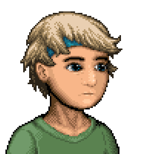
Edit:
I made a third and fourth version. This looks a bit less sinewy and the latter even less dithered. Which is your favourite?


I highly appreciate your opinions and suggestions. Does the new version look better? Does the perspective of the shoulders/arms look correct? How can I improve it further?
Old:
New:
Edit:
I made a third and fourth version. This looks a bit less sinewy and the latter even less dithered. Which is your favourite?

I think version 4 definitely loses a lot of depth. But it wouldn't hurt to cut back a bit on the sinews and dithering and maybe pull back the shadows, but not that much. Something between 1 and 3 I'd say, and definitely fix those single darker pixels in the middle of versions 3 and 4.

Please do something about that jawline. It's driving me crazy (sorry >.<; ) Just the straight pillow shading on it is... very disconcerting for some reason. It makes his face look flat. Maybe if there were some hint at cheek/bone structure instead of straight flat colour/pillow?
And neck 3 is much better than the others, showing structure without overdoing it or making it too flat (like the 4th one).
And neck 3 is much better than the others, showing structure without overdoing it or making it too flat (like the 4th one).

As a popular feedback I picked neck 3 and changed the chin line/left side of the face. What do you think?
LockeZ I'm pretty sure this is somehow your fault.

This isn't just a reactor!
Right, so anyway. Screenshot time, because dev has been cray.
End of Act Boss, Esperia, may have a video soon.

A Soulcatcher you encounter.

Game over image for Act One

Esperia being psychotic and scary as usual.

Less then 3 days now...
This isn't just a reactor!
Right, so anyway. Screenshot time, because dev has been cray.
End of Act Boss, Esperia, may have a video soon.
A Soulcatcher you encounter.
Game over image for Act One
Esperia being psychotic and scary as usual.
Less then 3 days now...
I think you still have a problem with the orphan pixels you're using to create the shadows on the inside of the neck. Your changes to his right cheek are a big improvement though.
The dithering all over seems like too much as well. I'm looking at the shirt and the dithering on his right shoulder (HIS right) give a little bit of depth there but imply that the rest of the shirt is completely flat.
The dithering all over seems like too much as well. I'm looking at the shirt and the dithering on his right shoulder (HIS right) give a little bit of depth there but imply that the rest of the shirt is completely flat.

Okay, so some of you might remember a few pages back where I was working on my title screen for my Phantasy Star fan game, well I threw out everything about it, and made an all new one.

The background is simple, it's just some stars in space, and I threw out the font and what not I had going, as it was rips from Generation 1 on the PS2.
In the fonts place was my attempt at the original way the title font looked in the sega genesis games, only higher rez and more gold looking.
Here is the original 16 bit one for a comparison.

And last but not least, the title screen I made last and I threw out, it's the one that's scrapped.

/\this shot is scrapped but i posted it as a reminder of the one I showed last a few pages back./\
And that's it.
I am happy with this last one I have made.. the gold one at the top.
I might tweek and improve it, but I rather move on to other things.
Besides, I think it looks good, it "pops", to me anyhow.
The background is simple, it's just some stars in space, and I threw out the font and what not I had going, as it was rips from Generation 1 on the PS2.
In the fonts place was my attempt at the original way the title font looked in the sega genesis games, only higher rez and more gold looking.
Here is the original 16 bit one for a comparison.
And last but not least, the title screen I made last and I threw out, it's the one that's scrapped.
/\this shot is scrapped but i posted it as a reminder of the one I showed last a few pages back./\
And that's it.
I am happy with this last one I have made.. the gold one at the top.
I might tweek and improve it, but I rather move on to other things.
Besides, I think it looks good, it "pops", to me anyhow.

No no... no.. read it all again man, that last pic was the LAST title screen I made, it's the one I threw out.. the very TOP screen is the title screen I just made.
It's the one I settled on.
It's the one I settled on.
Crap, I'm total dumbo. I read your post, then moved on something else and then returned to comment on it. I though that's the original PS One (tho you don't write anything about ps) title. Somehow I turned text on its head in my head and wrote that piece of crap.
My reaction suggests that the now one really caught the style, man.
My reaction suggests that the now one really caught the style, man.

