


SCREENSHOT SURVIVAL 20XX
Posts
bm> Yeah, now that you mention it, it is off. I can't move the face, since it's centred vertically. I'll just compress the bars a bit.
sated> It's the class name :)
I removed the window in the status area (actually, just made it transparent) because I didn't like the clogged up feel the default interface gave. I could add a translucent black background to it though, something like in the battle log window. It should work just as well.
e> page brkrrr!!!

Personally, I don't think having different colours for different levels of stats makes much sense. Usually green numbers represent healthiness and red represents critical values, but for static and steadily growing values like stats, having red numbers denote low stats kind of doesn't make sense in my view. Perhaps you could make a system where the numbers are on a graduating scale of red to green depending on how bad/good they are in said stat, but usually that applies to static personality traits that don't improve over time. But when you're dealing with this kind of stat improvement, low stats aren't going to stay low for very long, so dealing with the colour red as a kind of "punishment" doesn't really make sense, just as dealing with the colour green as a kind of "reward" for good stats doesn't make sense either.
It's like if your actor level was red when it was below 10, and green if it was above 90. Kind of weird.
Other than that, it has a pretty neat layout. I'd personally put the time as "00h:10m:20s" just because I prefer units. For me, "cleared" doesn't describe anything by itself so either you're going to have to rename that, or introduce its importance explicitly through a tutorial.
Otherwise, I like when menus are altered like this to give the game a kind of custom feel.
Cash> You were actually quite spot on. The stats do go red if they're at most 10, and go green if they're at least 100. Anyway, I don't think it'll be a problem. None of the actual classes start with values lower than 12 (so the only time they'll see red stats is if they're penalised by conditions and what-not), and stats don't rise much on level up (if at all). It should be uncommon for a character to reach at least 70 in any stat (aside from accuracy) for much of the game, so by the time that they do, seeing all that green'll (hopefully) make them feel moar op.
The 'cleared' is temporary. It's supposed to show how many missions you've completed so far, but 'missions cleared' is a bit too long to fit in that space. Maybe 'progress' fits the bill most. Yeah, I'll go and change it to that.
The 'cleared' is temporary. It's supposed to show how many missions you've completed so far, but 'missions cleared' is a bit too long to fit in that space. Maybe 'progress' fits the bill most. Yeah, I'll go and change it to that.

Did a small amount of work on boned, but listing it sounds like a lot!
Loads more interior decos.
Ladders
New character sprites.
Facesets for Arial, as well as a faceset called sides that have two different looking flowers.
But I can't do all that in a screenshot, so here's me talking to one of the flowers.

Loads more interior decos.
Ladders
New character sprites.
Facesets for Arial, as well as a faceset called sides that have two different looking flowers.
But I can't do all that in a screenshot, so here's me talking to one of the flowers.

Those characters may as well be impossible to read against that house. You should probably avoid using totally white background objects when dealing with spaces that characters can occupy like that- or in the case of the Flowey knockoff, avoid making characters that stand against the black background totally black.
Also as you may have guessed by my previous comment, this game (IMO, from what you've shown off thus far) looks like a pretty huge knockoff of Undertale, which really isn't cool.
Also as you may have guessed by my previous comment, this game (IMO, from what you've shown off thus far) looks like a pretty huge knockoff of Undertale, which really isn't cool.
author=PizzaThe characters animate, which sets them aside from the staticness of the background.
Those characters may as well be impossible to read against that house. You should probably avoid using totally white background objects when dealing with spaces that characters can occupy like that- or in the case of the Flowey knockoff, avoid making characters that stand against the black background totally black.
The flower is just a friendly nod, also there's several different flower characters, and all have different personalities, also-- the trend of speaking flowers started for me personally in Perseverance and Menagerie, both of which were publicly released before Undertale even began.
author=PizzaThe only thing that makes it look alike is the simpler palette, all of the ideas seen have been done by me before Undertale began.
Also as you may have guessed by my previous comment, this game (IMO, from what you've shown off thus far) looks like a pretty huge knockoff of Undertale, which really isn't cool.
Skeletons of a radical nature.
Sideview maps.
We already went over sentient flowers.
So using essentially what in fact are my own ideas and stories with an inspired palette is not uncool.
Even if it was a blatant knock-off, which frankly, it isn't-- even if it was, it wouldn't matter because it's a project I'm doing for fun.
It won't be publicly released, it's homework for school stuff, and I in no way and never in anyway have sought money for my own ideas, let alone other peoples.
And after the amount of fucking final fantasy spinoffs on this website you'd have a very shallow nail to hammer into the bodyless grave you're presuming has a robber in it, anyway.
Sorry about the Crass revelation that your opinion is entirely wrong, it's unflattering of me since the facts weren't present for you to research. I just don't feel like retaining myself. So in advance, I apologize if this comes off as rude.

I agree with Pizza. When I saw those screenshots I thought of Undertale. Maybe have some originality with the characters atleast? Like have it be bears instead of skeletons etc...
author=FroggeI think the better option is since I've already drawn the sprites, facesets and written dialogue for the three skeleton characters the cherry-enticed boars can await elsewhere.
I agree with Pizza. When I saw those screenshots I thought of Undertale. Maybe have some originality with the characters atleast? Like have it be bears instead of skeletons etc...
Keep in mind I am limited somewhat, I mentioned earlier that my spreadsheet for this has 18 different keywords on it. Squirrels and Boars are the only other character types within the sheet. I'm stretching bushland a little with talking flowers, but I'll make palm trees that talk too.
Here's the keywords again.
Ambience | Boars | Skeletons | Water | Squirrels | Berries
Counting | Squatting | Kissing | Falling | Thirst | Bleeding
Survival | Bushland | Drought | Aroused | Miniature | Chilling
The idea behind having a skeletopian leads into that I could make water toxic (as displayed by the main title), the ways to progress would be by offering berries as tribute to boars, kissing squirrels, squats and oats! Counting the flowers on a map to diagnose which way is the 'canon' way. Survival being based off a drought of Deathly Ichor (which is a cooking ingredient that Richard is sent off to get), I'm probably going to introduce arousing / always aroused characters, along with chillable / always chilling characters. Miniature is the artstyle, GEDDIT?
Also your skills are going to be Kiss, Squat, Chill and Arouse, each will instantly win a fight against an enemy.
It's a text adventure game. So there'll be multiple branching paths. Now that I've done the only linear map I can at this stage, it'll be tomorrow I make a flow chart.
Corfaisus

"It's frustrating because - as much as Corf is otherwise an irredeemable person - his 2k/3 mapping is on point." ~ psy_wombats
7874
author=Pizza
Also as you may have guessed by my previous comment, this game (IMO, from what you've shown off thus far) looks like a pretty huge knockoff of Undertale, which really isn't cool.
author=Frogge
I agree with Pizza. When I saw those screenshots I thought of Undertale. Maybe have some originality with the characters atleast? Like have it be bears instead of skeletons etc...
I always thought Undertale looked like a lazy knockoff of old minimalist RPG Maker games like OFF.


Can't even tell the difference.
Sure, maybe a flower plotting your demise is a little Undertale-esque, but aside from that, I don't see the problem. Give the guy a break.

everything with skeletons is a knock-off of grim fandango
like corf said just because undertale did it well doesn't mean people haven't been using that style for-fucking-ever. you might as well say IT LOOKS LIKE A DOS GAME
like corf said just because undertale did it well doesn't mean people haven't been using that style for-fucking-ever. you might as well say IT LOOKS LIKE A DOS GAME

The roof is causing a lot of wonky perspective issues. Your ledges are "flat" yet we can see the roof? It makes the whole house look like its leaning towards the screen.
EDIT: Actually, scratch that. I think I'm just looking at it wrong.
EDIT: Actually, scratch that. I think I'm just looking at it wrong.
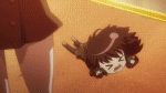
@BM> The characters blend too much with their background. Especially in front of the building. Maybe gray out the building a bit and make it duller?
So I was redesigning the menu from recently, and suddenly had a 'holy shit I actually did it' moment. To show:

I turned the command window horizontal to conserve space, and then maxxed out the status window.
I managed to get my hands on busts, so I decided to show them off in the menu. After an hour or so of toil, I managed to finally display the pictures, only to find out minutes later that galv made a script that does (pretty much) the same thing. Oh well. I learned something new, and I believe I have found an easier method to display busts than galv's method (easier for me, at least). A-anyway.
The odd window in the right (the one with Line: n) is supposed to hold a current-quest-briefing of sorts, but I haven't decided whether I should push with it or not.
I should probably make a new window frame to better fit everything else sometime soon...
So I was redesigning the menu from recently, and suddenly had a 'holy shit I actually did it' moment. To show:
I turned the command window horizontal to conserve space, and then maxxed out the status window.
I managed to get my hands on busts, so I decided to show them off in the menu. After an hour or so of toil, I managed to finally display the pictures, only to find out minutes later that galv made a script that does (pretty much) the same thing. Oh well. I learned something new, and I believe I have found an easier method to display busts than galv's method (easier for me, at least). A-anyway.
The odd window in the right (the one with Line: n) is supposed to hold a current-quest-briefing of sorts, but I haven't decided whether I should push with it or not.
I should probably make a new window frame to better fit everything else sometime soon...

I like how your window border is similar to RM2K3's. How hard is it to make a menu like that yourself?

Quick map I did this morning, the inside of the Bee Hive Castle.
Still needs a good bit of cleaning up.

The Queen Bee has been being fed poisoned nectar by the Roach Clan, trying to seize power from the Hive.
Still needs a good bit of cleaning up.
The Queen Bee has been being fed poisoned nectar by the Roach Clan, trying to seize power from the Hive.
sated: wow yeah that is reminiscent
dookie: damn man. i don't know what needs cleaning up, i ain't an expert, but that looks awesome! she looks so unwell :<
i'm slowly working...

serenity beach resort is a bit empty i guess, but the tears in space-time should help

changing/rest room, i should make some tile edits so there are proper doorways there...

the exterior of gabble news, the biggest tv station in ignacia. that radio tower thing looks really stupid. i should probably remove it?

who would build a lounge in the middle of a sewer?????????????

part of firewall, belcorre security's unmanned observation satellite. it does have some offices and accomodations for engineers, however. (the windows are transparent ofc)
dookie: damn man. i don't know what needs cleaning up, i ain't an expert, but that looks awesome! she looks so unwell :<
i'm slowly working...
serenity beach resort is a bit empty i guess, but the tears in space-time should help
changing/rest room, i should make some tile edits so there are proper doorways there...
the exterior of gabble news, the biggest tv station in ignacia. that radio tower thing looks really stupid. i should probably remove it?
who would build a lounge in the middle of a sewer?????????????
part of firewall, belcorre security's unmanned observation satellite. it does have some offices and accomodations for engineers, however. (the windows are transparent ofc)

@Craze I think you addressed most of the main problems I would have pointed out so no point in repeating them.
@Dookie looking good as always.
@BM if your ever going to use the excuse that your ideas came before undertake remember this isn't a really new project. The kickstarter was live during June of 2013 and they already had the demo made.
@Dookie looking good as always.
@BM if your ever going to use the excuse that your ideas came before undertake remember this isn't a really new project. The kickstarter was live during June of 2013 and they already had the demo made.

author=Dookie
Quick map I did this morning, the inside of the Bee Hive Castle.
Still needs a good bit of cleaning up.
The Queen Bee has been being fed poisoned nectar by the Roach Clan, trying to seize power from the Hive.
Noooo! I have no idea if she's the bad guy or not. but I hate roaches so I am immediately enraged! . Seriously though this game looks bonkers. Can't wait to try it out!

