


SCREENSHOT SURVIVAL 20XX
Posts

author=Dookie
Also that "in-between" diagonal wall looks weird, i would just have the 45 degree diagonal go all the way like how Earthbound does it.
This angle has it's problems but it makes rooms look more dynamic in my opinion.
:)
author=Infinite
I don't think it's cluttered... but I'm a little bothered by the perspective shift/line-angle at the back of the room.
I figured that angle would bother people. I already had the 45 corner ready just in case, Its just that like Dookie mentioned wanted to the rooms to look a bit more dynamic.
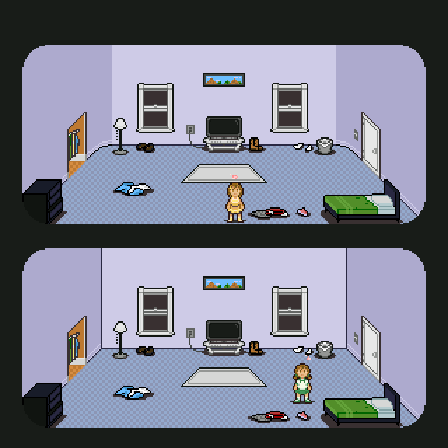
I'm going to round the corners instead and see if that works out better.
@Chilly I'm no expert in art or architecture, but I think the curved corner looks way better than the 45 degree corner. It gives the room more personality, makes it look more creative.
Overall, I think the curved corner looks better and somehow gives 'emotion' to the room. Dangit, I went slightly philosophical, didn't I?
Overall, I think the curved corner looks better and somehow gives 'emotion' to the room. Dangit, I went slightly philosophical, didn't I?

The straight line looks and makes more sense. I do like the curved corners. Makes it looks like a frame is laid over everything~
How would it look without the black lines in the 45 degree one? I think it'd look a bit better.
How would it look without the black lines in the 45 degree one? I think it'd look a bit better.

I personally like the straight lines better, it fits with all the hardlined stuff in the room.
Thanks for the feedback! Agreed about the brightness being a bit too much. Not sure how I'll solve that problem yet (trying to use only NES colours + a few).
@Chilly-Pheese-Steak:
Both versions look great. Gotta agree with Ozzy though, the one with the rounded courners has more personality.
@Chilly-Pheese-Steak:
Both versions look great. Gotta agree with Ozzy though, the one with the rounded courners has more personality.

A couple days ago I finished up a home interior tileset I've been working on. I started with an existing design that one of our artists created, and built upon it by making the tiles more repeatable and adding in a lot of variations so you can build different structure shapes. Also added some additional original content. Here's a few shots of it in use (along with some furnishings and other artwork).
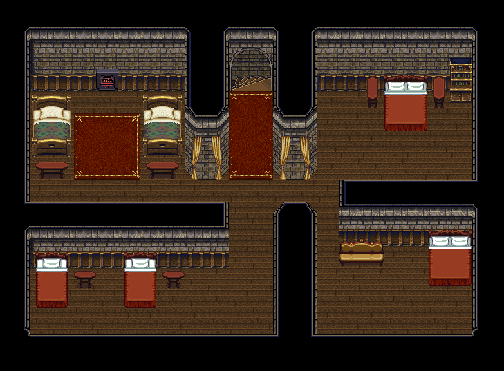


If you like it, I made it available for others to use here. Just please respect the license it is provided under.
http://opengameart.org/content/stone-home-interior-tileset
If you like it, I made it available for others to use here. Just please respect the license it is provided under.
http://opengameart.org/content/stone-home-interior-tileset
@Roots, that tileset looks awesome! I get Final Fantasy VI vibes from it, maybe because of the color palette or something. I really like the walls especially!
anyways.. I started this weird project. I guess you can call it a game. It's a YoutubeRPG lol. It's based on the game I'm working on RPG Maker at the moment. It works kinda like a pen n paper RPG, where viewers get to decide the actions. The art is pretty rough, but the idea is to update it often, so I don't want to spend too much time on every episode.


anyways.. I started this weird project. I guess you can call it a game. It's a YoutubeRPG lol. It's based on the game I'm working on RPG Maker at the moment. It works kinda like a pen n paper RPG, where viewers get to decide the actions. The art is pretty rough, but the idea is to update it often, so I don't want to spend too much time on every episode.
I'm having a bit of trouble deciding on how this sloped part of the road should look. The idea is that the road and the stairs are on the same level. The first picture is how it looks with no changes, and frankly it looks very flat. In the second one I've added cliff edges to simulate it going down, but there's still something bothering me about it
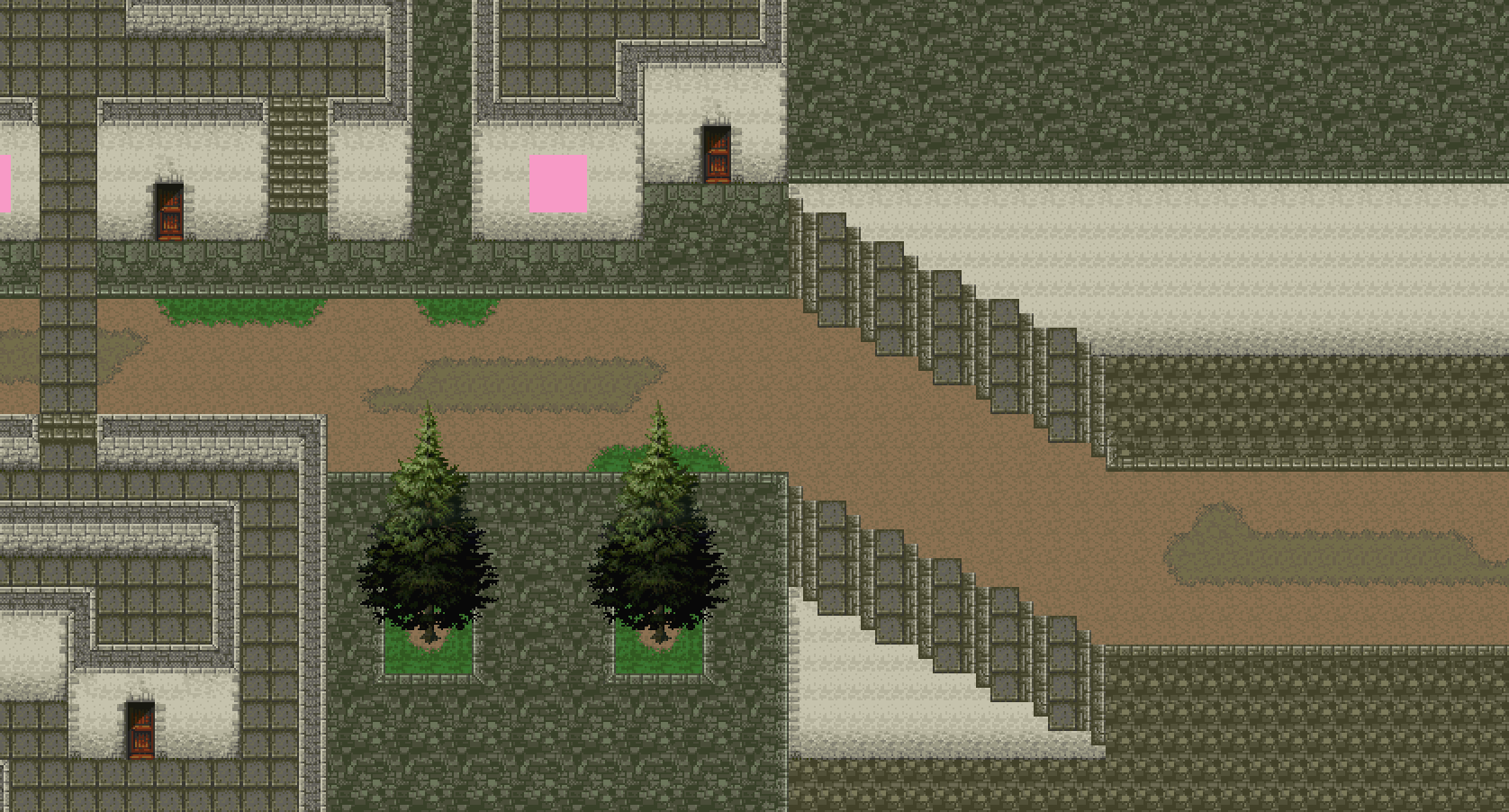
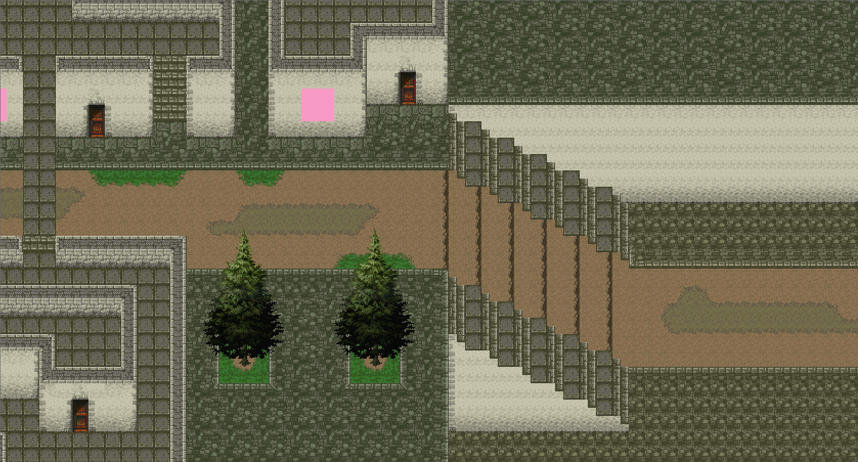
Does anyone have a good map pic that has a similar road to this? I'm betting that I'll have to make a new graphic anyway, maybe looking at another map would help.
Does anyone have a good map pic that has a similar road to this? I'm betting that I'll have to make a new graphic anyway, maybe looking at another map would help.


@Konradix:
Angles in 2D are difficult to show from that angle. My advice to you would be to make the entire dirt section use the fully transparent tile and then use a correctly aligned, stationary panorama to show the angle. The reason for using a panorama is simple: you can draw a specially angled dirt path to show add some added depth. Roads don't usually have impassable cliffs in them, so that should be right out.
One of the reasons the dirt-only path doesn't look right is because the dirt tile itself has some obvious tiling in it (the darker shade forms a little line). With a panorama, you can rotate the tile a few degrees and not break the illusion of height difference. If you don't understand what I mean I can show you, but I am pretty lazy, so...
@Dragol:
I prefer Dyn blending.
Some of you may recall I posted my moist cave (body interior) tileset awhile back, but it was repugnantly bright. I tried fixing the colours and lowering the saturation considerably, and I think it looks way better. It might still be too bright, because my monitor has a tendency to darken things slightly, but I like where it is now. Thoughts?

The original for comparison:

Angles in 2D are difficult to show from that angle. My advice to you would be to make the entire dirt section use the fully transparent tile and then use a correctly aligned, stationary panorama to show the angle. The reason for using a panorama is simple: you can draw a specially angled dirt path to show add some added depth. Roads don't usually have impassable cliffs in them, so that should be right out.
One of the reasons the dirt-only path doesn't look right is because the dirt tile itself has some obvious tiling in it (the darker shade forms a little line). With a panorama, you can rotate the tile a few degrees and not break the illusion of height difference. If you don't understand what I mean I can show you, but I am pretty lazy, so...
@Dragol:
I prefer Dyn blending.
Some of you may recall I posted my moist cave (body interior) tileset awhile back, but it was repugnantly bright. I tried fixing the colours and lowering the saturation considerably, and I think it looks way better. It might still be too bright, because my monitor has a tendency to darken things slightly, but I like where it is now. Thoughts?
The original for comparison:

LockeZ

I'd really like to get rid of LockeZ. His play style is way too unpredictable. He's always like this too. If he ran a country, he'd just kill and imprison people at random until crime stopped.
5958
From a fantasy perspective, I sort of liked the walls being the same color as the ground for an "inner body" tileset. But from a gameplay perspective, the new more-different colors make it way more readable and less of an eyesore. And it still looks completely gross, like a place where I definitely don't want to have a picnic, which is probably the most important thing for an inner body dungeon.
Put some big gross pimples in there as doodads.
Put some big gross pimples in there as doodads.
author=Feldschlacht IVYeah, haha, thanks. The GBA palette is nuts.
That looks way better!
author=LockeZI agree with you; having the walls and floor the same colour gave it a sort of "inside a vein" feel, whereas this is more of a "dungeon walls and floors" thing. I felt like the players eyes would thank me after staring at this gross mess for awhile, though, and readability is a big deal to me. It was a tough decision.
From a fantasy perspective, I sort of liked the walls being the same color as the ground for an "inner body" tileset.
author=LockeZWhat do you think chests are going to be? ;D
Put some big gross pimples in there as doodads.
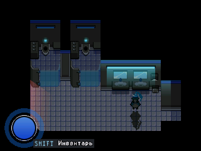
@Dragol:
That's a pretty bathroom. I'm sure those stainless steel toilets are auto-cleaning and not gross at all!
edit: I'm not sure having a glass stall door makes a lot of sense, though... kind of defeats the purpose, no?
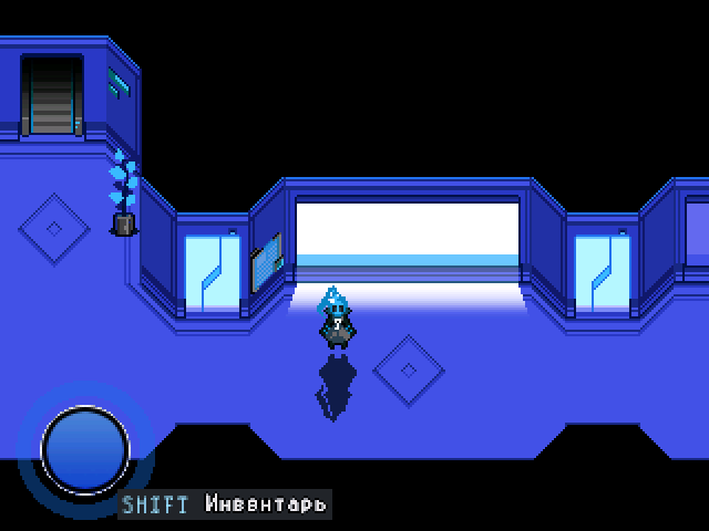
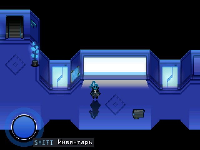
author=KaempferIt's more like touchable hologramm, cuz fuuuuture.
edit: I'm not sure having a glass stall door makes a lot of sense, though... kind of defeats the purpose, no?
Transparency active then cabin is empty, if somebody goes in there then it becomes matt.
author=Dragol
It's more like touchable hologramm, cuz fuuuuture.
Transparency active then cabin is empty, if somebody goes in there then it becomes matt.
Genius!
Here is the latest trailer for World In Danger plus a special announcement.
Let me know what you think.
The final bit of the trailer is actually about a contest. Where the winner will be made into a playable character in the game. All you have to do to enter is "join the World Army" and get the high score in a "combat simulator" by the end of the contest.
You can go here for more information on the contest: World In Danger Become-A-Playable-Character-Contest

