


MY SCREENSHOT IS BIGGER THAN YOURS!
Posts

That actually looks pretty good but it just needs some more detail added to it, i actually wasn't that bad mapping in Zelda Classic. If i had my old project i'd show some screens but it got deleted along with the engine.
author=demondestiny link=topic=1971.msg43065#msg43065 date=1226402882
That actually looks pretty good but it just needs some more detail added to it, i actually wasn't that bad mapping in Zelda Classic. If i had my old project i'd show some screens but it got deleted along with the engine.
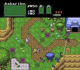
The ZC screen I just posted?
Compare it to what I could do by the time I left:
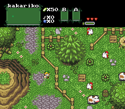
I don't know how you could say it looked even good. Anyway I liked mapping screen by screen, it was alot easier.
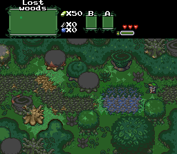
This is what it is so far. Not done yet.
I might get rid of the path and close in the map a bit more.

I quite enjoy the scale and vastness conveyed by your maps, lifelessangel.
Playable release or at least topic soon, plz?
Playable release or at least topic soon, plz?
I'm not releasing this game, as it will be for one of my classes. But i'm working on another game, someone else is making the story. I guess I could make a topic on that soon.
I'm not releasing this game, as it will be for one of my classes.
Weak! Why does that mean you can't release it?
Man, I hate that I've completed all my schooling without ever finding an excuse to use RPG Maker for a project.

It's good LWG. Just the last tile of the waterful looks like it's floating.
I really don't want to release as it will be around an hour short and very cliche.
I really don't want to release as it will be around an hour short and very cliche.


I hereby find that screenshot.. Bad. I mean you kinda know what it's supposed to be an all but it's just so cluttered and to many things look out of place and awkward that it almost ruins the structure of the warf.
author=Max McGee link=topic=1971.msg43276#msg43276 date=1226516850
Man, I hate that I've completed all my schooling without ever finding an excuse to use RPG Maker for a project.
You just want to be better then the other kids.

S'up

I decided to make the player slow down a bit. You're supposed to have three people in combat, this is a test. For the record, they are INSIDE the barn. (I know, it's shit.)
I decided to make the player slow down a bit. You're supposed to have three people in combat, this is a test. For the record, they are INSIDE the barn. (I know, it's shit.)

author=Little Wing Guy link=topic=1971.msg43290#msg43290 date=1226523100I'm impressed with that. It's pretty spectacular, actually. :]
Yay or nay?
Keep it up!

Meavor- I think it's alright, it has an okay effect, but the biggest problem with it is that the auto-tile that you have for the edge of the stone structure, firstly lacks a bottom edge by the black things, secondly, borders around the boxes. If you fix those, I think it would look pretty good.


Testing something out. I'm not sure if I'll actually use this type of BG or stick with the original:

But I may try it at least to see how the others look like.
Ocean: The second one reminds me of FF2 NES battles. If you're trying to make it feel retro go with the second one, if not go with the first one. I like the hero sprites, it reminds me of the start of FF6. Also, maybe make the hand thats pointing to whats selected a bit bigger.

Lifelessangel: That hand does NOT need to be bigger. I know from personal experience with the game that the hand does NOT need to be bigger. THE HAND DOES not NEED TO BE BIGGER.
OCD: <3 <3 I say keep the black base (second screen). Moving the woodies to the left a little so that they aren't overlapping the edge would be nice.
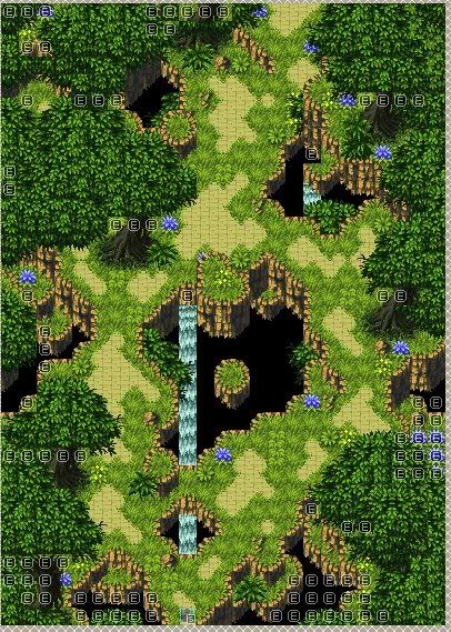
Lil' WinGuy: That map is pretty when you look at it but would not be very fun to play on. There is so little room for movement that despite the BIG NIFTY HOLEY FOREST idea it would so obviously be on rails. Don't get into the habit of Ara Fell's 1-tile impossible-to-find walkways. :<
OCD: <3 <3 I say keep the black base (second screen). Moving the woodies to the left a little so that they aren't overlapping the edge would be nice.
Lil' WinGuy: That map is pretty when you look at it but would not be very fun to play on. There is so little room for movement that despite the BIG NIFTY HOLEY FOREST idea it would so obviously be on rails. Don't get into the habit of Ara Fell's 1-tile impossible-to-find walkways. :<
author=Craze link=topic=1971.msg43467#msg43467 date=1226577259
Lil' WinGuy: That map is pretty when you look at it but would not be very fun to play on. There is so little room for movement that despite the BIG NIFTY HOLEY FOREST idea it would so obviously be on rails. Don't get into the habit of Ara Fell's 1-tile impossible-to-find walkways. :<
I know what you mean, I do have a big problem with aesthetics over game play. You'd be surprised to hear that this is actually an improvement with playability compared to previous maps I've made. I'm still trying to perfect xD but I find it difficult to judge. If you look closely you'll see I have tried to keep the actual pathway reasonably bare. It wouldn't hurt to give it some editing (move some trees over etc) The actually holey forest idea is kind of crucial (it's another generic floating island game), so I can't really get rid of them, But I can make them smaller. Thanks Craze!
Ocean: The second one reminds me of FF2 NES battles. If you're trying to make it feel retro go with the second one, if not go with the first one. I like the hero sprites, it reminds me of the start of FF6. Also, maybe make the hand thats pointing to whats selected a bit bigger.RM2K3 doesn't let me make it bigger, trust me, I tried. There is a 8x8 limit for pointer icons and I tried the best I could to fill that space.
OCD: <3 <3 I say keep the black base (second screen). Moving the woodies to the left a little so that they aren't overlapping the edge would be nice.Yeah, I like both of them so I found it hard to decide. I guess I will keep the black one though. I dunno how to move the mechs over to the left. I tried playing with the terrain grid but the best it could do is move Amelia over to the left and have Neil remain in the same place. Am I just doing something wrong?
Thanks for the comments! I didn't actually get to play around with these too much so I'll check it out again when I get home.
You could always just move them over two pixels in the actual battlechar. If that's not possible, you could make them battle animations and set their battlechar graphics that way.
The 'terrain grid' only works if you are on that specific terrain and automatic battlechar placing is on (set in battle layout, iirc). That might be your problem. Another solution would be to turn off automatic placement and just set all heros normally--shouldn't be too terrible since you have consistently sized battlebacks and only six PCs to place (the four bodyguards and those two woodies).
The 'terrain grid' only works if you are on that specific terrain and automatic battlechar placing is on (set in battle layout, iirc). That might be your problem. Another solution would be to turn off automatic placement and just set all heros normally--shouldn't be too terrible since you have consistently sized battlebacks and only six PCs to place (the four bodyguards and those two woodies).

