


RMN PIXEL ART CONTEST
Posts

If you have trouble working with larger sprites, you could have started with a 100x100 scene using small sprites which wouldn´t require much zooming to work with :P
As it is, as Harmo said, looks cute, however looks more like a drawing (still know it is pixelart :P), start small and then go bigger and bigger and you will reach the results you wanted :) Just a tip, hope it helps any.
As it is, as Harmo said, looks cute, however looks more like a drawing (still know it is pixelart :P), start small and then go bigger and bigger and you will reach the results you wanted :) Just a tip, hope it helps any.

author=Clest link=topic=2372.msg43538#msg43538 date=1226611284
Okay, here is my entry =^.^=
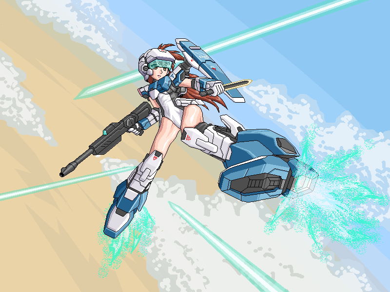
That looks really good Clest.
@iamnot- I don't know what that is but it interests me. Looks great.

So, the deadline is tomorrow.
Now is obviously the time to post up your submissions for anyone who hasn't yet! (D-bones, Craze and Videowizard, I think?)
Now is obviously the time to post up your submissions for anyone who hasn't yet! (D-bones, Craze and Videowizard, I think?)

Lol, I'm not sure why, but Iamnot's submission makes me think of something like a welfare pixar!
Clest: Win...
Clest: Win...

Looks interesting Videowizard =)
Actually I have to try newerr DK games, I tried the snes ones years ago, but the snes RM crashed on me for some reason :O
Anyway, last minute UPDATE:
Actually I have to try newerr DK games, I tried the snes ones years ago, but the snes RM crashed on me for some reason :O
Anyway, last minute UPDATE:


Holy fuck Clest! Also completely forgot about this, will try to do something when I get home. That's if my brother isn't playing WoW again(Doubtful, wish I didn't buy him it now) but don't expect anything close to that. Just participating.
hehe thankies Tao, but I think the deadline has expired, though if you can post something anyway and hopefully the judges will let it in since they didn´t actually post a "deadline ended now" thing. Good luck anyway =)
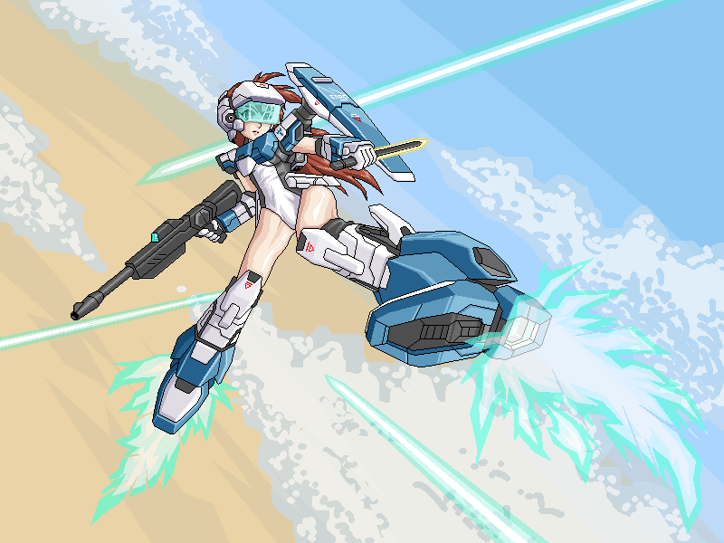
Clest, your updated version is looking considerably better. Good job.
Should have kept the writing and what-have-you on the shield though.
Should have kept the writing and what-have-you on the shield though.
Oh damn, I was in such a hurry to post it that I forgot to re-add the markings >.<...
Thanks anyway =^.^=
Thanks anyway =^.^=
We're still open to accepting late entries (despite what the main post may say), so feel free to submit that, Tau. We will, however, deduct considerable points from one of the five main assessment categories ('Compliance with Rules').
That may put you at an automatic disadvantage, but it's at your discretion, either way. :]
That may put you at an automatic disadvantage, but it's at your discretion, either way. :]
We have eight entries, which is a pretty good turnout I suppose.
We'll be going over this stuff over the next few days. Stay tuned!
We'll be going over this stuff over the next few days. Stay tuned!
author=BlindSight link=topic=2372.msg45055#msg45055 date=1226965140
We're still open to accepting late entries (despite what the main post may say), so feel free to submit that, Tau. We will, however, deduct considerable points from one of the five main assessment categories ('Compliance with Rules').
That may put you at an automatic disadvantage, but it's at your discretion, either way. :]
Does that deduction applies to this last minute update too? If it does, disregard it and count my previous update posted sunday, if not, consider this then:
The judges and I discussed the results for several hours before coming upon an absolute conclusion. It was a very close contest, most definitely, and (whatever your score); I'm extremely grateful for everyone that participated. Wonderful work.
This was a little mind-numbing to write out, so I'm sorry it took a few days.
Nessiah -- 17/25
All of us felt very collectively that this was one of the more impressive pieces, and made commendable use of color, certainly. However, we also agreed that there were a number of issues holding the work back from it's utmost potential-- and this ultimately lowered the score quit a bit. Most notably, the woman's proportions (as pointed out by Karsuman) were fairly far off from a believable set of human anatomy, and this makes a lot of the image look rather silly.
Likewise, we found a LARGE amount of seeming pillow-shading in the piece, most clearly exemplified in her umbrella and dress segments. A lot of the color choices were awkward combinations, and (with 40), you were kind of pushing things.
All in all, though, as I said, it was very much one of the better submissions.
1.) Originality/Inventiveness -- 3/5
2.) Detail and Embellishment 3/5
3.) Use of Color -- 4/5
4.) Style and Form -- 2/5
5.) Compliance with Rules -- 5/5
Ocean -- 18/25
Again, this was a quality work. Ocean's made unbelievable progress in his pixel art prowess over the years; so parts of this piece kind of disappointed me in the sense that it could have been considerably better were more time devoted to it.
While there's certainly a striking (and modest) use of color here, we mutually felt that the image could have been better with a bit more of it. There's a very awkward transition between some of the tones, (particularly in the sky, dirt, and roof of the ship); and lack of a proper gradation is likely to blame. What's more, a few of us also conceded the perspective itself was lacking: the trees in particular seemed off.
Still, a very nice effort. I can't help but worry myself over what the submission could have amounted to, but unfortunately we have to assess things as they are!
1.) Originality/Inventiveness -- 4/5
2.) Detail and Embellishment 3/5
3.) Use of Color -- 3/5
4.) Style and Form -- 3/5
5.) Compliance with Rules -- 5/5
Ody -- 21/25
This was definitely a contender for winning the contest. Every ounce of this piece felt classically and professionally done; almost evocative of an old genesis game. While not especially original, the style and detail in the characters (with such a limited palette, even) was absolutely wonderful.
To reiterate, as well, we were particularly impressed with your managing to maintain such a small color count; it exemplifies perfectly the meticulous nature of pixel art and is well deserving of it's second-place score!
1.) Originality/Inventiveness -- 3/5
2.) Detail and Embellishment 4/5
3.) Use of Color -- 5/5
4.) Style and Form -- 4/5
5.) Compliance with Rules -- 5/5
D-Bones -- 12/25
While we definitely admired the patience that accompanies a larger piece, we were let down by this entry for a great deal of reasons. Primarily, and perhaps more significantly, it was submitted in .JPG form, making us relatively unable to properly analyze the nuance and detail of the shading.
We *were* fond of your phoenix's design, but that admittedly that was the only element of it we could agree on. This very much felt rushed and unpolished to us, and rather inconsistent in it's scope of detail.
We appreciate the effort, though!
1.) Originality/Inventiveness -- 2/5
2.) Detail and Embellishment 2/5
3.) Use of Color -- 1/5
4.) Style and Form -- 2/5
5.) Compliance with Rules -- 5/5
Harmonic -- 19/25
This was indeed a very ambitious undertaking, and all three of us were highly attentive to the sheer amount of detail you attempted to convey, Harmonic. That said, this piece was extremely inconsistent. Given the EXTREMELY HIGH color count; one would expect the image to be radiantly detailed and embellished with marvelous shading. And, yes, parts of it were.
What I mean by that, most basically, is that the piece felt incomplete in many ways. The dragon was richly textured (pillow-shaded, but more than passable.) The characters, too, were very well made, and almost appear to stand out too much when juxtaposed with that sorrowfully simplistic backdrop. It just doesn't correlate well. You have a single character with nearly double the color count of the entire background and that just didn't sit well with us.
Whether it was intentional or not, we still recognize the enormous effort, and congratulate you on a worthy third place.
1.) Originality/Inventiveness -- 3/5
2.) Detail and Embellishment 4/5
3.) Use of Color -- 2/5
4.) Style and Form -- 5/5
5.) Compliance with Rules -- 5/5
iamnot -- 10/25
I very much blame myself for the mistake (having not been more clear in the initial post), but we all generally had the consensus that this wasn't true pixel art. It uses basic color tones, and doesn't include Photoshop aliasing or filtration; so while it *technically* matches the criteria, it unfortunately wasn't what we were looking for.
What was it actually supposed to be, for some clarity?
1.) Originality/Inventiveness -- 3/5
2.) Detail and Embellishment 1/5
3.) Use of Color -- 2/5
4.) Style and Form -- 1/5
5.) Compliance with Rules -- 3/5
Videowizard -- 11/25
Given how difficult it can be to compare smaller pieces to larger ones in judging them, we expected quite a bit of detail in assessing such a small image. And, unfortunately, we didn't really find much of that.
You had quite a large amount of one-tone segments, essentially no shading to speak of, an ambiguous and unclear depiction in terms of what the image actually WAS, and the black border around everything was definitely a turn off.
We're aware that Videowizard casually comes up with intuitive, freehand images for his project and the like; but the entire point of pixel art is to implement meticulous detail through careful color selection. That wasn't really happening in this piece.
1.) Originality/Inventiveness -- 2/5
2.) Detail and Embellishment 1/5
3.) Use of Color -- 1/5
4.) Style and Form -- 2/5
5.) Compliance with Rules -- 5/5
Clest -- 22
As If this was really any surprise, Clest's entry was decided to be the most deserving entry after several hours of our deliberation. Nearly everything about this; the sleek and stylized character design, the astonishing embellishment and intricacy of her clothing and accessories, and the masterfully articulated color palette that comes together in such harmony we felt little room to decide on anyone else.
As a very minor issue, Karsuman and Sovan both suggested that the seemingly transparent flames of the girl's heels seemed not to have been added manually. (I.E. Drawn out and then photoshopped in). Only a single point was deducted, as we had no proof of this and could not fully making the accusation.
That aside, Clest clearly knows what he's doing and I have little place to criticize him. Absolutely wonderful job here!
1.) Originality/Inventiveness -- 4/5
2.) Detail and Embellishment 5/5
3.) Use of Color -- 5/5
4.) Style and Form -- 4/5
5.) Compliance with Rules -- 4/5
------------------
Thanks again to everyone who participated! If the other judges (or members) want to add their own little quips about the pieces, I definitely encourage it. The winner can contact me privately about the monetary prize... and I'll leave WIP to reveal what they shall receive in terms of RMN3. :]
Good job, guys, everyone's was pretty amazing. I'm practicing a little bit on it, and I still don't see how you guys get those results!
Haha, yea I kind of though that afterwards. Maybe in the future if you do another contest I can enter a more appropriate piece?
And it was someone extending a hand to a robot.
I very much blame myself for the mistake (having not been more clear in the initial post), but the all generally had the consensus that this wasn't true pixel art. It uses basic color tones, and doesn't include Photoshop aliasing or filtration; so while it *technically* matches the criteria, it unfortunately wasn't what we were looking for.
What was it actually supposed to be, for some clarity?
Haha, yea I kind of though that afterwards. Maybe in the future if you do another contest I can enter a more appropriate piece?
And it was someone extending a hand to a robot.

Yeah I probably would've voted Clest's the winner too.
For everyone's information, mine is made up of in-game graphics from LodVX. The dragon was started and finished in one night, the sunday the contest was announced. And since I'm using edited RTP (non original) backgrounds for battles, I had to just shit out a background that I wasn't going to use in game anyway :P
For everyone's information, mine is made up of in-game graphics from LodVX. The dragon was started and finished in one night, the sunday the contest was announced. And since I'm using edited RTP (non original) backgrounds for battles, I had to just shit out a background that I wasn't going to use in game anyway :P
I liked Ody's the best. =(

