


SCREENSHOT SUPERBOWL SUNDAY
Posts

author=ZPE link=topic=3024.msg65527#msg65527 date=1236478912
Ugly screenie Chaos. Had to be said but the ideas are interesting.
Eh? How so? Don't tell me it's just the gradient.
EDIT: GODDAMN TOP OF PAGE. That's why I never post in these topics...
Hahaha, I'll break it down for you Chaos:
- Faceset is cut off. Not major but that's one point.
- Some of the title's aren't capitalized while others are. Looks untidy.
- The glyph icons are too close to their corresponding pre-text plus there are repeats of the icons as well. Looks too squeezed.
- Finally, the colour scheme just looks bad. I mean yeah the gradient isn't really a gradient is it? It's just two colours and the bright pink doesn't help make it look any better.
Other than that, it's nice.

Okay I fixed:
-Built the faceset frame directly into the face, to show that I cut it off.
-Fixed capitalizing in the title frame.
-Removed glyph icons from
-Killed the gradient.
Note that this incorporates advice garnered in IRC.
author=ChaosProductions link=topic=3024.msg65536#msg65536 date=1236482609The Health, Spirit and XP in the top right hand corner don't have capitals :(. Is that intentional?
Screenshot and text.
Indeed it is. I just made the choice aesthetically. If reshack would work properly, I'd un-cap the left side as well.
EDIT:
Finished product.

More dark, less foreboding. It's manlier, too.
EDIT:
Finished product.
More dark, less foreboding. It's manlier, too.

author=ChaosProductions link=topic=3024.msg65543#msg65543 date=1236485227
Finished product.
http://img17.imageshack.us/img17/5043/sne.png
More dark, less foreboding. It's manlier, too.
That's looking a hell of a lot better. Now, just the rest of the game.
author=ChaosProductions link=topic=3024.msg65536#msg65536 date=1236482609
http://img22.imageshack.us/img22/5043/sne.png
Okay I fixed:
-Built the faceset frame directly into the face, to show that I cut it off.
-Fixed capitalizing in the title frame.
-Removed glyph icons fromequipmentpassive abilities list.
-Killed the gradient.
Note that this incorporates advice garnered in IRC.
Like I said in the chat earlier today, good thing that you fixed the gradient fill on these windowskins, looks a lot better. Still looks kinda saturated, tone the colors down a bit to make it look better.

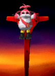
author=Rei- link=topic=3024.msg65784#msg65784 date=1236631196
It is a cat, and almost a parachute! It's a cat, a grappling-hook and a propeller!
That's the single greatest thing I've ever seen. Can the cat also fight?
http://farm1.static.flickr.com/192/448912956_bae1c1edd1.jpg
author=Nightblade link=topic=3024.msg65785#msg65785 date=1236631456Hey now, isn't it enough you can use it as a helicopter! (Psst remember to take escape route 1 in the game!)author=Rei- link=topic=3024.msg65784#msg65784 date=1236631196
It is a cat, and almost a parachute! It's a cat, a grappling-hook and a propeller!
That's the single greatest thing I've ever seen. Can the cat also fight?
http://farm1.static.flickr.com/192/448912956_bae1c1edd1.jpg


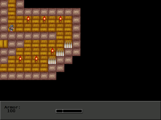
author=GameOverGames Productions link=topic=3024.msg65533#msg65533 date=1236480848
The Egyptian tileset still needs some more work, but I think that it's coming along.
It took me a long time to realize what I was looking at was not at all a top down view, and after that, I had a lot of difficulty figuring out what was a wall in the foreground ( a solid object) versus just a wall in the background (walkable space). Other than that, looks pretty neat. Reminds me of "Super Mario Bros. 2".
author=Craze link=topic=3024.msg65834#msg65834 date=1236645805
You can rename the characters.
Please tell me doomtit is not the default name.
@Rei-
YESSSSSSS.
author=Max McGee link=topic=3024.msg65866#msg65866 date=1236652286author=Craze link=topic=3024.msg65834#msg65834 date=1236645805
You can rename the characters.
Please tell me doomtit is not the default name.
Her name is Lucia.
He is making fun of her large assets. =D (See spoiler)


Craze, I can't see much of what VX has to offer in that screenshot but I guess it looks okay (like every other VX DBS screenie).
author=Karsuman link=topic=3024.msg65890#msg65890 date=1236656742
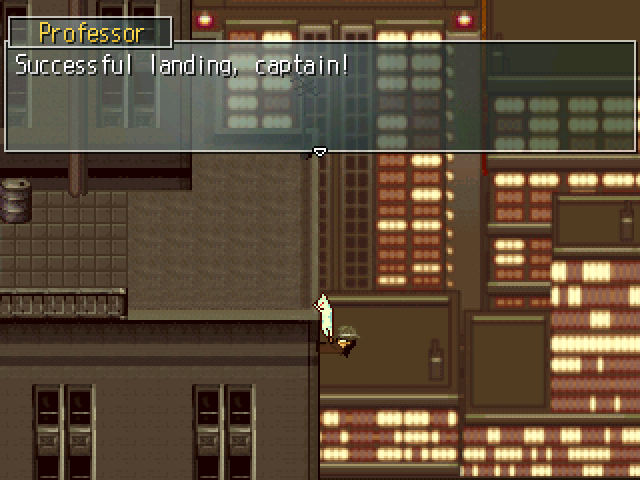
This is the best screenshot I've seen yet. Great lighting effects and user interface. :)
author=Max McGee link=topic=3024.msg65898#msg65898 date=1236660159author=Karsuman link=topic=3024.msg65890#msg65890 date=1236656742
This is the best screenshot I've seen yet. Great lighting effects and user interface. :)
Seconded. I also have noted the updates you made on this drawing, or I should say this more completed version than the other one you previously showed of her.

