


SUMMER SCREENSHOT SPECTACULAR!
Posts
looks good Rei. only thing I can see that bugs me is the pipes against the back wall to the left, next to the fridge. They are shaded to look like they have no curve at the top, making them look flat at a tad bit lifeless. Look at the pipes up on the center wall, for example, towards the front. They're curved to look like they're going back into the wall, which looks nice. Having them both in the same room is very contrasting, not in a good way.
You and I use similar styles/resources, Rei. :D Something's telling me we should team up some happy day, like the Wonder Twins. Which reminds me, you and I are in similar boats right now- I too have to attempt to make steampunk indoors for my town. Your screens are really getting my creative juices flowing!
I really like the lamp on the wall in the bottom screenshot better than that in the top. I think it would go quite well with the walls in the top. Same goes for the little crate with the boots on top. All in all, I think these screens look great! Aside from the fact that I'm not fussy about the 'refmap look,' I think they suit the tone of your project nicely. This is for the in-the-past-part you hint at in your RSD demo, yes?
I really like the lamp on the wall in the bottom screenshot better than that in the top. I think it would go quite well with the walls in the top. Same goes for the little crate with the boots on top. All in all, I think these screens look great! Aside from the fact that I'm not fussy about the 'refmap look,' I think they suit the tone of your project nicely. This is for the in-the-past-part you hint at in your RSD demo, yes?
Looks great Rei, I really like the light spilling onto the floor from the front door. I'm not sure about the stone wall on the room in the far right on the second screenshot though. Maybe keep it consistent with the rest of the walls in the house? That's really just nitpicking though.

post=92353
looks good Rei. only thing I can see that bugs me is the pipes against the back wall to the left, next to the fridge. They are shaded to look like they have no curve at the top, making them look flat at a tad bit lifeless. Look at the pipes up on the center wall, for example, towards the front. They're curved to look like they're going back into the wall, which looks nice. Having them both in the same room is very contrasting, not in a good way.
Yeah, those crappily shaded pipes are custom ones done by me. Might fix 'em a bit at some point!
post=92383Yeah, creative juices, and brotherly love, all that sounds very exciting me. No I mean, I like to juic- I mean, this is in-the-past part as 95% game is. It's supposedly steam-punk / industrial game, so yeah.
You and I use similar styles/resources, Rei. :D Something's telling me we should team up some happy day, like the Wonder Twins. Which reminds me, you and I are in similar boats right now- I too have to attempt to make steampunk indoors for my town. Your screens are really getting my creative juices flowing!
I really like the lamp on the wall in the bottom screenshot better than that in the top. I think it would go quite well with the walls in the top. Same goes for the little crate with the boots on top. All in all, I think these screens look great! Aside from the fact that I'm not fussy about the 'refmap look,' I think they suit the tone of your project nicely. This is for the in-the-past-part you hint at in your RSD demo, yes?
What comes to refmap, it's supposed to be a graphical style that holds the different styles and textures in compilations somewhat consistent. It's the combining theme, and somewhat default in sort of way. It suits the mood I'm going for. Like, it's not too serious.
And yeah, I noticed our graphical style for current games is pretty similar! I hope it's not just you copying me. ;) haha, joking!
post=92397
Looks great Rei, I really like the light spilling onto the floor from the front door. I'm not sure about the stone wall on the room in the far right on the second screenshot though. Maybe keep it consistent with the rest of the walls in the house? That's really just nitpicking though.
Hehe, thanks. Yeah I have to see about how I design the houses when I start mapping them properly. That is after all, just a test map. I need to practice the chipset for a while to get the most well working combinations out.
While we are on the subject, your windows hurt my heart, dhm. All of them move far too slow so you can show of the fading and moving which does very little other than waste my time. =(


:)
It's always nice to see those little things in RM games. Also I'm loving that city backdrop you have there.
It's always nice to see those little things in RM games. Also I'm loving that city backdrop you have there.
New screenshot from the project- working on the interior mapping of my little underground village. This is a bedroom. Thoughts?
Well, then I have a feeling you're going to like this:

Feast your eyes upon the first glorious screenshot of the now-lightmapped town.
I still have to add a subtle steam effect and possibly an additional light source or two. The steam effect will probably be demonstrated fully in a short demo video of the town. That's still about a week or two out, mind. I still have to build the rest of the interiors and two more exterior maps. Thankfully, both will be smaller than this giant monstrosity- you can only see a little of it the screenshot, but the overlay for the map is 1280 pixels wide. Took me bloody forever to mask off all the roofs and pipes, but I'd say it was 20-30 minutes of hard work well worth the effort.
It's funny you should mention Breath of Fire 5- the theme song for my town is actually a track borrowed from the BOF5 OST. :D
That said, the actual plot of this little project has very little in common with Dragon Quarter. Don't profile based underground living- it's just how some people roll.
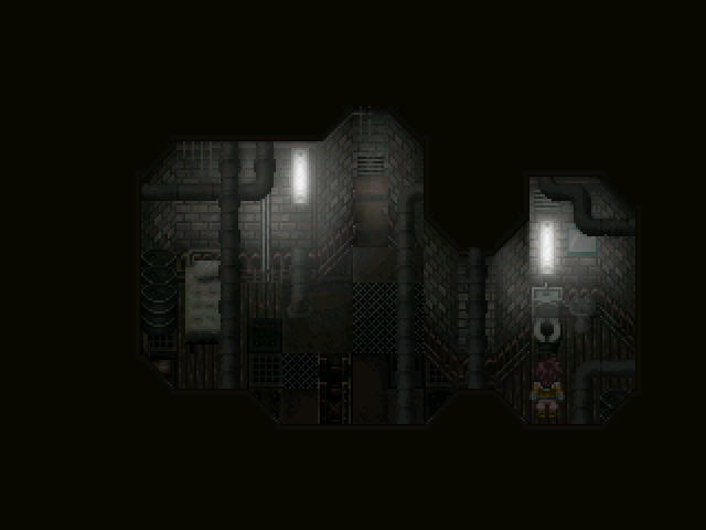
this prolly looks really good but alas, it is too dark. I realize that this monitor im using currently is pretty dark but y'know... it's almost pitch black in some places.
post=92543
this prolly looks really good but alas, it is too dark. I realize that this monitor im using currently is pretty dark but y'know... it's almost pitch black in some places.
It's because it contrasts with RMN's white site-skin. It will most likely look lighter and more visible in-game :).
It really is the white site skin- everything's actually quite visible in-game, even on a darker monitor. I also bumped the brightness up a tiny bit after taking this screenshot, so everything's easy to see comfortably. Once I add in a couple of other lighting effects, it will make things much easier to see than they already are.
I'm amazed rm2k3 can handle an overlay that size tardis. Looks lovely though, liking the really harsh white lights in the first screen.
Well, I might as well post something...

Something a little more light-hearted than most of my darker maps :/.
Something a little more light-hearted than most of my darker maps :/.

nickad - Great stuff. The light coming from the window looks awesome. The room itself looks very nice and the spider webs are a nice touch. I would love to see more screens from you.
tardis - Your mapping is great and I really like the attention to details, but (and I'm sorry if this is getting old)... too dark, mate. I can't see any details in the last screen you posted unless I highlight it. I even saved it and opened + zoomed it to full screen, and still, too dark.
I wanted to post some screenshots too but no time, gotta go. I will post them later. :-(


