


SUMMER SCREENSHOT SPECTACULAR!
Posts


@Skie:
Very nice, love the style as always. Those face pics seem familiar, I think I've seen them on a project of your's before; probably the same one? If so, looks like ya got a lot of progress since last time. c:

Underwater bubble mini-game WIP:
Very nice, love the style as always. Those face pics seem familiar, I think I've seen them on a project of your's before; probably the same one? If so, looks like ya got a lot of progress since last time. c:
Underwater bubble mini-game WIP:


@ Jakester: looks pretty alright but nothing really eye-catching. I think you should try some elevation and work on map interaction.


I made some progress, YAY!
First of all, I made some new sprite poses for dual-daggers fighting:


Second and more importantly, I finally added ranged skills to the ABS:


I had to re-write the whole skills system, but it's much better now and it's much, much easier to add a new skill now.
The next step is to add a ranged weapon. This shouldn't be so hard because I already set up the foundation for it with the ranged skills functions.
Unfortunately I'm going away for a week tomorrow so I won't be able to work on it until I get home... :(
--------------------------------------------------------------------------------------------------------------------------
@ Jakester - I like that screen, but It seems like the treetop tiles are taking too much space, and in that space the 16*16 grid is too visible. Maybe you should try to add more "levels" to the treetops, or even edit the tiles so they won't look so "gridy".
@ Reives - That really is an eye-candy. Looks fantastic. Are the underwater graphics original?
First of all, I made some new sprite poses for dual-daggers fighting:
Second and more importantly, I finally added ranged skills to the ABS:
I had to re-write the whole skills system, but it's much better now and it's much, much easier to add a new skill now.
The next step is to add a ranged weapon. This shouldn't be so hard because I already set up the foundation for it with the ranged skills functions.
Unfortunately I'm going away for a week tomorrow so I won't be able to work on it until I get home... :(
--------------------------------------------------------------------------------------------------------------------------
@ Jakester - I like that screen, but It seems like the treetop tiles are taking too much space, and in that space the 16*16 grid is too visible. Maybe you should try to add more "levels" to the treetops, or even edit the tiles so they won't look so "gridy".
@ Reives - That really is an eye-candy. Looks fantastic. Are the underwater graphics original?

Jakester, in addition to what everybody else has said, the two sprites you're using for big evergreen trees really, really clash. Pick one or the other, man :[

So it's been said that I'm all flash and no substance when it come to this stuff. This is my first true attempt to try and address that.
This is a test boss battle with the new battle system for Sacred Earth: Bonds REMAKE. I'm also using this to create a first time basic non-random boss strategy.
This boss has a set routine to lower your ice resistance with two ice spells, and then strike with a big ice spell for maximum damage, and finally heal afterwards. So you have to counter her ice spells with ice protection in between taking your own actions while finally still dealing enough damage to counteract her healing. If you slip up even once, you probably WILL die. Luckily I didn't in this video, but I lost once.
The key is to either strike at her weakness, which is fire, or whittle away at her Barrier and deal maximum damage.
As you can see, this is much more strategic than SEB1, off the bat. I'm hoping to keep stuff like this going and expand on this as I go. But I think it's a good first attempt for someone who's never really messed with making monsters do much more than random actions with different priorities.
post=96826
This boss has a set routine to lower your ice resistance with two ice spells, and then strike with a big ice spell for maximum damage, and finally heal afterwards. So you have to counter her ice spells with ice protection in between taking your own actions while finally still dealing enough damage to counteract her healing. If you slip up even once, you probably WILL die. Luckily I didn't in this video, but I lost once.
No Skie Fortress, you are supposed to be making your game easier, not harder! I played the earlier version of your game, and I never bothered beating it because it was too hard.

Everything's custom. Except for the water effect, if someone notices that anyway. I'll change that when I've mind to do that. =D
@Skie:
I'd like to watch that, but my internet connection is too slow.
@East:
This ABS looks really good! One question: what does the "false" mean? Oh, and like your mapping as well. Exactly the right one for fighting and moving.
@Jakester:
To fill up the screen with many treetops doesn't look really good, it would be better if you make another (maybe an unreachable) area under them. But as a map that is just there to walk through it, it is absolutely ok.
Edit:
Why do I always forget letters? >.>

@Darken:
That is strange, I saw the screen as I left that page. Maybe I did someting I cannot remember.
Also, that chipset and the setting were thought for a contest. The condition was a setting that consists of water mostly, that's the reason why there is water all around. Additionally, I took that grass and the mood as ground because it seemed to be more natural to me, and I wanted to create another game style, so that not everything is similar to most other games. ^^ But the reason why I show it already is that I do not have enough time left to end this game in the default time. Hmhh... I'll probably finish this project later.
And thanks for your positive comments!
post=96847post=96826No Skie Fortress, you are supposed to be making your game easier, not harder! I played the earlier version of your game, and I never bothered beating it because it was too hard.
This boss has a set routine to lower your ice resistance with two ice spells, and then strike with a big ice spell for maximum damage, and finally heal afterwards. So you have to counter her ice spells with ice protection in between taking your own actions while finally still dealing enough damage to counteract her healing. If you slip up even once, you probably WILL die. Luckily I didn't in this video, but I lost once.
But this is fair, formulated, method to madness difficulty! Not unbalanced, random, fake difficulty! D:
post=96897
But this is fair, formulated, method to madness difficulty! Not unbalanced, random, fake difficulty! D:
Just keep the attack patterns somewhat obvious ;)
@Skie: I think it looks challenging and fun, and not too difficult. I'd have to play it to fully understand the difficulty, but it didn't look too extreme to me.
Your character animations are excellent and fluid, Skie. I especially like the animation that shows when the enemy dies- nice touch there.
@cilence: I like that. I like that in many many ways. I, for one, did not immediately question the water/grass in his home. ;) Great style.
Now, something from me! Hopefully 2/3 of these screens will be a little different from the various town exterior shots.
I'm currently in the process of updating the interior tileset for my underground town.
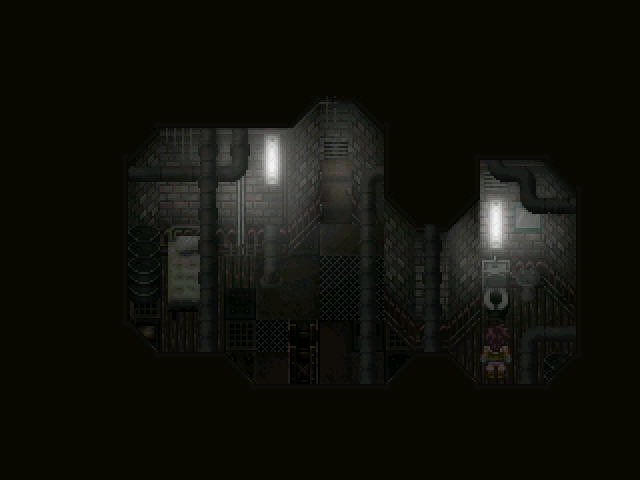
This is what it looked like before, keeping in mind, this is the most completed/only lightmapped interior map in the whole town. And yes, I did borrow the mirror from Muse, until I can make my own.
And this is a rough draft using the new tileset:
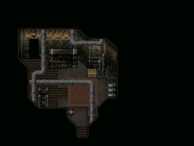
Note the lack of electric lights/wires. Decided a while back to do away with electricity in the town, as it would be very inappropriate for the steampunk setting I'm going for. Hence, everything is steam and gas powered. Yay, smog!
Also, as a side note, I need to fix a palette error that badly discoloured my metal-floor-plate-things.
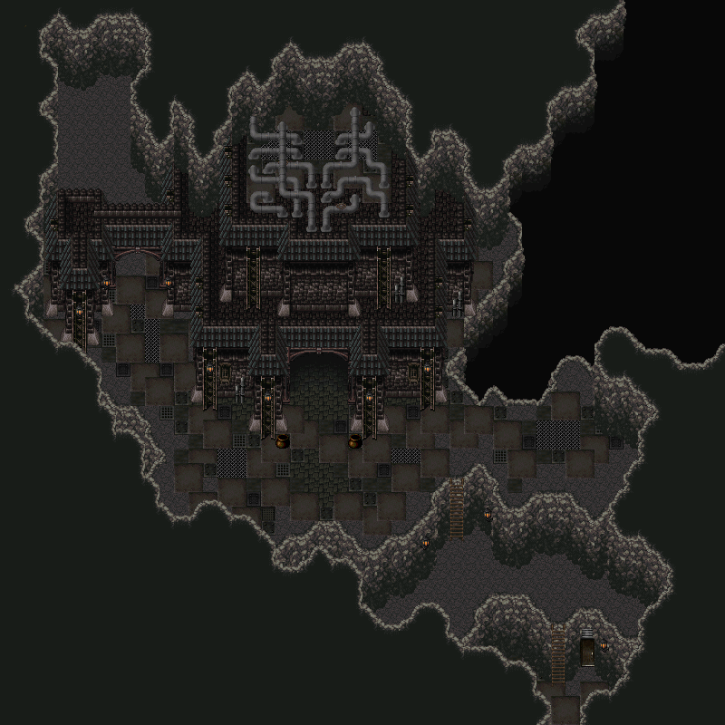
Below is my latest exterior work- this place is called the "Hall of Records," and it's the centre for important town meetings. It's also where genealogical records of everyone who's ever lived in the town are stored/recorded. The two pots by the entrance (I know they don't match the rest of the tileset- they're placeholders until I can sprite/edit new ones) are for villagers to drop stones into, representing a 'vote' on a town issue. Each villager has a stone with their own insignia carved into it, so there's no cheating. This is going to be an important gameplay aspect, as your character's vote can often swing town decisions and change the story. Oh, and the upper-left corner is unfinished- it's going to be an entrance to a cavern of some sort eventually. And what ever could all those pipes on top of the building mean?
Your character animations are excellent and fluid, Skie. I especially like the animation that shows when the enemy dies- nice touch there.
@cilence: I like that. I like that in many many ways. I, for one, did not immediately question the water/grass in his home. ;) Great style.
Now, something from me! Hopefully 2/3 of these screens will be a little different from the various town exterior shots.
I'm currently in the process of updating the interior tileset for my underground town.
This is what it looked like before, keeping in mind, this is the most completed/only lightmapped interior map in the whole town. And yes, I did borrow the mirror from Muse, until I can make my own.
And this is a rough draft using the new tileset:
Note the lack of electric lights/wires. Decided a while back to do away with electricity in the town, as it would be very inappropriate for the steampunk setting I'm going for. Hence, everything is steam and gas powered. Yay, smog!
Also, as a side note, I need to fix a palette error that badly discoloured my metal-floor-plate-things.
Below is my latest exterior work- this place is called the "Hall of Records," and it's the centre for important town meetings. It's also where genealogical records of everyone who's ever lived in the town are stored/recorded. The two pots by the entrance (I know they don't match the rest of the tileset- they're placeholders until I can sprite/edit new ones) are for villagers to drop stones into, representing a 'vote' on a town issue. Each villager has a stone with their own insignia carved into it, so there's no cheating. This is going to be an important gameplay aspect, as your character's vote can often swing town decisions and change the story. Oh, and the upper-left corner is unfinished- it's going to be an entrance to a cavern of some sort eventually. And what ever could all those pipes on top of the building mean?
some of the cliff-levels are really confusing; it might be the distance to it all but I can swear that almost all the cavewalls have the same height yet being on different levels. Sure, it still looks damn good but if there would be some way to correct this, the map might even make some sense!
Also, I don't think the metal-plating is that odd. It's a bit dithered but it doesn't really look that bad.
Also, I don't think the metal-plating is that odd. It's a bit dithered but it doesn't really look that bad.

stealing my graphicsss
And I agree with Mr. Nemo says, the wall edges are a little off-looking. Like, on the right edge, at the highest elevation there, the walls look alright. One ladder down, the walls feel like they should be double the height, etc. etc. I don't really work much with elevation myself, but yeah, it feels a little off. And in the back of the building too.
Anyways, that is pretty gorgeous. I literally feel inspired to go work on Muse now. Time to get to it.
edit:

This is kind of an old one, but I was just redoing the intro and I remembered this was the first line YDS wrote, and I decided to keep it.
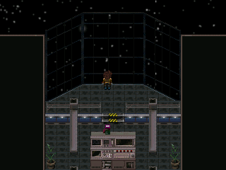
It's the bridge... Subtle fixes, and various edits. Now we just need the lighting, and perhaps I'll put a NPC in there too.
And I agree with Mr. Nemo says, the wall edges are a little off-looking. Like, on the right edge, at the highest elevation there, the walls look alright. One ladder down, the walls feel like they should be double the height, etc. etc. I don't really work much with elevation myself, but yeah, it feels a little off. And in the back of the building too.
Anyways, that is pretty gorgeous. I literally feel inspired to go work on Muse now. Time to get to it.
edit:
This is kind of an old one, but I was just redoing the intro and I remembered this was the first line YDS wrote, and I decided to keep it.
It's the bridge... Subtle fixes, and various edits. Now we just need the lighting, and perhaps I'll put a NPC in there too.

