


SUMMER SCREENSHOT SPECTACULAR!
Posts
The walls probably look odd in that you can see the entire map. The illusion of elevation is much more convincing in-game. I'm leaning on the assumption that the walls go 'up' diagonally in the dimension you can't see. Since RM's point of view is fixed straight-on, who's to say those walls don't slant up/have different heights on the parts you can't see (the sides)?
All of that bullshit aside, I'm going to touch the chipset up a little bit for this map, but mostly, I'm just calling it good for now.
I'm going to do a little work with the walls at sides along the top edge of the building, but any more is nonessential, as the player will never see that far up.
@AznChipmunk: I'm not a thief! I'm a treasure hunter. :P
I'm very against stealing resources, but as that was an alpha map that has since gotten the axe- I figured I might as well slap it on there as a placeholder so I could show the rest of my dev team the screenshot and have it look decent. By dev team, I mean one(1) other guy, of course.
The bridge looks great- the top of the wall edge looks weird against outer space, though. Would it be possible to have some part of the station visible outside the window? Speaking of which, that is one sweet window.
How is Muse coming? The demo really left me wanting more.
EDIT: New page, fuck me.

post=96949
@AznChipmunk: I'm not a thief! I'm a treasure hunter. :P
I'm very against stealing resources, but as that was an alpha map that has since gotten the axe- I figured I might as well slap it on there as a placeholder so I could show the rest of my dev team the screenshot and have it look decent. By dev team, I mean one(1) other guy, of course.
The bridge looks great- the top of the wall edge looks weird against outer space, though. Would it be possible to have some part of the station visible outside the window? Speaking of which, that is one sweet window.
How is Muse coming? The demo really left me wanting more.
I don't really mind if you use our mirror. =P Treasure hunt from Muse all you want... just obviously, don't use resources that are too obviously Muse. (Like our title screen and logos.)
I actually did notice the top part of the wall, and it does look odd. I think I will sort of extend the window into the side, and do some various other edits. Hopefully that will look better. I'll talk to YDS about it and see what she has to say too...
Otherwise... Muse's progress is just recently picking up again. YDS just left last week for the middle east, and she won't be back for 2 weeks -- 2 weeks in which I plan to redo some dialogue, add more, fix bugs, get the entire layout of the Vestel working, etc. etc. We've laid out most of the plot and written out the endings. Our plan is to finish by the end of the year! (Actually a year later than initially planned, but the game has been fleshed out and lengthened, instead of merely being a two month project.)
I've gotta get my college apps in, and then full speed ahead on Muse.
Edit:

Any better? I am cautious of showing anything outside the ship because I want to create a sense of claustrophobia, and thus not show anything that's not the interior.

This topic could use more Dego screenshots.

Just for completing the quest, every player earns a reward. If the party scores over a certain number of points, everyone gets a bonus reward. And finally, the player with the highest scores gets yet another bonus reward. Plus this quests gives out items not found anywhere else in the game.
Just for completing the quest, every player earns a reward. If the party scores over a certain number of points, everyone gets a bonus reward. And finally, the player with the highest scores gets yet another bonus reward. Plus this quests gives out items not found anywhere else in the game.
post=96955Any better? I am cautious of showing anything outside the ship because I want to create a sense of claustrophobia, and thus not show anything that's not the interior.
I really like this. Not only does it fix your problem, it totally matches the tone of the rest of the ship, and creates some nice directional flow in the scene towards the starscape. I'd say you're damn right to create a sense of claustrophobia- this is purely conjecture, but just from the demo, I'd hazard the guess that Muse, in terms of plot, is probably going the direction of intense player mindfuck. A sense of player claustrophobia coupled with game atmosphere will really escalate the emotions as you explore the cramped spaces of the Vestel, and the moments, like the one at the end of the demo (which was truly heartpounding and exciting, especially considering you're working with RPG Maker) will pique the player's emotion. After intense moments like those, I'm sure the player would gladly retire to the bridge of the ship to soothe the sense of claustrophobia and excitement. It's an already relaxing map, but after intense plot moments, I think it would be doubly so. That, and the botanical room to the south of the main hall (which really reminded me of the old scifi classic Silent Running- you should watch it, it would definitely help with inspiration/background study for Muse) seem like great places for the player to unwind.
Fuck, I need to review Muse.
... But I'm holding out for the full release. :D
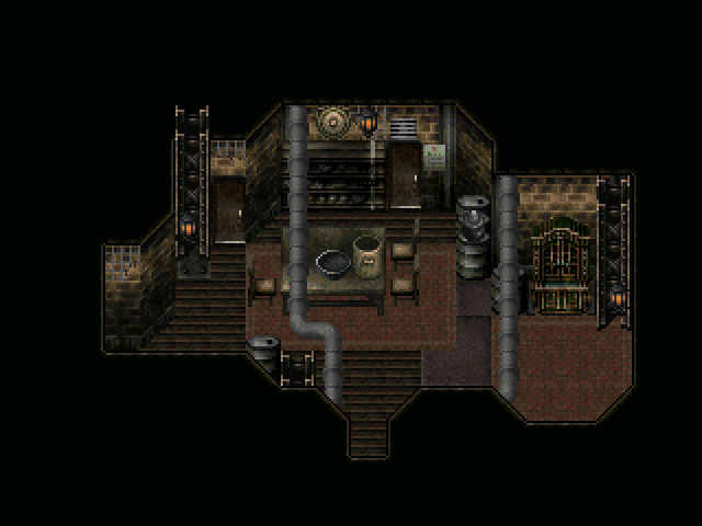
EDIT: Better, less-alpha-looking use of the new interior chipset. Still gotta make up some kitchen-stuff for the lower right corner.
Also, that table took me 10 minutes to edit so it was non-suikoden'd.
Ah, the little garden map is somewhat expanded, but I'll try to check out Silent Running sometime to get some inspiration. I also updated Muse's page a bit, with more of our story background... taking care to keep out any spoilers.
And that's a gorgeous map. The only issue I have, and it's a nitpicky one, is the oil strums seem to be a slightly different perspective. (It's noticeable on the one with the kettle sitting on top.) However, that's a pretty nitpicky thing and not major at all. I love the pipe thing you have going on.
And that's a gorgeous map. The only issue I have, and it's a nitpicky one, is the oil strums seem to be a slightly different perspective. (It's noticeable on the one with the kettle sitting on top.) However, that's a pretty nitpicky thing and not major at all. I love the pipe thing you have going on.


The Wanderer is not in either of those screenshots! WHAT IS HAPPENING!?
Seriously though, looking nice Craze. Whichever one of you two is mapping in Visions and Voices knows that they are doing. Good luck with the project.
Seriously though, looking nice Craze. Whichever one of you two is mapping in Visions and Voices knows that they are doing. Good luck with the project.
Karsu mapped the maps for the game's final cutscenes, but I did everything else. I actually made the village proper surprisingly quickly! VX is amazingly fast at mapping. I love it.
EDIT:
For the record, if it's gameplay or something you interact with (maps, menus), I set it up. If it creates the atmosphere (text, general feel, ideas, design) it's Karsu's work. I like to say "I made the game, Karsu made it interesting."
EDIT:
For the record, if it's gameplay or something you interact with (maps, menus), I set it up. If it creates the atmosphere (text, general feel, ideas, design) it's Karsu's work. I like to say "I made the game, Karsu made it interesting."
I have to say, Craze, I'm not a huge fan of the "look" of VX (I love me some 32-pixel tall sprites with nice jaggy edges at low resolutions. Mmm.) but you present it beautifully here. You just might bring me around. I especially like that cave- the atmosphere is killer. Also, I find something inexplicably hilarious about the term 'superior lock.' No idea why. In general, I love what you're doing, and you'd better damn well keep doing it, man! I'm going to reinstall VX just to play this beast, I think... Dialogue seems quality too- very distinct style, and it feels like it know's where it's going. Good job on that, Craze/Karsu.
One question- what exactly do you mean by 'feat?' D&D influence? Different name for a skill? Is this all explained in great detail on a gamepage I don't know about, ergo I'm wasting your time?
Like good holy shit, or shitty holy shit? D:
tardis bad at reading internet intent in text. ;_;
also, tardis are use too many emoticon, roflmaololwtfbbqdongs. :D :3 ;)
a grammar is i.
The pipes are my own pride and joy. Bonus point is they're as consistent as possible with the pipe locations on the outside of the houses. Too much damn work? I think not, good sirs.
You definitely have a point about the oil drums, though. And now that you've pointed it out, my perfectionist nature is starting to eat at me a little. I have some other ones I like from another tileset, maybe I'll transfer those over instead... Thanks for the critiquing, mate. I love it when people are nitpicky with my stuff- it's almost a fetish. D:
Wow, that sounded way less creepy in my head.
One question- what exactly do you mean by 'feat?' D&D influence? Different name for a skill? Is this all explained in great detail on a gamepage I don't know about, ergo I'm wasting your time?
Feldschlacht IV
holy shit, tardis
Like good holy shit, or shitty holy shit? D:
tardis bad at reading internet intent in text. ;_;
also, tardis are use too many emoticon, roflmaololwtfbbqdongs. :D :3 ;)
a grammar is i.
post=97046
And that's a gorgeous map. The only issue I have, and it's a nitpicky one, is the oil strums seem to be a slightly different perspective. (It's noticeable on the one with the kettle sitting on top.) However, that's a pretty nitpicky thing and not major at all. I love the pipe thing you have going on.
The pipes are my own pride and joy. Bonus point is they're as consistent as possible with the pipe locations on the outside of the houses. Too much damn work? I think not, good sirs.
You definitely have a point about the oil drums, though. And now that you've pointed it out, my perfectionist nature is starting to eat at me a little. I have some other ones I like from another tileset, maybe I'll transfer those over instead... Thanks for the critiquing, mate. I love it when people are nitpicky with my stuff- it's almost a fetish. D:
Wow, that sounded way less creepy in my head.
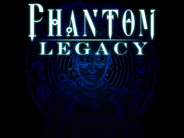
Spent a few hours some time revising my title screen again. Ended up with this.
Below is the old one for those who haven't seen it yet (and for comparison's sake).
Below is the old one for those who haven't seen it yet (and for comparison's sake).

Mainly because the guy in the first one looks like he has something up his ass, i prefer the second one.
Simplicity ftw!
Simplicity ftw!
Factory. If it's still too dark then my monitor must be too bright. Might also put some more detritus on the floor to make it look less bare.


post=97137
it's like a wall of black for me.
It looks a little better to me with my calibrated monitor, at the very least it doesn't have giant paintbrush blot lighting effects.

I can pick out enough of the details. plus it's not in motion.
nightblade the original title looks a bit more classy. you should use that.
nightblade the original title looks a bit more classy. you should use that.
I like the new one better. The one with the man gives off too much of a pixelated lolresized4RM* vibe.
tardis: Hang out in IRC/click my username to find Visions & Voices. Thanks for the compliments! I love the Hellspace regions, myself (the red cave areas). As for Feats, every day you get a certain number of actions that allow your party to push themselves further than normal, based on who you've recruited - Telia can pick locks, Ox can scrounge around and find amazing herbs, Lyla can pray to revive allies and confer a stat bonus for several battles, etc. You start off with 3/day and can find Featured Keys throughout the game that improve your maximum amount.
tardis: Hang out in IRC/click my username to find Visions & Voices. Thanks for the compliments! I love the Hellspace regions, myself (the red cave areas). As for Feats, every day you get a certain number of actions that allow your party to push themselves further than normal, based on who you've recruited - Telia can pick locks, Ox can scrounge around and find amazing herbs, Lyla can pray to revive allies and confer a stat bonus for several battles, etc. You start off with 3/day and can find Featured Keys throughout the game that improve your maximum amount.

I like the text on the old one. The new one looks too much like Heroes. Phantom Legacy - Save the Cheerleader!

