


SCREENSHOT DRAMA-RAMA!
Posts

post=105006
The reason why this is is because it's very likely that none of those friends, classmates, and random people that you've shown you game to know of the standard for games made by this community. It's easy to say 'Wow, this looks great!' if you have nothing to compare it to. However, us in the community have been making and playing games like yours for years, and we have seen some really great stuff. Stuff that frankly, blows your game out of the water. Here's some examples of some really great shit.
http://rpgmaker.net/games/1512/
http://rpgmaker.net/games/650/
http://rpgmaker.net/games/371/
http://rpgmaker.net/games/736/
http://rpgmaker.net/games/471/.
This made me really happy. Thank you.
EDIT: Dranart those face graphics are slick. I personally liked the look of the second one better, but the first is definitely more practical in terms of fitting in more text.

post=105019post=105014I'm sure you could have become a valued member of the community if you took what everyone said with a grain of salt.
Okay thats it i'm though, i'm through with this i'll just post my games and screens and won't say anything about peoples attacks on my game.
I'm done.....
Ness, I'm loving your art style. The orange is so nice on the eyes.
No i'm not leaving or anything i'm just going to post my screens and games without listening to haters.
And btw how can I take "your god awful screen shots" with a grain of salt?
I just want productive feedback thats all.

All of those posts were productive, your screen shots were god awful. The mapping isn't that great. The Mario and Luigi sprites you used classed horribly with everyone else. The Maps seemed far to open, and for no reason.
post=105024post=105019No i'm not leaving or anything i'm just going to post my screens and games without listening to haters.post=105014I'm sure you could have become a valued member of the community if you took what everyone said with a grain of salt.
Okay thats it i'm though, i'm through with this i'll just post my games and screens and won't say anything about peoples attacks on my game.
I'm done.....
Ness, I'm loving your art style. The orange is so nice on the eyes.
And btw how can I take "your god awful screen shots" with a grain of salt?
I just want productive feedback thats all.
I REALLY didn't want to continue with this stupid feud, but theres one question.
How are they haters? They may have been somewhat harsh, but they have in no way just outright insulted you...

Better quality screen shots!
I downloaded that one photo program and used it to better transfer my screenshots.
These screenshots come from my game "Dream Saga."
Most of these shots were taken during battle and I was using no spells, skills, or limits.
The New textboxes! (Hopefully they look better than the last one.... -__-

An enemy!?

That dragon's nice just don't wake him up

Fighting some beasts!

This boss took me 2 days to program and perfect so you better believe he's going to be epic.

This boss took me even longer but he's a blast to fight.

PLEASE LEAVE PRODUCTIVE FEEDBACK
Thank you
I downloaded that one photo program and used it to better transfer my screenshots.
These screenshots come from my game "Dream Saga."
Most of these shots were taken during battle and I was using no spells, skills, or limits.
The New textboxes! (Hopefully they look better than the last one.... -__-
An enemy!?
That dragon's nice just don't wake him up
Fighting some beasts!
This boss took me 2 days to program and perfect so you better believe he's going to be epic.
This boss took me even longer but he's a blast to fight.
PLEASE LEAVE PRODUCTIVE FEEDBACK
Thank you
Looks fine to me. However, since you have an ABS here it might be more productive to post a video of some of these boss fights in action.

@French_Dreamer:
screen 1: Those artworks are definitely 2 different styles (look at their eyes). And the diagonal wall on the right looks different from the other wall on the left. Grammar mistakes: ''You'', ''an'' and ''Knight''.
screen 3 and 4 have different chipset styles and the mapping on both is below average.
screen 4: You mixed RTP-style chars with Mario World chars and Paper Mario chars.
post=105042
@French_Dreamer:
screen 1: Those artworks are definitely 2 different styles (look at their eyes). And the diagonal wall on the right looks different from the other wall on the left. Grammar mistakes: ''You'', ''an'' and ''Knight''.
screen 3 and 4 have different chipset styles and the mapping on both is below average.
screen 4: You mixed RTP-style chars with Mario World chars and Paper Mario chars.
Yeah i'm working on the grammar but the face sets were hard as hell to find and edit so i'm keeping those.
Mixed graphics will be present thoughout this whole game, that is my intention.
Screen 4 is when the hero is in Mushroom Kingdom trying to help Mario save his world from nightmare.
The graphics and chipsets will constantly change, thats what will signify that the player has entered a new world.
Expect to see a lot of different video game worlds explored here.
Here are a few:
Final Fantasy 7
Final Fantasy 6
Super Mario World
Bomberman
Kirby
Pokemon
and many more....
I've got great chipsets and monster sprites to accomplish my goals of realeasing a unique game.
Thanks for your feedback!

A port town Lee visits on his journey. The town was made by LittleWingGuy, I just added in the NPC's and stuff.


Have you guys thought about redesigning that character? He's way too...blue. The color edit could be better as well, they don't match the style of the town screenshot.
@AFrenchDreamer: Since this is a screen shot topic, people focus all their attention on graphics. From experience I can tell that some people will be bothered by clashing graphics but this is a learning community so no one is expecting you to ditch that project and start over. My biggest problem with the screen shots is the hp/mp bars and the face above it. I'd say you should reduce their sizes and try something a little more fancy like you did with the other parts of the hud.
@LWG: Mapping is great but if you really want to make that look good you should do something to balance out all that green, maybe make the grass stand out more against the normal tiles. I have a feeling that it might look different in-game but thats just how that looks to me.
@LWG: Mapping is great but if you really want to make that look good you should do something to balance out all that green, maybe make the grass stand out more against the normal tiles. I have a feeling that it might look different in-game but thats just how that looks to me.

post=105006
http://rpgmaker.net/games/1512/
http://rpgmaker.net/games/650/
http://rpgmaker.net/games/371/
http://rpgmaker.net/games/736/
http://rpgmaker.net/games/471/
I can easily say that these games look leagues better than yours in almost every way for different reasons.
w-w-what
w-what about my gam

AFrenchDreamer, this is a post for you! Please read and take note!
Okay, I know I don't really comment in this thread much, but I think I need to get this off my chest. FIrstly, you have shown these screen three times now. That is two times too many. Usually people don't appreciate screen dumpage - one to three screens is fine, but most of these should be put on your gamepage instead. You don't need to repost the same shots on every page. If people want o comment they will, if not, then don't shove it in our faces.
Now, sure, the guys are being a bit grumpy with you. From my point of view it's understandable, though I'm sure you don't think so. So let me just put this out there for you. Some constructive criticism.
Your first screen: The whole sentence is pretty bad, but I understand that not everyone is great at english. That's fine, but perhaps you can ask someone for help in that department. As for the actual map, well, compared to some uses of the same chipset I've seen before it's not that great. There's far too much empty space (though that's really been covered by the face graphics.) You could cut that room in half and it'd work better. As for the faces, they really don't match the sprites much do they? I do like your message box, but maybe you can move the face pictures off screen a bit more so we can see more of the maps? They take up a lot of room.
Second Screen: I'm going to guess that this a dream sequence of some sort. I have no problems with that. The graphics are significantly different to those used in the last screen, but it can be hard to find the right chips to use for the scenes that you imagine. Despite the differences in graphics I have no problems with this screen, really.
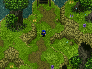
Third Screen: Okay so straight off the bat this one suffers from the last screens diagnosis - different graphical style. Now, with the dream one I could let it slide because dreams are supposed to be all kinds of fucked up, but this one, well, it's not like there are no outside graphics that suit the first style. There are a lot. Let's ignore the graphical difference for a moment, though, and focus on the mapping itself. The area is really bare. Like, really. If you've ever played the game they're ripped from you would see that the maps are pretty nice. Even with just a few items. This is the VGA version, but I assume you get the idea?

How to fix this? Well, again cut down on the size of the area, make things a bit closer together. Go have a look outside your window and count how many things you can see. Take a walk in the neighbourhood and see if there's two trees and a few pots. My guess - no.
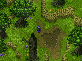
Fourth Screen: Great! This looks a lot better than any of your other maps. Why? Because there's something for our eyes to look at - details to take in. Most good maps have quite a few details in them so that our eyes and mind don't get bored looking at them whilst we move through them. If a map has few details then players get bored easily and aren't distracted from the logistics of playing, aren't getting immersed in the game experience. Details keep the player occupied and interested. Details keep you looking and enjoying. Of course, too many details can be too distracting. If I had to offer advice on this map I would say perhaps add a few more cliffs of differing heights.
Fifth Screen: Okay let me just say that I like the general hud that you have, though I will agree that it is a bit too large. I like the layout and the bars, but you could make them smaller and still have them looking great. I really don't have much to say about the mapping because it's a boss fight and you need to focus on the boss. Still, a bit of graphical quality can make a good boss fight into a great one, so perhaps experiment a little. Also, on another note, maybe add an indicator of how many items you have left? Even if it's a x3 or an overlap to show you have more than one. Other wise, yeah, not bad.
Last Map: Same thing about the hud. I like that his face changes. Hm, you can get away with the boat being a Golden Sun one but maybe look into getting a boat that fits with the graphics you use most.
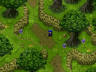
Okay, so to wrap up! From looking at the fourth shot it's apparent that you can map but that you're too lazy/can't be bothered to. If I were you I'd look into getting some consistant graphics happening. Either stick with the Golden Sun ones and learn how to use them or change to the other ones instead.
There's a little rule that most good mappers disdain, but that help new mappers out a bit. It's called the three tile rule. Basically, if you have more than three or four tiles of the same in a row you need to do a bit of redesign. I think this idea will help you a bit.
Also, take a look at other maps and check out a couple of games to see how they did things. Look for games that use the same chips as you for a start and see if you can't improve a bit. Think in the terms of 'what makes sense to go here' and try not to take it too hard when others tell you that they don't like your maps.
I must say that I've seen worse maps, but I would like to see how much better you can get through experience and listening to others.
Okay, I know I don't really comment in this thread much, but I think I need to get this off my chest. FIrstly, you have shown these screen three times now. That is two times too many. Usually people don't appreciate screen dumpage - one to three screens is fine, but most of these should be put on your gamepage instead. You don't need to repost the same shots on every page. If people want o comment they will, if not, then don't shove it in our faces.
Now, sure, the guys are being a bit grumpy with you. From my point of view it's understandable, though I'm sure you don't think so. So let me just put this out there for you. Some constructive criticism.
Your first screen: The whole sentence is pretty bad, but I understand that not everyone is great at english. That's fine, but perhaps you can ask someone for help in that department. As for the actual map, well, compared to some uses of the same chipset I've seen before it's not that great. There's far too much empty space (though that's really been covered by the face graphics.) You could cut that room in half and it'd work better. As for the faces, they really don't match the sprites much do they? I do like your message box, but maybe you can move the face pictures off screen a bit more so we can see more of the maps? They take up a lot of room.
Second Screen: I'm going to guess that this a dream sequence of some sort. I have no problems with that. The graphics are significantly different to those used in the last screen, but it can be hard to find the right chips to use for the scenes that you imagine. Despite the differences in graphics I have no problems with this screen, really.
Third Screen: Okay so straight off the bat this one suffers from the last screens diagnosis - different graphical style. Now, with the dream one I could let it slide because dreams are supposed to be all kinds of fucked up, but this one, well, it's not like there are no outside graphics that suit the first style. There are a lot. Let's ignore the graphical difference for a moment, though, and focus on the mapping itself. The area is really bare. Like, really. If you've ever played the game they're ripped from you would see that the maps are pretty nice. Even with just a few items. This is the VGA version, but I assume you get the idea?
How to fix this? Well, again cut down on the size of the area, make things a bit closer together. Go have a look outside your window and count how many things you can see. Take a walk in the neighbourhood and see if there's two trees and a few pots. My guess - no.
Fourth Screen: Great! This looks a lot better than any of your other maps. Why? Because there's something for our eyes to look at - details to take in. Most good maps have quite a few details in them so that our eyes and mind don't get bored looking at them whilst we move through them. If a map has few details then players get bored easily and aren't distracted from the logistics of playing, aren't getting immersed in the game experience. Details keep the player occupied and interested. Details keep you looking and enjoying. Of course, too many details can be too distracting. If I had to offer advice on this map I would say perhaps add a few more cliffs of differing heights.
Fifth Screen: Okay let me just say that I like the general hud that you have, though I will agree that it is a bit too large. I like the layout and the bars, but you could make them smaller and still have them looking great. I really don't have much to say about the mapping because it's a boss fight and you need to focus on the boss. Still, a bit of graphical quality can make a good boss fight into a great one, so perhaps experiment a little. Also, on another note, maybe add an indicator of how many items you have left? Even if it's a x3 or an overlap to show you have more than one. Other wise, yeah, not bad.
Last Map: Same thing about the hud. I like that his face changes. Hm, you can get away with the boat being a Golden Sun one but maybe look into getting a boat that fits with the graphics you use most.
Okay, so to wrap up! From looking at the fourth shot it's apparent that you can map but that you're too lazy/can't be bothered to. If I were you I'd look into getting some consistant graphics happening. Either stick with the Golden Sun ones and learn how to use them or change to the other ones instead.
There's a little rule that most good mappers disdain, but that help new mappers out a bit. It's called the three tile rule. Basically, if you have more than three or four tiles of the same in a row you need to do a bit of redesign. I think this idea will help you a bit.
Also, take a look at other maps and check out a couple of games to see how they did things. Look for games that use the same chips as you for a start and see if you can't improve a bit. Think in the terms of 'what makes sense to go here' and try not to take it too hard when others tell you that they don't like your maps.
I must say that I've seen worse maps, but I would like to see how much better you can get through experience and listening to others.

The above post is for AFD. Sorry it's so loooong!
:blush:
I don't really think RealmS belongs in a list like that! Not for a long while yet at least.
LWG: Have I ever mentioned that I really like those trees? I really, really like those trees! And the maps in general! You, sir, are great at using those Rudra chips. Yes, even the town ones. XP
NicoB: Nice. I love the little boat on the water. ^.^ The dialogue is pretty well done too.
post=105006
Actually, here's one thing I can say that might guide you in the right spot somewhat.
http://rpgmaker.net/games/1512/
http://rpgmaker.net/games/650/
http://rpgmaker.net/games/371/
http://rpgmaker.net/games/736/
http://rpgmaker.net/games/471/
I can easily say that these games look leagues better than yours in almost every way for different reasons.
:blush:
I don't really think RealmS belongs in a list like that! Not for a long while yet at least.
LWG: Have I ever mentioned that I really like those trees? I really, really like those trees! And the maps in general! You, sir, are great at using those Rudra chips. Yes, even the town ones. XP
NicoB: Nice. I love the little boat on the water. ^.^ The dialogue is pretty well done too.
post=105086
The above post is for AFD. Sorry it's so loooong!
post=105006
Actually, here's one thing I can say that might guide you in the right spot somewhat.
http://rpgmaker.net/games/1512/
http://rpgmaker.net/games/650/
http://rpgmaker.net/games/371/
http://rpgmaker.net/games/736/
http://rpgmaker.net/games/471/
I can easily say that these games look leagues better than yours in almost every way for different reasons.
:blush:
I don't really think RealmS belongs in a list like that! Not for a long while yet at least.
Yes it does. I've really enjoyed what I've played of RealmS.
It's me who's not sure why my game is on that list, let alone at the top. :/

