


SCREENSHOTS- 525,600 CHIPSETS
Posts

post=118132
You do realize that fog/gas is the intended effect, right?
No he obviously needs a reason to use that chart of his.

No, s/he doesn't ready any post that they aren't immediately quoting when responding to something in particular. And it's not a chart it's a graph- a histogram to be more exact.

Visuals should be organically approved, not approved with maths and graphs, unless it's a tessellation.


I assume it probably just goes like that for games that use pixel art and not any smooth pictures or anything. I dunno what the issue is though.
"This histogram shows that your screen uses pixel art". Actually mostly I just wanted to post that line. Pixeeellllllssssss.
@Ocean
Yeah, pure pixel art does that, there's nothing wrong with it. But the subject managed better softer ranges while still being a 2D game where the tiles and sprites were drawn with pixel art.
I posted an analysis of the subject picture I quoted because initially I felt the screen was a bit hard to focus upon and wanted to see what the problem was. Plus the lights in the image don't have the impact I think they should have, so I did a little bit of checking to make sure it wasn't just me.
If you see ocean's post you can see the screen is normally colored, not smashed too far the left or right. Also remember that a screen can produce results that lean to the left and right but still be visible, but there needs to be some sort of contrast. In the subject I was talking about, there exists no colors that are even half power for a map with at least a few lights which are supposed to be bright.
Yeah, pure pixel art does that, there's nothing wrong with it. But the subject managed better softer ranges while still being a 2D game where the tiles and sprites were drawn with pixel art.
post=118146I'm using it to objectively make statements so that they aren't due to problems you have in your personal monitor, eyes, etc. You cannot say my monitor is wrong or I need my eyes checked rationally if I provide some sort of evidence. I mean you don't have to analyze the crap out of your screenshots and be as artsy as you want, but I worry about whether or not things are readily visible or not for a video game. I kind of need objective evidence because I don't even trust my own monitor/eyes let alone anyone else's so that I can be sure of the results. Sure it may be visible to me, but how else would I know? This was all brought on because someone said my screens were too dark and while others re-assured me it was fine, I just wanted to be able to say they are within expected parameters.
Visuals should be organically approved, not approved with maths and graphs, unless it's a tessellation.
I posted an analysis of the subject picture I quoted because initially I felt the screen was a bit hard to focus upon and wanted to see what the problem was. Plus the lights in the image don't have the impact I think they should have, so I did a little bit of checking to make sure it wasn't just me.
If you see ocean's post you can see the screen is normally colored, not smashed too far the left or right. Also remember that a screen can produce results that lean to the left and right but still be visible, but there needs to be some sort of contrast. In the subject I was talking about, there exists no colors that are even half power for a map with at least a few lights which are supposed to be bright.

If his Rei's levels are screwy, then mine must be off the charts!
*check latest screenshot level in photoshop...*
Ohhh wow, it literally is off the chart :|...It looks like it will be yet ANOTHER battle between atmosphere and playability. This is really only a problem when I'm mapping caves, where having light sources from anywhere doesn't make sense. The light in my caves I try to make very intention and somewhat realistic? Well at least for a game where character's heads are a big as their torsos.
(yeah this is the one I checked in levels, and I can't imagine it being much better than the lava area)
raise your hand if you can't see anything =_=
Just have a higher ambient darkness value, but make the white much brighter. When you're somewhere dark, normally OK light sources would be brighter because your eyes try to get more light. Especially if you are a lighting purist and want caves where light comes ONLY from motivated sources. Something like this

Now that's a sexy cave.
Now that's a sexy cave.

I agree with wolf for that last shot; it is WAY more visible, and the effect works better as a result. Assuming, of course, there's a sun outside and not another cave.
post=118162
My eyes are bleeding
They're supposed to. Lava would also stand out much brighter than it normally would in a cave where everywhere else is so dark (except it doesn't have to be as bright as the sunlight hitting the floor, bouncing off the rocks and filling the room with ambient light.
I admire your willingness to have only motivated lights, so remember how light behaves in illuminating things:
http://en.wikipedia.org/wiki/Radiosity_%283D_computer_graphics%29
A little extreme for a 2D game, so just draw your game so that it looks like that. I'm personally a little less purist as I'll place dim ambient lights with no motivators to illuminate the important parts of any map.
Yeah, same. It may not necessarily need to be that bright, but I feel that's a big improvement over the original.

I forget if I posted this, so I'll just post this here.
I forget if I posted this, so I'll just post this here.

I actually quite like the original version of StormriderAngel's lighting. The subtle lighting gives off a dull, dark and gloomy atmosphere. These are RPGs people. Not everything is going to be realistic.
Edit: Ocean, there is something with the pavement in that screen that really irks me. I think it is the lack of definition (as in, most of the other objects have a darker version of a colour as an outline. As in, they have a higher contrast, whilst the pavement really doesn't stick out like the rest of the objects. I suppose it was intentional to highlight the difference between the ground and buildings, but it just seems a little off to me.
Edit: Ocean, there is something with the pavement in that screen that really irks me. I think it is the lack of definition (as in, most of the other objects have a darker version of a colour as an outline. As in, they have a higher contrast, whilst the pavement really doesn't stick out like the rest of the objects. I suppose it was intentional to highlight the difference between the ground and buildings, but it just seems a little off to me.
Yeah i see what they're saying but there neeeeds to be a comprise, because my eyes literally hurt after seeing that screen because the contrast is so high. I'm working on it right now.

Compromise: The hero carries a torch. Light!

Yeah.

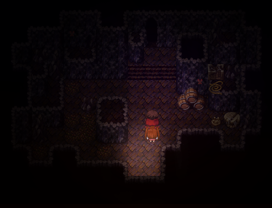
It's a cave with lighting effects! And fog! I made it in less than ten minutes because I felt like making a point, but I'm not sure what that point is. So, suck on that.
It's a cave with lighting effects! And fog! I made it in less than ten minutes because I felt like making a point, but I'm not sure what that point is. So, suck on that.

