


SCREENSHOTS- 525,600 CHIPSETS
Posts
post=118171I can see it perfectly. And this would vary, as mentioned, depending on the settings, calibration and type of monitors used by different people.
No it doesn't always have to be realistic. It just has to be visible.
Also, do take into account the fact that the site-skin is white, which does contrast with the image quite a bit, and may not be reminiscent of the actual result in-game.

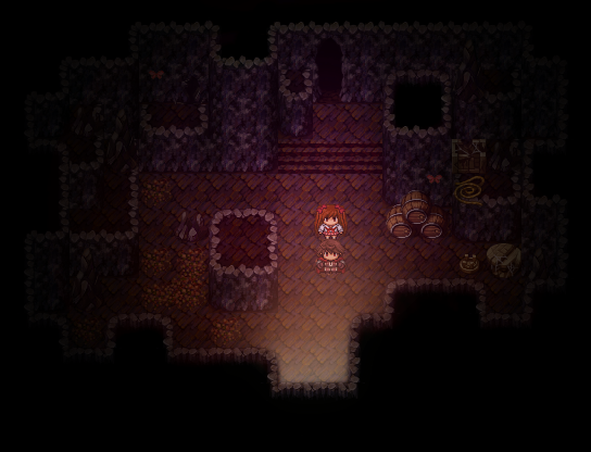
Edit: Ocean, there is something with the pavement in that screen that really irks me. I think it is the lack of definition (as in, most of the other objects have a darker version of a colour as an outline. As in, they have a higher contrast, whilst the pavement really doesn't stick out like the rest of the objects. I suppose it was intentional to highlight the difference between the ground and buildings, but it just seems a little off to me.
Yeah I did this on purpose. I like the sprites in particular to stand out. I sometimes have issues with the floors sticking out a bit too much so I want to avoid that. But yeah, the floor is there to not stick out and let everything else stick out instead.
post=118179post=118171I can see it perfectly. And this would vary, as mentioned, depending on the settings, calibration and type of monitors used by different people.
No it doesn't always have to be realistic. It just has to be visible.
Also, do take into account the fact that the site-skin is white, which does contrast with the image quite a bit, and may not be reminiscent of the actual result in-game.
If I have to (1) put my face up to my screen and squint or (2) turn the brightness way up (which by the way, I can't do since the brightness is already at 100%) it's not clearly visible. Plus the original poster posted it because it was extremely dark in the range of colors in terms of picture data in the first place.
Ohhh wow, it literally is off the chart :|...It looks like it will be yet ANOTHER battle between atmosphere and playability.
post=118179Let's not keep ruining the screenshot topic :P. On with the screenshots!
I can see it perfectly. And this would vary, as mentioned, depending on the settings, calibration and type of monitors used by different people.
Also, do take into account the fact that the site-skin is white, which does contrast with the image quite a bit, and may not be reminiscent of the actual result in-game.
Repeating what you said doesn't mean anything, but I'm all for posting more screenshots. If you don't want counter combos (long ones like in Disgaea) do not answer/challenge/rebut/refute me.

This is as much of a compromise that I can make,creating an overlay with that much contrast is a pain compared to just editing a flattened picture. To tell you the truth, I utterly hate the way it came out and am most likely going to ditch is for another style. I just don't think there's anything I can do to make us both happy, so here it goes.


post=118187
This is as much of a compromise that I can make,creating an overlay with that much contrast is a pain compared to just editing a flattened picture. To tell you the truth, I utterly hate the way it came out and am most likely going to ditch is for another style. I just don't think there's anything I can do to make us both happy, so here it goes.
This is really easy to do on an engine that supports alpha maps. You should reproduce a "flare" effect where the brighter the pixel in the original lighting map, the more visible it is. The problem is that the light just doesn't look like light. The overlay should be a full-range with pure black and pure white pixels. Then, in the game you can reduce the light intensity by simply adjusting the percent of transparency. I know XP and on supports alpha mapped PNG files. If you do this, note that the original color of the cave will not be effected in the black portions of the overlay, so the original cave picture should be as dark as you want light level 0 to be. Unfortunatly I don't know if VX (if that's the engine) has a blending option that does what you need apart from a typical transparency, so if all else fails just don't have quite as dark a cave. Remember, I can actually see every tile, but I have to strain my eyes and it will hurt trying to focus on the floor paths.
On the positive side, I think the reddish light you added improved the "feel" or "atmosphere" much greater than just having it simply too dark and this screenshot you have posted is still a vast improvement over the original.
I mean, in Oblivion, the caves aren't THAT dark.

Well it seems that I have managed to create an intelligent A.I. system for my ABS.
I get tired of seeing ABSs on the rpgmaker 2003 and other engines that have the player fighting alone.....so I decided to change that.
Keep in mind that this system is WAY FAR FROM COMPLETE and I still have a lot of coding to do.
Alright the partner keeps his distance from the enemy and uses his weapon when he feels necessary.
He will heal you, cast magic, and do other functions as well.
Please excuse the map...it is only a TEST MAP.
Next video I show I should hopefully have the ABS/CBS completey coded.....hopefully.
post=118186
Repeating what you said doesn't mean anything, but I'm all for posting more screenshots. If you don't want counter combos (long ones like in Disgaea) do not answer/challenge/rebut/refute me.
Oh, by repeating what I said, I was trying to emphasise that it would look different on all monitors. So, just because it appears darker on yours does not mean it would appear darker on others. So really, it's quite hard to please everybody. I've had the same problem when I've tried making games with lighting effects :(.
@StormriderAngel >> That does look quite nice. It has completely changed the atmosphere from a dull and gloomy cave to a... Well, it seems to give off (to me personally!) a feeling of Autumn and sedation. Though, it should be more visible to those that thought your previous screen was too dark.
@ Sweet Liar >> It looks nice. Though, my only criticism would be that message box displaying the player's information. The information doesn't seem to be centered in the box (as in, the left-hand side has more 'free' space than the right-hand side).
So really, it's quite hard to please everybody.
.. Which is why I added the part about the PICTURE DATA being too dark to begin with. Like I said, 64, 128, 192, and 255.
post=118192
...
...
What's so intelligent about the A.I.? I just see two people running around with oversized weapons landing hits on a rabbite they are clearly off center from with a screen cluttered with HUD elements that are too confusing for an action game. It's kind of hard to tell what's going on since the hit effects are crazy too. And what's with the bouncing enemies off the map on top of the wall facing random directions?
Plus the strict 90-degree limit is too akward and disorienting for an action game, in Star Ocean you can move all over the place in all 8 directions (and full 360 in the later games).
It's like a choice between pleasing myself, or pleasing everyone else XD.
When I first started making this game it was suppose to be a quick project just to say I've actually completed a game in my life, now I'm spending 3 bloody hours perfecting the lighting for one little 17x13 map! I really need to move on and kinda do this the way I want to, and I truly am sorry about that. What looks perfect to you guys seems painfully and sharply saturated with ugly blending. I hate to sound like I'm giving up here but...well yeah that's pretty much exactly what I'm doing ^^.
When I first started making this game it was suppose to be a quick project just to say I've actually completed a game in my life, now I'm spending 3 bloody hours perfecting the lighting for one little 17x13 map! I really need to move on and kinda do this the way I want to, and I truly am sorry about that. What looks perfect to you guys seems painfully and sharply saturated with ugly blending. I hate to sound like I'm giving up here but...well yeah that's pretty much exactly what I'm doing ^^.
The funny thing is that when your game is complete and people review it, the map will probably never even be mentioned.
post=118196
The funny thing is that when your game is complete and people review it, the map will probably never even be mentioned.
lol, I know right? Especially since the game is made up of multiple small maps rather than big ones, so there are already much better and more memorable maps made. I'm just gonna finish and move one with the game. Start programming the area the area enemies now.

@Wolfcoder: Yes the players are off center with the rabites because I coded the damage range for player weapons to attack a zone not in a unrealistic straight line.
And the A.I. is intelligent because it heals the player, stays away from powerful threats, and tries to exploit enemy weaknesses. (Which is very hard to do in rm2k3)
And yes the weapons are huge.....and thats the way I like it sawwy.
The HUD has not been fully explained and its not COMPLETE so its confusing right now. I'll clarify it later.
Rm2k3 ABSs do not have to have players attacking in a staight line. SWORDS ATTACK A ZONE....
I've managed to create something like Blizz ABS on the RM2k3 without scripting so i'm very proud of it.
LOL what I just said up there also adds to the A.I. intelligence and I didn't even realize it.
Your partner also can tell where he has to EXACTLY move to get the quickest most efficient hit.
An "Evention."
Yes the players are off center with the rabites because I coded the damage range for player weapons to attack a zone not in a unrealistic straight line.
Why?
And the A.I. is intelligent because it heals the player, stays away from powerful threats, and tries to exploit enemy weaknesses. (Which is very hard to do in rm2k3)
When in the video does that happen? I just see attacking.
The HUD has not been fully explained and its not COMPLETE so its confusing right now. I'll clarify it later.
Does it need to be visible all the time? Why can't the health bars be visible at all times, and everything else appears when you actually do things with it? Er... It's just that in most of the action RPGs I have played, the HUD nearly explains itself thanks to conventions and on-screen cues.
Rm2k3 ABSs do not have to have players attacking in a staight line. SWORDS ATTACK A ZONE....
Again, why?
LOL what I just said up there also adds to the A.I. intelligence and I didn't even realize it.
Your partner also can tell where he has to EXACTLY move to get the quickest most efficient hit.
An "Evention."
It must be AI so awesome it just looks like the AI is deciding to hit the enemy repeatedly and move around sporadically like a grunt from Halo.

