PIXELS
Posts
post=125440
Please post small version so we can edit :3

if that one is considered pillowshading then these two probably are too but I understand if you don't feel like editing them:


@Merkaval1: First off, you need to use A LOT less colors/shades. Shading does not = left to right gradient. The less shades you use, the more easier it is to distribute which is close and which is far (at least for a newcomer to spriting).

Take a look at good ol ken here (specifically his hot pants), he has just 2 orange colors for the light and dark of his legs (he also has 3 extra dark ones for the outlining but don't worry about that). Notice how thats all he needs to show that his legs are indeed bending and in a battle ready position. Your green dude in comparison has like 10 shades of green all in a very pillowshade/gradient fashion which doesn't give that cloth feeling very well.
Take a look at good ol ken here (specifically his hot pants), he has just 2 orange colors for the light and dark of his legs (he also has 3 extra dark ones for the outlining but don't worry about that). Notice how thats all he needs to show that his legs are indeed bending and in a battle ready position. Your green dude in comparison has like 10 shades of green all in a very pillowshade/gradient fashion which doesn't give that cloth feeling very well.
Yeah, in this case less is more.
read: http://www.gas13.ru/v3/tutorials/sywtbapa_almighty_grass_tile.php
read: http://www.gas13.ru/v3/tutorials/sywtbapa_almighty_grass_tile.php

the big problem I have is that I don't know how to do stuff like folds and creases and I haven't been able to find a decent tutorial for those, and without them all my pants look like they're made out of plastic. I tried again on the legs of the first sprite is this any better? The arrow is supposed to be the angle the light was coming from
You use way too many colors, you could just use 3-4 colors only with noticeable contrast against each other. It's late and I'm sleepy so here for now:

Rough edit but yeah, your colors needs some reducing and higher value+hue/contrast.
Oh and I added some muscles on him, I'm not sure about his pose but w/e

Rough edit but yeah, your colors needs some reducing and higher value+hue/contrast.
Oh and I added some muscles on him, I'm not sure about his pose but w/e
My internetz cut out so I had to entertain myself somehow :|
post=121130
France's hot, but your sprite's not.
Here's my version:
Schooled.
Sorry I know that was from the first page but that was an amazingly harsh burn and I just couldn't let it go w/o comment.
In other news we have some good pixel artists on here!
I told him to shade that sprite. Stay out of other people's jests. :D
Hey everyone, new to the site, here are my first two sprites I've ever done. There incomplete becuase I just recently found tutorials on spriting so I'm more than likely going to scrap these and start from scratch again.
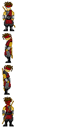
and here's an Assasin's Creed sprite I had just started.
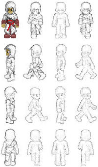

and here's an Assasin's Creed sprite I had just started.


Here's my first attempt at pixel art...and if there isn't a faster, easier way of doing this then it will probably be my last because holy crap that was way too much effort for not a lot of quality...but who knows? If not I'll just go with a celshades style like originally planned.
Stormrider, that's really good for a first attempt. Almost too good compared to some of the stuff I've seen. You're probably really good in art in general, right?
that looks really nice, chaos! i'm not so sure about the placement of the back arm- is it supposed to be in his pocket? it looks awkward. look at how far back his right arm is the other one's placement just doesn't make sense.
also, the centre of gravity is majorly throwing me off. it could just be the way his left (our right) leg is shaded, though.
also, the centre of gravity is majorly throwing me off. it could just be the way his left (our right) leg is shaded, though.


