PIXELS
Posts
wow that new page snipe could not have been timed better.
post=127182
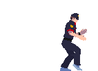
everybody comment on chaos's sprite

post=127197
that looks really nice, chaos! i'm not so sure about the placement of the back arm- is it supposed to be in his pocket? it looks awkward. look at how far back his right arm is the other one's placement just doesn't make sense.
also, the centre of gravity is majorly throwing me off. it could just be the way his left (our right) leg is shaded, though.
His pants are pretty baggy which doesn't help when trying to find his legs, for sure. His anatomy was drawn out beforehand, and then his clothes were sort of hung off of him to make them baggier.
As for his other arm, yes it's supposed to be in his pocket. It's supposed to be sticking out away from the viewer, so I should probably shade it darker still.
Anyway, CAMULOS
Not totally satisfied with his eyes but w/e.
Hope you don't mind, Chaos, but I had some free time and when I stumbled upon your sprite I decided to edit it a bit. Sometimes it's good to see how others would color your lineart, I know I like it when others do it to my sprites :) You can learn a lot from it. Anyway, here it is:

I didn't change any colors apart from adding a light gray and I didn't touch the lineart apart from removing internal blacklining.
I didn't change any colors apart from adding a light gray and I didn't touch the lineart apart from removing internal blacklining.

DE has some valid points on how to improve both sprites, but mostly the demon. First off, I recommend using color for at least most of your outlines; I used to be a staunch black-only guy until I realized oh hey that looks way better. Obviously, stuff like Mother sprites and Lennon's work fits a black-only style but HEY SIDETRACK.
Another, thing, chaos, is that that Adrian pops out more; there's more of a focus on the lighted areas, which makes it look more interesting. Camulos is very bland; he's just... purple-red. DE's extra highlights make it pop better.
Another, thing, chaos, is that that Adrian pops out more; there's more of a focus on the lighted areas, which makes it look more interesting. Camulos is very bland; he's just... purple-red. DE's extra highlights make it pop better.

I do mind if people don't give me a chance to say "Oh DE will definitely have a trick or two to show me, go right ahead sir".
That said, Adrian is a lot closer to what I wanted than the demon is - a hard black outline with a high-contrast fill and a minimum of shades.
Concerning the edit, that isn't quite what I had in mind for him (for example, the horns are part of the mask only, other such nitpicks). I'll dink around with it a bit and see what I get.
Took what DE pointed out and applied it while trying to stay within the style I set down for this project (Hard black outlines for everything, minimal use of shades, vivid colors). He's still not quite where I want him to be but it certainly looks a lot better - good lookin' out, DE.
JUSTICEPOST
Fine I'll edit. Jerks.

post=128331post=127042FUCK YOU
But today is not that day.
Well it's the closest thing I've gotten to feedback on that sprite so I'll take it.
The color choice of that sprites seems pretty solid but the body structure is hard to figure out. It also seems to be shaded in weird places


finally have free time to work on stuff for Chromatose again. this guy is yet another enemy. regal-icious!