


MAPPING TECHNIQUES (YES I READ THE OTHER FORUM FROM START TO FINISH)
Posts
There's about a hundred different ways to handle world maps.
When it comes to that give this topic a look http://rpgmaker.net/forums/topics/4585/
When it comes to that give this topic a look http://rpgmaker.net/forums/topics/4585/

Ah, see now I think (with regard to that topic you posted) I was using the region style, as both of those are regions of the bigger world. Not just smaller maps. Probably should have specified that.
Good advice so far regarding the size. In terms of aesthetics, everything is very square and devoid of detail. A long, flat surface is pretty boring to look at and navigate, and on natural surfaces such as cliffs or oceans it looks artificial, so try breaking it up a little. Try making the cliffs (at least I think they're cliffs) more jagged and broken.
A common rule of thumb is something called the "Three tile rule." Some people take it a little too seriously but it can be helpful for stuff like that. Basically an "edge" or surface should not go more than three tiles without a break, bend, turn, or curve, or something that breaks up the monotony. Obviously this isn't a hard, fast rule and it's not applicable to every situation, but it is a good start.
A common rule of thumb is something called the "Three tile rule." Some people take it a little too seriously but it can be helpful for stuff like that. Basically an "edge" or surface should not go more than three tiles without a break, bend, turn, or curve, or something that breaks up the monotony. Obviously this isn't a hard, fast rule and it's not applicable to every situation, but it is a good start.

also note this: the three tile rule works both ways! don't go too crazy with restrictive environments because it becomes annoying to try to walk through. generally allow the player at least a three-square tile area to move around in
Alright, still working on getting the hang of this, any other advice is still wanted and appreciated, anything to help out.
Edit: I'm gonna work on making a concept world map, just to see if I can get any better, I'll post it tomorrow after I'm done if you don't mind.
Edit: I'm gonna work on making a concept world map, just to see if I can get any better, I'll post it tomorrow after I'm done if you don't mind.

post=132409
I'll start by stating that your map is waaaaay too big.
start with small maps and work on making them look full. filling a 200x200 map with 80% of it being the same tile isn't good practise.
In fact this can be extrapolated to fairly ridiculous degrees.
I have found that the smaller a map is, the better it will look, no matter what. A 17 x 13 map will look better than a 30 x 20 map. A 3x3 visible section of a 17x13 map will look better than the whole thing being visible. I don't know why this is or what tick of the human visual sense causes this, maybe it's just me but this is my advice.
Build the smallest maps you possibly can.
I think there's a pretty good mapping tutorial around here somewhere by the way.
Ah yes Mertes. I thought he only did "How To" though, not what makes a map look good. In either case, alright, I'll make a 17x13 map and post it tomorrow and see how that looks.
When I said "build the smallest map you possibly can" I meant like, always, for life, not just like right now as an exercise. But either one is fine. : )
Remember that an even more basic practice than the three tile rule is:
1. Manufactured surfaces/objects use straight lines and rectangles.
2. Natural surfaces DON'T (there are few to no straight lines in nature). But don't go all crazy with sloppy tile vomit either.
When you post your 17x13 try and give us a step-by-step idea of how you went around it. Usually with the layer-based tiles, creating a map is largely procedural (i.e. first add the ground/floor tiles, water-if-applicable, ceiling tiles-if-applicable, and wall tiles, i.e. the TileA stuff, then the Tile B stuff, then the Tile C stuff, etc.).
Alright, since it was only a 17x13, didn't take as long as I expect, plus I just really got something in my head as soon as I re-looked over Merte's mapping tutorial.

First I began making the whole floor grass, mostly because I was trying to go for a whole "peaceful town" look, after that I decided I wanted to make a shop. Thanks to Merte for the type of room crafting, instead of making a separate map, instead putting the house just in the map with a doorway. Since, well, red is my favorite color, that's the roof I took. I made the walls small, mostly because I felt a bit confined with the 17x13
map. Next I made the road. I first made the road heading east, and then north. Before I made the road go east however, I decided I wanted to make the road north almost a kind of "grove". So I added some trees, that weren't to consistent with each other. I also added some shrubs/flowers/other plants, to give it more life and variability. Next is when I decided to make the road split to the South East. After I made the fork, I decided the player would probably want some help in finding their way. So I added the sign, which would technically have a event telling which way went where in a full game. Next I felt the lower part of the map needed more. So I added the fence to keep the player along the right track. Then I lined the backside with high grass, mostly because I felt that in a typical town, at the bounds the grass would be less kept together. Also I figured a town would need at least SOME water to survive. So I added the beginnings of a pond, along with a well from which they would probably draw water from. So I think that about sums up what I was thinking about...Wow. That took longer than it would normally take for me, but it's certainly the best map I've made so far.

That's a bit better now. However let's take into consideration a few things.
Would you REALLY want to build a fence like that? No. Fences are generally built straight except for a single 90 degree turn when they have a corner. Don't have the fence based on the road--base the road on the fence. Some other things: you don't have to force water in like that, although if you wanted to make water, it would look infinitely better if say, you had a river running through the town and a bridge over the river... something like that. The interior looks decent, can't say much more about it although it could stand to have some objects on the floor near the upper left or right. As for those trees, they are a bit too random and sparse. It's like some gardener accidentally spilled some seeds. Typically I'd imagine in a town (unless it's a forest town) that the trees should be more even unless they are trees on the edge of town. The darker grass on the bottom is a bit blocky and the little square that juts out looks odd although if you fix the fence that should be gone.
Just to link some samples of good mapping... Mapped by YDS. These aren't VX they are 2k3, but they are done with REFMAP chipsets which people typically look down upon. However she received praise for her mapping here because she is one of the few people who know how to use REFMAP well!
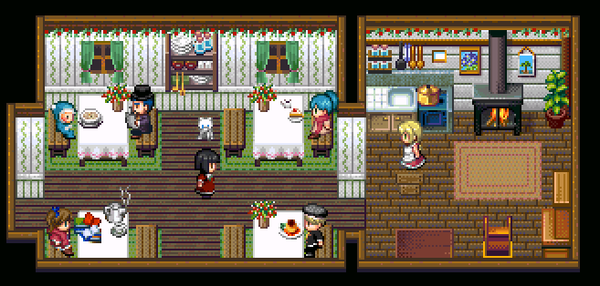


These maps are tiny and compact and were able to create a "cozy" feeling. They are actually cut out from a 20x15 tile map (although the rest is just black/darkness so that's why it's cut.)
Another example of good mapping except in VX is Ill Will.


Looking past that there are lighting effects, this mapping is always size-relevant, aka small and compact. Areas where you can walk are small and there is enough detail to be detailed without being cluttered.
A good way to learn really, is to look at other maps that are pretty. Emulate formations, styles, and whatnot, until you get a hang of the reasons other maps look good. And it's a process! I'm not a bad mapper myself, although I wouldn't call myself a "mapper." It's just something I've gained from working with maps a lot and looking at other peoples' maps.
Would you REALLY want to build a fence like that? No. Fences are generally built straight except for a single 90 degree turn when they have a corner. Don't have the fence based on the road--base the road on the fence. Some other things: you don't have to force water in like that, although if you wanted to make water, it would look infinitely better if say, you had a river running through the town and a bridge over the river... something like that. The interior looks decent, can't say much more about it although it could stand to have some objects on the floor near the upper left or right. As for those trees, they are a bit too random and sparse. It's like some gardener accidentally spilled some seeds. Typically I'd imagine in a town (unless it's a forest town) that the trees should be more even unless they are trees on the edge of town. The darker grass on the bottom is a bit blocky and the little square that juts out looks odd although if you fix the fence that should be gone.
Just to link some samples of good mapping... Mapped by YDS. These aren't VX they are 2k3, but they are done with REFMAP chipsets which people typically look down upon. However she received praise for her mapping here because she is one of the few people who know how to use REFMAP well!
These maps are tiny and compact and were able to create a "cozy" feeling. They are actually cut out from a 20x15 tile map (although the rest is just black/darkness so that's why it's cut.)
Another example of good mapping except in VX is Ill Will.
Looking past that there are lighting effects, this mapping is always size-relevant, aka small and compact. Areas where you can walk are small and there is enough detail to be detailed without being cluttered.
A good way to learn really, is to look at other maps that are pretty. Emulate formations, styles, and whatnot, until you get a hang of the reasons other maps look good. And it's a process! I'm not a bad mapper myself, although I wouldn't call myself a "mapper." It's just something I've gained from working with maps a lot and looking at other peoples' maps.
Yah, I was looking at Ill Will, the other day and my jaw dropped. The maps were awesome. Alright, I'll give it a shot. By the way, how often do you normally have a total wipe of game information, because now on this game I'm up to 3 for redoing maps.
These maps are tiny and compact and were able to create a "cozy" feeling. They are actually cut out from a 20x15 tile map (although the rest is just black/darkness so that's why it's cut.)
This is what I meant about the "smaller = better" thing being taken to an extreme and still unfailingly working.
Also, I'd just like to add that your mapping skills would benefit if you take a few minutes before each map (or series of maps) planning it/them. For instance, in a village-esque setting, think of key questions such as - What is the state of this village? How large is it (population and landscape-wise)? Why was this village/town constructed here (perhaps it has a affluent water supply, or is in close proximity to a forest that has an abundance of wildlife for hunting?)? What formation will it have? Why? Essentially, a lot of these questions will be 'why?' (but you don't need to go into great detail! Just a little something to make your maps seem a little more realistic or make sense).
It would also be beneficial to, in some circumstances, do a little research on the naturally occurring phenomena in life. For instance, if you're about to map a forest, do a little research (this could involve simply looking at real-life images to base concepts off, etc) as to how vegetation grows - such as growing in clusters and abundance around water supplies, or perhaps shriveling due to lack of exposure to the sun.
Though, it's not always necessary to do this, but it will allow you to understand how things work and applying this to your maps :).
Edit: Although this may seem contradictory to what I have just said, not everything in your maps need to stick to realism (such as if you were doing a sci-fi genre or you have GLOWING PLANTS OF DOOM AND JUSTICE).
One of the biggest things that helps me in regards to laying out maps is always to make sure I ask myself how big a room should be in relation to the sprite itself. For example, think of your own bedroom. How many "tiles" would you say your own personal bedroom is? How many steps does it take to get from one end to the other? Usually maybe 4 or 5 steps. So your bedroom is maybe 4 or 5 tiles across.
post=132478To add to this, take into account the socio-economic status of the resident, and adjust the size of the bedroom accordingly (obviously, someone whom is quite well-off may have a larger house, hence a more spacious room).
One of the biggest things that helps me in regards to laying out maps is always to make sure I ask myself how big a room should be in relation to the sprite itself. For example, think of your own bedroom. How many "tiles" would you say your own personal bedroom is? How many steps does it take to get from one end to the other? Usually maybe 4 or 5 steps. So your bedroom is maybe 4 or 5 tiles across.
Edit: Also James (I'm just assuming you're a James), don't be deterred by a lot of the things that people are saying to consider before beginning on your map. We're just getting into great detail about these things, that is all.
Why is there a well next to a pond/lake/sea?
Why is there a sign in the middle of the road?
Others have already commented on the fence.
Why is there a sign in the middle of the road?
Others have already commented on the fence.
post=132478
One of the biggest things that helps me in regards to laying out maps is always to make sure I ask myself how big a room should be in relation to the sprite itself. For example, think of your own bedroom. How many "tiles" would you say your own personal bedroom is? How many steps does it take to get from one end to the other? Usually maybe 4 or 5 steps. So your bedroom is maybe 4 or 5 tiles across.
I can't take more than one step in my room without having to navigate around an obstacle that would be impassable in RM.
My room is really poorly mapped. : (
Well. I'm in the same boat as Max here, my room is FAR to messy to navigate. And ya, thanks for the extra advice, I'm thinking about scrapping my whole project and making a short game based around completing quests for a small village just to get some extra mapping experience in a smaller setting. Wait, should I modify the map I posted to specifics you guys have stated and see how that does? I'm trying to get a system down here so I don't end up screwin up again.
P.S. to Nickdad, yah I'm James. I figured I'd use my more obvious nickname considering I planned on doing more talking here than posting. I coulda been Zencurse haha.
P.S. to Nickdad, yah I'm James. I figured I'd use my more obvious nickname considering I planned on doing more talking here than posting. I coulda been Zencurse haha.

Ok so here's my second shot at this. I took out the sporadic trees and plants in favor (hopefully) of a more controlled tree environment. I attempted to make the trees as conformed, yet not conformed for being nature, as possible. As the villagers would probably cleared the trees to make the road, yet again, as you guys stated, nature isn't in blocks. As for the sign, I moved it off to the side of the road, in hopes of not blocking passage. I still felt as if the village/house need SOME source of water, so I put the pond instead on the east side without a well. I again placed tall grass where the pond used to be, trying to fill in some space, attempting to be not as conform as possible again. I also added the child near the pond, as the village needed to feel more alive than just a lone blacksmith living here.

