DOING IT! - WEEK FIVE
Posts
I like that narcodis. A lot.

Obligatory map go go go~
As long as it keeps on topic I'm fine with that, though more discussion about what a map should be/have and how you go about mapping is highly encouraged - wink wink.
^.~
As for me, I tend to start with the lower layers and build from there. First I lay grass and water tiles, then dirt and paths. Once I get them how I like I'll add buildings, plants and cliffs, then more plants. Give it a playthrough to make sure everything works and all the edges are blocked off* and fix anything that needs fixing. Of course that's for outdoor maps. Inner mapping is a bit different, as is city mapping. I like adding height to cities.
*A question for all mappers out there. Do you make your map transition areas in certain spots or all around the map itself? I tend to stick to paths and try to make the edges match up with the adjoining map. You?
I also have a question about mapping: Do you like to map your adjoining areas (door entrances, stairwells, paths, etc.) so that when the player exits an area and enters the next one, he/she faces the logical direction or a whole other direction? Personally, I find the latter unorthodox and somewhat confusing.
In my book, if you face down when you leave an area, you face down when you're in the new area. unless it's something like an elevator or a rope going down a hole kind of thing.
Pretty much what Liberty said. Cameras/Perspective usually shouldn't change during area transition to avoid confusing the player.
Thanks for your replies, Liberty and GRS. It confirms that it is normal for me to feel awkward when see that sort of thing.
Another thing related to maps that intrigues me is the following: How do you test whether your map works as you expect it?
As a game player, I always try to the extent that I can to see whether things work as they are supposed to in the map and sadly, once in a while, find, for example, that something that is supposed to be lying on the floor, when I walk to it is actually floating in the air over my head or that something that looks like a wall or an object you can actually walk through as if you were a ghost (by this, I don't mean when there's a hidden room or treasure behind it for the wall). The interesting thing is that the map looked OK at first glance.
Test play, test play, test play. That's all there is to it. And if you can get someone else to do it for you every now and then, go for it. New eyes catch things that 'old' eyes missed. Or something.
LockeZ

I'd really like to get rid of LockeZ. His play style is way too unpredictable. He's always like this too. If he ran a country, he'd just kill and imprison people at random until crime stopped.
5958
You know what I did to my game's maps that was great? I got rid of all the one-tile staircases, and all the horizontal doors to other maps. I'll give you some shitty RTP examples of what I mean, since the shitty RTP tilesets are some of the only ones that are dumb enough to even include this kind of staircase...
One-tile staircases are just universally unappealing. I can't think of any reason to justify their existance. "Fine" here is relative, since my uncreative use of RTP resources can hardly be called acceptable, but it's a perfectly good staircase at the least.

Horizontal exits are okay in towns where you go off the edge of the screen to get to the next map, but when it's a door in a building or cave? Terrible. Even worse if your character is two tiles tall and the southern wall covers the lower half of him, and thus also covers the actual exit, leaving only the wall behind it visible. It does not look even like an exit when you do that. Either that or you have to make the exit two tiles tall. The downside of getting rid of horizontal doors is obviously that you are limited to north-south doors. But it still looks infinitely better, and it doesn't really impede the function of your maps at all.

Such simple things. You wouldn't think they would matter, as long as you keep your style consistent. But they do. They somehow make the maps feel much less polished.
One-tile staircases are just universally unappealing. I can't think of any reason to justify their existance. "Fine" here is relative, since my uncreative use of RTP resources can hardly be called acceptable, but it's a perfectly good staircase at the least.

Horizontal exits are okay in towns where you go off the edge of the screen to get to the next map, but when it's a door in a building or cave? Terrible. Even worse if your character is two tiles tall and the southern wall covers the lower half of him, and thus also covers the actual exit, leaving only the wall behind it visible. It does not look even like an exit when you do that. Either that or you have to make the exit two tiles tall. The downside of getting rid of horizontal doors is obviously that you are limited to north-south doors. But it still looks infinitely better, and it doesn't really impede the function of your maps at all.

Such simple things. You wouldn't think they would matter, as long as you keep your style consistent. But they do. They somehow make the maps feel much less polished.
LockeZ

I'd really like to get rid of LockeZ. His play style is way too unpredictable. He's always like this too. If he ran a country, he'd just kill and imprison people at random until crime stopped.
5958
Coming up with interesting dungeon themes was hard for me at first. Often anything you want to do seems dreadfully overdone. I found that combining two common types of dungeons can be surprisingly helpful. A cave map or a desert map is completely boring, but if you make a desert cave then suddenly your area is energetic and colorful. The player passes back and forth between two motifs, keeping the area from being repetitive without feeling like they are being thrown around at random. It also forces you to keep from making the different parts of the area the same, and also keeps you from making another very similar area later in the game, both of which are quick and easy for the designer but very boring for the player. Here's a section of a forest ruins map from Vindication that illustrates my idea. Though I only show the outdoor area here, the indoor parts of the ruins have constructed openings and broken walls that let you see the forest outside.


Wow man, why is everything so spaced out and empty? Too much empty space everywhere. Make everything more compact and a bit smaller. Add some trees, some detail or something as well.
That balcony's implied physics bother me muchly.
The biggest thing I always try to keep in mind is the size of a character against the size of their environment.
Lockez: I definitely agree with you on the staircases, and never really thought about that specifically before; however, I respectfully disagree on the horizontal doorways.
Lockez: I definitely agree with you on the staircases, and never really thought about that specifically before; however, I respectfully disagree on the horizontal doorways.
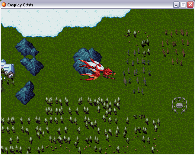
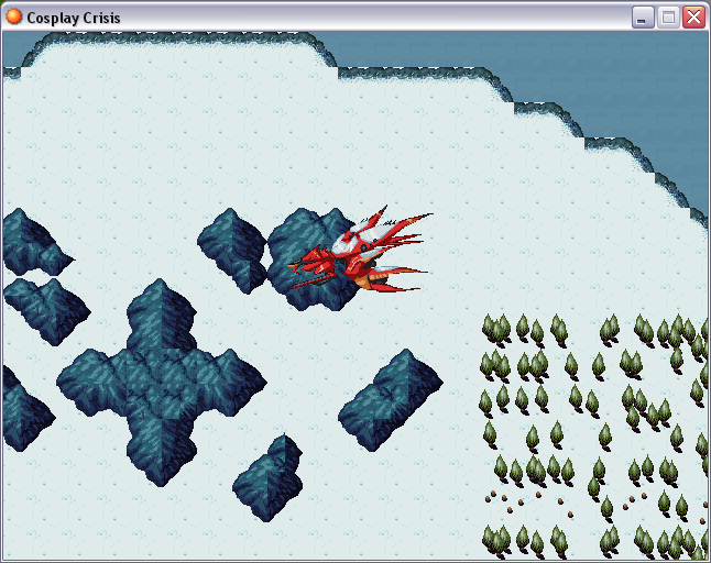
I'm finding it really hard to make my world map interesting (with lots of TILE VOMIT :V) and not make it completely unnavigateable. For example, you can walk through forests on foot, but you can't walk through mountains (some areas you have to wait until you get the above airship to get through). This doesn't exactly make a big difference to those who just browse with an airship once it's obtained, but some want to get encounters, find areas, examine random things, and I have to make sure I make it interesting for those players.
Also:
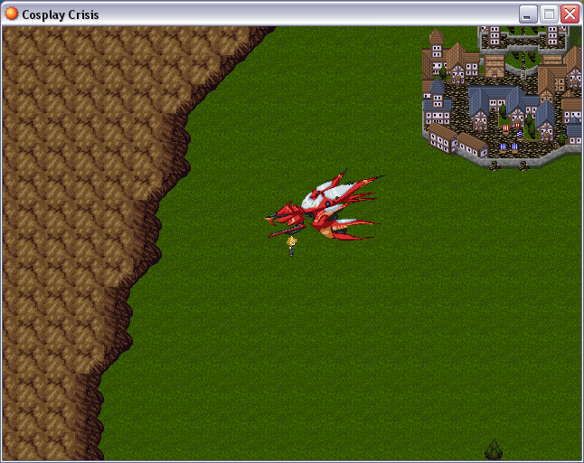
THE FF7 FANS WEEP (example of my crappy enviroment mapping :3)
Yes :<
How can you tell :V
/sarcasm
How can you tell :V
/sarcasm
I played around a bit with Gimp effects and made two "world" maps (Theodore map --> reduced size --> played with Gimp effects --> putting a few light effects over it)
Daytime:

Nite:

@Ocean:
@Dratio:
@narcodis
@Locke
@Sorceress:
Daytime:

Nite:

Eppicness! Especially Map 2.
@Dratio:
SEEMS great, but it's too tiny. Can't see anything. :-O
@narcodis
The chipset is awesome, especially the water! But the grass is a bit too edgey and the char sucks. His hair need a brighter border, but I would prefer a heavier edit of the whole sprite since it is 2k-RTP standard. But pleasant interface.
@Locke
You can get WAY more out of the RTP. Even the "fine" screens are way too empty. Problem are the floors. Needs more different floor styles. Also the walls need more stuff.
The Refmap outdoor map is DAMN empty!
The Refmap outdoor map is DAMN empty!
@Sorceress:
Cliff edges on screen 2 are missing... the conjuncting tiles. On screen 3 the mountains look weird. Something wrong with its autotile? Also I would add more different ground types to all the screens.
This has become the new screenshot topic.Shhhh!!! >:-O Or it will getting closed.... ;-(
Trying to get better at mapping with the VX RTP; not sure if it's working!
Here's the boss floor of one of the dungeons from my current project, sans enemies and treasures (but with shopkeeper because she's cool):
Something about the stair tile denoting vertical movement in that direction bothers me, but I'm not sure how else I'd indicate it. I dunno! I always have trouble making the VX RTP look good at all so any tips are welcome :<
LockeZ

I'd really like to get rid of LockeZ. His play style is way too unpredictable. He's always like this too. If he ran a country, he'd just kill and imprison people at random until crime stopped.
5958
The top of the waterfall looks weird. I'd make that wall go higher, and draw a hole in the wall that the water's coming out of.
Does the VX RTP not have diagonal walls? Yuck. You might invest in finding or making some.
If you dislike the stairs because you want the cave to look natural rather than man-made, use a ramp instead:

Does the VX RTP not have diagonal walls? Yuck. You might invest in finding or making some.
If you dislike the stairs because you want the cave to look natural rather than man-made, use a ramp instead:

Oops, thought I removed the spray from the top of the waterfall coming from above; it's coming down from a higher level, not out of the wall. I agree it looks strange though, I'll try to do something about it.
There's no diagonal walls in VX, no.
The RTP doesn't really have ramps but I guess just making the floor tile continue could work? I mean it's kind of obvious that it's supposed to indicate a height difference anyways, considering the walls get shorter, so I don't think it would confuse anyone.
Thanks LockeZ!


