


THE SCREENSHOT TOPIC RETURNS
Posts


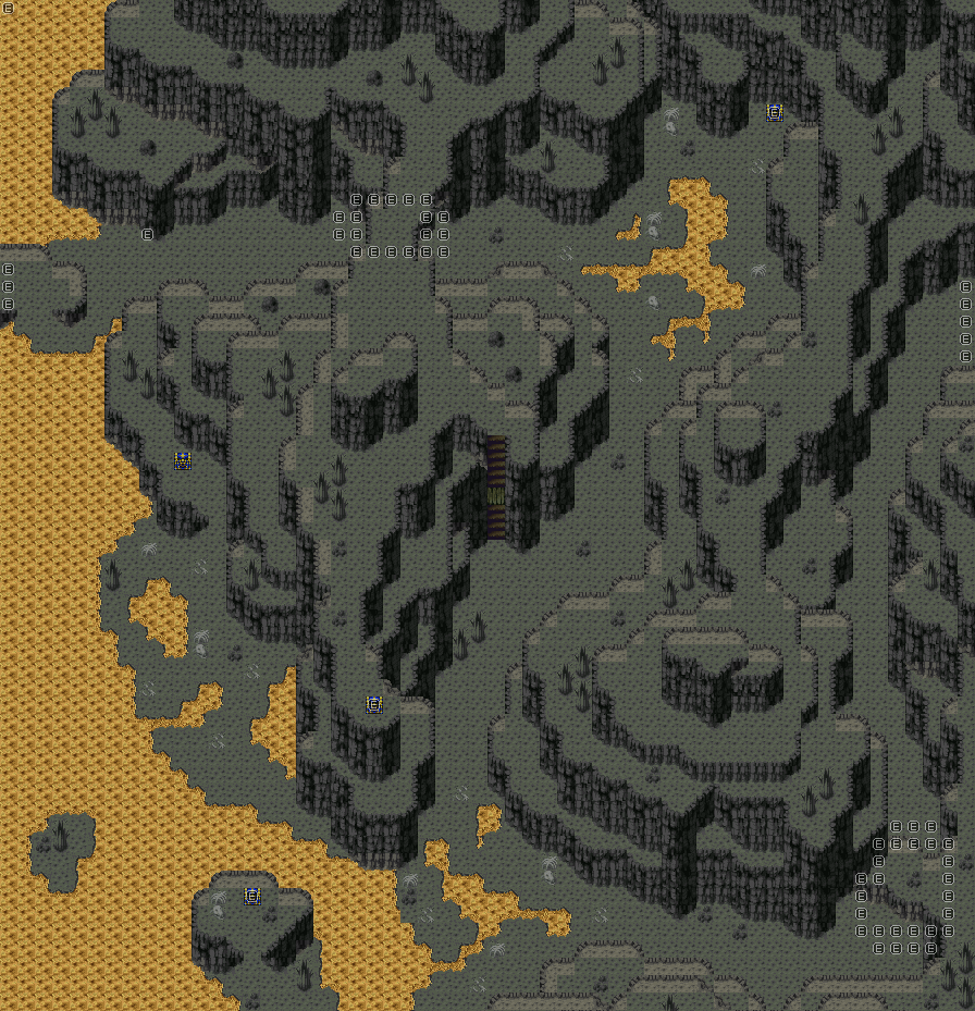
30x30. Only works I think because I don't need to deal with multiple floors like in the rest of the cave.

Trujin
@Craze: Nice dungeon as said. Btw, could you tell me what happened to this in a far past?

dude
i remember making that but that's about it. wow.
THE CAT'S OUT OF THE BAG, KIDS
I USED TO DO CBSs IN RM2k3
I (extremely sadly) never released it, but I once made a really unique CBS with 100% original graphics and full-on animations for each character attack, like a simpler version of Xenogears. Maaaaan. I used to be so young.
author=Xenomic
30x30. Only works I think because I don't need to deal with multiple floors like in the rest of the cave.
Much better! It looks better if you condense it like that.
author=Craze
dude
i remember making that but that's about it. wow.
THE CAT'S OUT OF THE BAG, KIDS
I USED TO DO CBSs IN RM2k3
I (extremely sadly) never released it, but I once made a really unique CBS with 100% original graphics and full-on animations for each character attack, like a simpler version of Xenogears. Maaaaan. I used to be so young.
Haha well you actually posted a screenshot of this game some years back asking what we thought about the interface. After that I made you that little interface where this screenshot derived from. I'm staring at my "produced resource" folder at the moment with the used fonts and grahpics in them XD.
And that was why I actually wondered about it ;).
author=Arandomgamemaker
Much better! It looks better if you condense it like that.
Now the thing is (yes, I looked at some of my other maps and some of them are dreadfully bad, even I admit that), is that if I wanted to cut down the size on other maps, I'd...have to do that for like 500 maps. Which I'm totally not going to bother trying to do right now, I'd rather get the game at least, ya know, DONE storywise and all that jazz...maybe later, unless I get someone who'd be willing to cut down on the size of the maps or something...

Left is old, right is new. I decided to go back and fix up some maps at least...though that's gonna be a chore. 500 maps is far too many to do this with ;_;
Sorry for junking up this thread with all of my replies and screenshots and whatnot. >_>;;
EDIT - One more for the road.

It's 80x80 and I'm trying to make it smaller...somehow. It got edited a bit, but this is the original map right now. Just...ugh. x_x;

While I've been avoiding this thread, since I'm not ready to post anything from the current project at this time, I'd like to 'chime in' about map sizes, since it's a subject near and dear to all of us.
I have noticed that new map designers tend to make areas far larger than they need to be. I've done this too, and my rationale was generally 'I'm not sure how big this area needs to be, so I'll give myself lots of room'. That may sound reasonable, except of course that I ended up expanding the area to fill the full space, resulting in a barren, uninteresting map. Even professional game designers today can make this mistake.
I find the best way to avoid this problem is a three step checklist:
1) start by working small. Create a map the size of a single screen to get a sense of how large passages, doorways, etc. need to be. This will give you a good set of building blocks with which to organize the rest of the dungeon. Additionally, it is a very good idea to think of things in relation to a real world scale, to make certain that areas such as house interiors are close to the right size. This also brings us to point 2.
2) Plan the area before you begin. If you know exactly what an area needs to contain, and where those contents will be located, you won't need 'a lot of space', and will instead make the map no bigger than it needs to be once you start working in the editor. You can draw the map out, make a spreadsheet with the different areas, or block out a 'dummy map' in the editor, whatever works best for you.
3) Make certain every map has a purpose. Does the map you just designed have no other purpose than to make the location larger and more complicated? If so, do yourself and your players a favour by cutting it out. Every map, even something like a simple hallway, should have a function, and every part of that map should have a sub-function. For example, when a good designer makes a dead-end, they put something there, like a treasure chest or a switch. Think about how the parts of your location fit together, and cut out anything that is just wasted space. If you look at maps from well-made RPGs, you'll be surprised how compact the dungeon areas really are.
There is, of course, a lot more to designing maps than what I've just posted, but I've found that these three steps (which I can't really take credit for) have been a big help in improving my design approach. I hope you guys find them useful as well.
So, let's see what happened between now and the old screenshot shall we? Note, old screen up there is 80x80.

This is 56x60. What do you guys think? I made it as small as I'm going to, since this is underground, and the underground (in source canon) IS supposed to be fairly large...
This is 56x60. What do you guys think? I made it as small as I'm going to, since this is underground, and the underground (in source canon) IS supposed to be fairly large...
LockeZ

I'd really like to get rid of LockeZ. His play style is way too unpredictable. He's always like this too. If he ran a country, he'd just kill and imprison people at random until crime stopped.
5958
That's a massive improvement over the one above it, for sure.
Remember there are other ways to show that an area is large besides actually making it take forever to get around in. For example, a quick travel system is an excellent way of indicating "this place is so large that showing it all is impossible." The player doesn't feel the size, but he knows it's there. An overworld map, either final fantasy style or super mario world style, can make the player feel like he has more freedom and can see and explore the vast underworld, but the different scale makes it as managable as exploring a small village. You could create a cut scene that pans across a large section of cave that the player never actually visits, or the player could fight a battle that takes place on top of a moving vehicle as it zooms through a large area.
Remember there are other ways to show that an area is large besides actually making it take forever to get around in. For example, a quick travel system is an excellent way of indicating "this place is so large that showing it all is impossible." The player doesn't feel the size, but he knows it's there. An overworld map, either final fantasy style or super mario world style, can make the player feel like he has more freedom and can see and explore the vast underworld, but the different scale makes it as managable as exploring a small village. You could create a cut scene that pans across a large section of cave that the player never actually visits, or the player could fight a battle that takes place on top of a moving vehicle as it zooms through a large area.
Well in my opinion everything is way to square. However I think more and more people are getting used to that at the moment because of the RTP of VX(Ace).
I would havily advice you to go and rely on the 3 tile rule and maybe put some more effort in detail. It's definently better than your old work, but it could use some work in the detail section.
Anyways, I just tried to give the new sewer tileset a testrun and added some shadow to see what kind of "shadow system" I want to use (basicly just determing what the shadowtiles need to look like. I tried to do my best to work on little details (like almost no wall is the same, and under the "transparant" ducttiles are diffrent kinds of backing (the area under the computer).
I'm not totally happy with how the big wall at the right ended up like and it's basicly due a lack in tiles. So I'll probably going to add some tiles to add some variety in that. I'm probably going to edit some tiles to have a nicer smoothing between the tiles on the diagonal large wall on the right too.
If anyone wonders btw: this is going to be a sidequest map to one of the dungeons.
PS: XP makes mapping so much easier ^^.
@Locke: Aye, I know. Though there's really no such thing for me to work with in this universe for that really, so I can't take advantage of moving objects really. ;_;. Though panning out to see the map itself might be nice in some instances...
@Trujin: Well...whenever I make a map, I set a start point (where the player enters the map) and an end point (or end points) (where the player exits the map) and go from there. No planning involved in the mapping whatsoever. Tis how I go really, and how I end up with some of the random maps that I do (though some were planned from the get-go, but not all were this way). For instance, in the last screenshot I showed (the three floored one), I pretty much said "Ok...this is where the player will enter from the ground level, and this is where they'll enter from the 2nd floor, and this is how they'll get to the third floor." Nothing planned in terms of layout though! ^^;;
Not really sure what ELSE I could detail it with. I'm fixing em up, aye, but prettifying em isn't on the top of my agendas really. @_@
Not a bad map there I must say too.
XenomicThis is 56x60. What do you guys think? I made it as small as I'm going to, since this is underground, and the underground (in source canon) IS supposed to be fairly large...
This looks much, much, -much- more like a game I would like to play.
I did actually put in my bridge mechanic that I so wanted to use earlier in the game here too, so this is a first. Works perfectly fine here as there's no other sprites interfering with the bridge process. The next map I'm looking at revamping though...I'm not sure how I'm going to. I COULD post it but...would you WANT to see that thing? @_@;;
LockeZ
I'd really like to get rid of LockeZ. His play style is way too unpredictable. He's always like this too. If he ran a country, he'd just kill and imprison people at random until crime stopped.
5958
I didn't think there were really still people who used the phrase "three tile rule" without being ironic
author=LockeZ
I didn't think there were really still people who used the phrase "three tile rule" without being ironic
Haha, sorry about that, I'm oldschool (just missed 5 years of community evolution XD). Anyways, since according to you most people are being ironic about it I guess you will hate this:
Made this to help out Xenomic a bit, but I guess it wouldn't be bad to get some feedback on it before I gave him the idea that my mapping is the golden grail.


Obviously there are less parishioners of the Holy Church of RMN around these parts than I thought there were. As a True Believer in the saving power of Alex and a strict follower of The Path, this saddens me.
Oh, Alex!
I pray now for the souls of these unworthy children, that you may save them from the destructive notions of the so-called Minimalists and Parallaxians!
Great and All-Powerful being, I beg of you, impart apon their unworthy minds the knowledge and understanding of Your Incredible Powers granted to we, your chosen few, through the use of the Holy 3-Tile Rules.
Help us lead them to the one, true Church.
Aremen
m(_ _)m


Cut down from 75x30 to 62x30.
My god, that actually took me 1 1/2 hours to do just this map...my head hurts from doing this. I had to do this one though so that this map would make sense with the map that Trujin did for me. ;___;
See, that? That looks much better. Keep doing maps like that and you might actually get people to play your game.
Yes, maps take time. You get a bit faster as you get more used to making them, but they still take time and effort to make. It's very worth it, though, since the better your maps, the more people you'll draw in to play the game. Sure, people say graphics shouldn't count (and they shouldn't) but if you have two videos - one showing only maps and one just text on a screen about the plot, which draws more people to it?
Yes, maps take time. You get a bit faster as you get more used to making them, but they still take time and effort to make. It's very worth it, though, since the better your maps, the more people you'll draw in to play the game. Sure, people say graphics shouldn't count (and they shouldn't) but if you have two videos - one showing only maps and one just text on a screen about the plot, which draws more people to it?

