


THE SCREENSHOT TOPIC RETURNS
Posts

The follower system has been updated. It's not like a caterpillar anymore and has a more realistic feel.
Some insights on the tree house as well. There are some filter errors in the vid. I hope you don't mind.

Concerning the castle map:
Large empty spaces in maps should not be encouraged, ever. I agree with Liberty.
Ingame you would pretty much just see gray floor most of the time walking around in that castle. This excuse that "it's realistic" that everyone uses when told to make their maps smaller is bullshit.
It's not realistic with huge unused areas in a castle that cost a fortune to build, and even if it was, it's shitty game design.


author=bulmabriefs144
"Wasted space" doesn't automatically make a bad game. It just creates a sense of openness, which is fine, provided it was the desired effect. If it wasn't then, yes, you have a bad game. But the same can be said of overcluttered areas space. If the items in question are just obstacles, you don't have effective use of space either. If you have bookshelves, but nothing can be read, seriously, why have books? The point of books is immersion, so whenever I see this decoration without substance crap, I quit the game.
"Wasted space" does make a bad map. Each area of space should have a reason for being, whether it be to allow the eyes rest from details, to lead to your destination or because pretty, there should always be a reason. If there's no reason for space, it's wasted and should be cut.
As for bookshelves, no. People have books in their houses. They have cabinets. You don't go to a house and pick up their books to read. Closing a game down just because you can't interact with a bookshelf is pretty silly. It's not in the rules to interact with them, so... what? You may be missing out on a great game just because you want to read peoples' books? That's just stupid. But hey, it's your way of playing so go you.
Of course, if the game makes you think they can't be read then later requires that you read them without letting you know... that's another thing altogether - bad game design. I can get behind not liking it, but to shut a game down just because of that? Eh.
"If the items in question are just obstacles, you don't have effective use of space either."
Uh, yeah, you do. Depending on how they're used, they can work very effectively. If there's a bookshelf in the middle of a room for no reason, okay - bad design. If there's a bookshelf against a wall in the study of a manor, or even in a bedroom, hey! Good design! It shows something about the person who owns that room - they like to read. Wowsers, there's some characterisation right there! Also, it makes a place look homey. (My sister doesn't read but even she has a bookshelf full of random books. She doesn't use them for anything but catching dust and I always lament their waste, but it does make the place look less bare and unwelcoming.)
I'm of the mind that space actually lends to the scene, if done effectively. Hence the prevalence of games like final fantasy 8 with the massive wasteland (5:30). Or stuff like kingdom hearts with the end of the world area.
:Video:
It's different if you're making a map specifically for something - a wasteland, plains and the like BUT, you'd still make the area different because, god forbid you set the player on a plain with just grass. There's a balance that needs to be achieved for a good map - that between white-space and detail. Too detailed and your map becomes a hot mess with the players' attention wavering between everything. Too much white space and the map is bland, boring and just plain bad. A happy medium is best.
Also, that wasteland in the video? It's not a map you get to control the character on. It zooms in and out, spins around, changes camera angles and is a freakin' cutscene with highly rendered 'realistic' graphics. That does not count as a map. >.<; At least pick a proper map if you're gonna do a comparison - say the Breath of Fire III plains as an example. (And everyone who ever played that part will tell you it was the worst part of the game. :/ )
So, yes, emptying out the castle in favor of more space inside the walls makes sense. An invading army has to break through the castle, and march through the court, which can be filled with troops, in addition to those stationed on the outer walls. That said, there are all types of castles, and you could conceivably build a "warehouse" style castle if so inclined.
Uh, no. The best defence is confusion and cover. Buildings in the courtyard that can be pulled down to use as a blockade to the gates and areas of the walls if they're ever breached. Or act as cover for a retreat. It's fine to have a courtyard, but don't make it overly-large - 10x10 is more than enough. That's a big courtyard right there (one step = 1 metre, so over 32 feet for you Americans)
Besides, troops would be on the walls, repelling attackers with bows, ladder hooks, oil, bricks and other missiles. Archers aren't the only ones on the walls and it makes for a terrible tactician who would have huge groups of men hanging around in one place while under siege. You have groups of 10-50 men, (usually made up of 5 groups of 10. The 10 have their own leaders who is led by one person in the group.) Also, most of the time withdrawing to the castle was the last line of defence. The towns usually had walls.
In the case of a castle of a large size, more often than not the towns were very large and had both a large population and very sturdy walls. Only the best soldiers would be in that area, and there'd most likely be rooms set apart for refugees from the town to hunker down in if necessary. Also, bolt holes around the town and easy ways to escape. ...I could talk about this for a long time if you let me. Don't let me.
author=unity
That is incredibly beautiful, Itaju! Is the game going to be available in english as well?
Yep, I was just too lazy to translate the random dialogues just for this video. :D
I'm with Liberty and Snow Owl here. Wasted space is wasted space, and especially sucks if the player has to spend an excessive time navigating around the big empty place. If you want to show how big something is, there are a lot more creative ways to do it.
Awesome! You've just got yourself another subscriber!
author=Itajuauthor=unityYep, I was just too lazy to translate the random dialogues just for this video. :D
That is incredibly beautiful, Itaju! Is the game going to be available in english as well?
Awesome! You've just got yourself another subscriber!

@Itaju Looking nice, Itaju! The only thing I can think to critique is that the little lift up to the tree house moves pretty slow. I guess it depends on how often the player has to use the lift, but I'd think that it would help to be a little faster.
It is a really pretty game that you're making though~<3
It is a really pretty game that you're making though~<3

Liberty=At least pick a proper map if you're gonna do a comparison - say the Breath of Fire III plains as an example. (And everyone who ever played that part will tell you it was the worst part of the game. :/ )
Don't you mean IV? Three had the desert at the end that was similar to the plains though.
Any rate, a big empty space sounds like a pain to walk through. If you want to show off say, it's better to fill a smaller space with things like statues.
author=Gourd_Clae
@Itaju Looking nice, Itaju! The only thing I can think to critique is that the little lift up to the tree house moves pretty slow. I guess it depends on how often the player has to use the lift, but I'd think that it would help to be a little faster.
It is a really pretty game that you're making though~<3
I make it slow on the first use so it feels EPIC when you are going up. And probably you can upgrade it pretty soon afterwards so it will move 2x or 4x as fast. :P

Alright, so now that I'm done with that mansion (of which turned out pretty good now I think), I decided to go back and tackle one of the earliest maps in the game. It's only one screen (well, 3 technically, but one room doesn't need changed, and the other I'll do on my own time). So...here's what I gots:
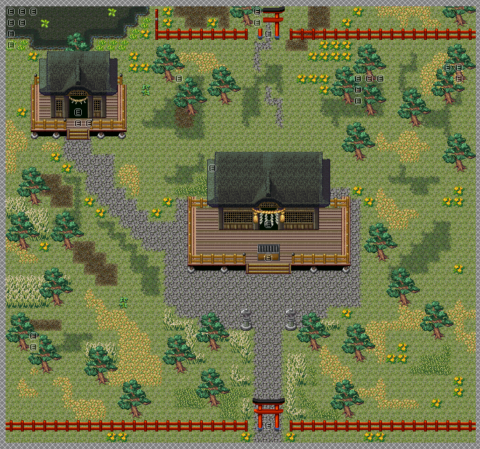
This is meant to be the Hakurei Shrine. Yes, it does feel kinda empty even with all that's going on, but looking at the official images (which will be shown below), there's actually not that much TO the place. Like, in ANY of the images, which strikes me as odd but...what can ya do? At least it's leagues better than the original, right??
Gods, just LOOKING at the old map makes me go ugh. So bad...in any case, here's the reference material. Maybe you guys can suggest something for it?
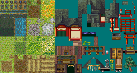
Main image I used to base this map off of:

Other Images:


I COULD probably use the last image as more of a reference seeing as it's the most recent version of it, but the original base image works just as well for me. *Shrugs* Figured I could post this here since it's something new that isn't indoor mansion stuff.
(Also yes, I realized just now that the back fence for the storehouse back there is wrong. >_>;; )
EDIT - Of note, this map is 42x39. It was originally 60x57. I'd say it's a lot smaller than before.
EDIT #2 - To clear things up, you technically only see THIS particular map for a very brief time (after finishing the first dungeon and viewing the first set of events at the mansion, this area is destroyed. Though that means I have to do a destroyed version of this map which...well, that requires me to just really remove a bunch of trees, flatten the shrine, and put a bunch of dirt patches everywhere with this tileset). So yeah...won't see this area for THAT long per say.
This is meant to be the Hakurei Shrine. Yes, it does feel kinda empty even with all that's going on, but looking at the official images (which will be shown below), there's actually not that much TO the place. Like, in ANY of the images, which strikes me as odd but...what can ya do? At least it's leagues better than the original, right??
Gods, just LOOKING at the old map makes me go ugh. So bad...in any case, here's the reference material. Maybe you guys can suggest something for it?
Main image I used to base this map off of:
Other Images:
I COULD probably use the last image as more of a reference seeing as it's the most recent version of it, but the original base image works just as well for me. *Shrugs* Figured I could post this here since it's something new that isn't indoor mansion stuff.
(Also yes, I realized just now that the back fence for the storehouse back there is wrong. >_>;; )
EDIT - Of note, this map is 42x39. It was originally 60x57. I'd say it's a lot smaller than before.
EDIT #2 - To clear things up, you technically only see THIS particular map for a very brief time (after finishing the first dungeon and viewing the first set of events at the mansion, this area is destroyed. Though that means I have to do a destroyed version of this map which...well, that requires me to just really remove a bunch of trees, flatten the shrine, and put a bunch of dirt patches everywhere with this tileset). So yeah...won't see this area for THAT long per say.
LockeZ

I'd really like to get rid of LockeZ. His play style is way too unpredictable. He's always like this too. If he ran a country, he'd just kill and imprison people at random until crime stopped.
5958
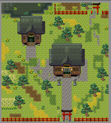
I actually think you did a good job redoing this one and don't need any more help. You're a lot better at outdoor maps, apparently.
I would probably use an L shape instead of a zigzag for the path between the house and the shed, but it's a crumbly uneven stone path so I guess either way works.
I would probably use an L shape instead of a zigzag for the path between the house and the shed, but it's a crumbly uneven stone path so I guess either way works.
It's probably due to how much I've worked with outdoor areas as opposed to indoor areas (in fact, there's really not many indoor areas IN my game, if that says anything lol...). Though there's a lot of things that still need redone (600 maps to fix up, ugh...)...
I think the top image is just fine as it is. Like you said, it feels kind of empty, but that's nothing a few NPCs can't fix. And while there isn't much to do there, that honestly doesn't bother me that much because;
1. The buildings are nicely distanced. They're not distanced to where you have to walk a mile to get to the other one, but they're not too close to where it'd make more sense to combine them either.
2. You say that there's not too much to place on the map, but that doesn't matter to me because in comparison to your other maps, it looks great and is nicely detailed.
One thing I would personally do is have the path covered by grass in some places, but still make it so that it's clear where the path is leading.
Corfaisus

"It's frustrating because - as much as Corf is otherwise an irredeemable person - his 2k/3 mapping is on point." ~ psy_wombats
7874
Sure it's better than the original, but that's not saying much. If you want for it to closer resemble the source material, get rid of the stilted platforms (and the crate in front of the shrine) beneath the buildings and move them closer together. You should make the walkway perfectly square around the shrine, and do away with the path between it and the "shed".
You could also probably cut the map down by another quarter and bring the trees in closer together while making the flowers/tall grass/dirt auto-tiles more chaotic to appear more natural.
I think your biggest problem is depth perception. I'd like to make a sample map of what I'm trying to explain, but I don't have said chipset.
If you wanna use it I suppose. The crate is supposed to be the donation box, mind you. As for the depth perception, I...don't see anything wrong with it here at all. o.o??
LockeZ
I'd really like to get rid of LockeZ. His play style is way too unpredictable. He's always like this too. If he ran a country, he'd just kill and imprison people at random until crime stopped.
5958
Oh, yeah, the central building is sticking off the back of the wooden platform. Didn't notice that at first, but it is the depth perception problem he mentioned.
Corfaisus
"It's frustrating because - as much as Corf is otherwise an irredeemable person - his 2k/3 mapping is on point." ~ psy_wombats
7874


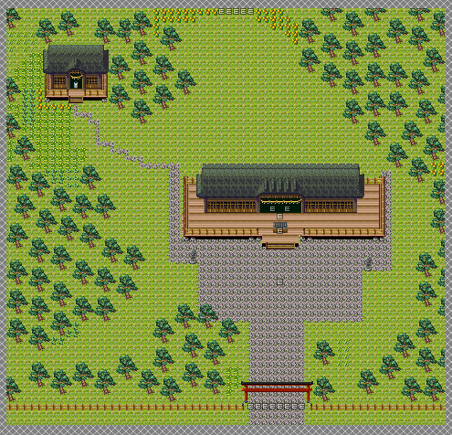
This is the entire map (20x17). It establishes all that you need with the exception of game-play compromising decoration (donation box) and, seeing as you're going to be seeing it in-game all of once or twice, lowers the payload to something more reasonable.
Mmm....I suppose so, though I use the map in a different way later (for the ruins version of it), so there's also why it was bigger than it should've been. But I did size it down now (from 42x39 to 27x30). This is as small as I'm going to make it, as I need the room for the cutscenes as well as both exits and the lake. I know mine isn't EXACTLY like the references but eh...it's close enough as it is (yes, you do go inside the storehouse, hence why I have the storehouse exit where it is. I probably can make it be on the side but that seems...awkward in this type of perspective).
Still though...it's not bad! Though fixing all of those events for this map and the ruins version was a pain in the arse. Ugh...also kept forgetting abou thte top of the roofs for some reason. Never could figure out why they looked weird to me...now I know! Also, for some reason I never noticed that A) The donation box is INSIDE the shrine, so for this version, that's where it's at, though in the ruins version, it's right outside the entrance, and B) there aren't any porches. I could've SWORN there were some porches...oh well!
So yeah, hopefully this is a lot better? Not as detail-rific as previously but eh...I'll fix it up later.


