


THE SCREENSHOT TOPIC RETURNS
Posts

@Xenomic It seems OK-looking, actually. But like most of your maps, you could still condense it quite a bit. Also, I'm not sure if they make rugs in that Tetris-block shape (the ones near the doorways).

I wasn't sure on how to handle the rug part actually, so I figured that'd work that way. Again, I have no idea how to deal with hallways lol. I know this is far too long/big, but I don't know how long/big it should be to accompany multiple rooms (or if I should just stick the entire hallway section into one map. Kinda like how several games tend to have all rooms on one map or something like that. Though if I did that...I'd have to know where things would be too. Ugh...complicating...x_x;
Gave it another ernest try. I kinda like how this one came out compared to the other one myself.
Original size: 60x50
New size: 46x32
In fact, it's even smaller! By..14x18! Still not sure what all rooms will be on this side, but I think it'll work? I hope? ^^;;
EDIT - Just to get more feedback (and maybe make the thread live??), I decided to work on the living quarters by editing the tileset (which will probably be used for other rooms like bathrooms and bedrooms). I'm rather pleased with how this turned out myself...could be smaller maybe, but it feels alright.
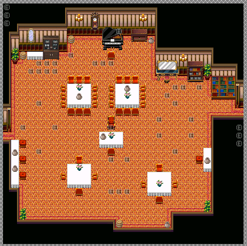
Size: 30x30

Please do not fill a room with that carpet. Put small carpets under the tables if you must but do not fill a room with it. Also, look into Shift Mapping.
That will help make your maps look a lot better, especially when it comes to carpet tiles that are against roof tiles.
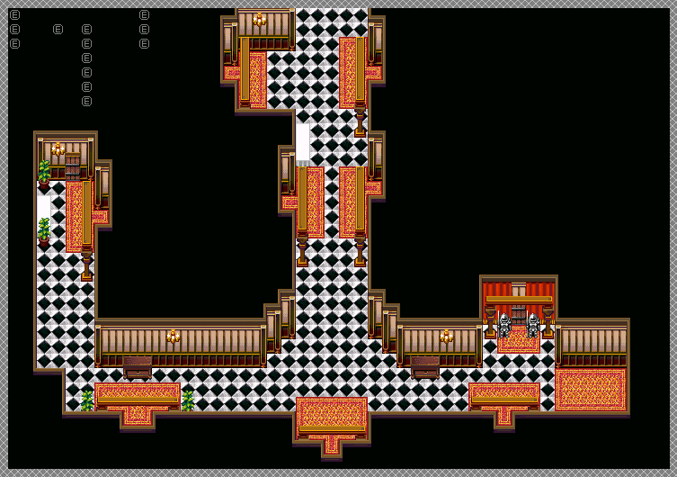
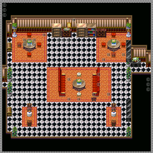
Now, for the main part rooms and hallways are rectangular and/or square. Please don't make crazy indints and stick outs like you have. They look ridiculous. For the hallway... Here:

Very rough editing job.
Humans. Humans make buildings. Humans plan and construct. Humans like symmetry in their plans a lot. Most buildings like this? Symmetry. It looks good, it's easy to find your way around and it makes for a nice looking map. I'm not even going to say anything about the size because we've already been over that more than a few times.
Hallway - make it symmetrical. Get rid of the overbearing arches - they add fuck all except make you look pretentious. Nix em. No, to the small indent on the far left. No to the carpets in front of the doors (how are they supposed to be that shape? Carpets should always be rectangular or square, and yes, I know the cross shaped one in the pentagonal room breaks that, but I really should have just cut out the most of it and made it into four.) Add a runner down the hallway instead.
Make the doorways symmetrical. Make them look the same. No fancy sudden indents for one - do that shit in the room as an antechamber if you must. No to the armoury(?) doorway looking like that. It should mirror the other side.
You do have a lot to learn.
WHat I assume is the dining room... No to the vanity/dressing table. No to the crazy indents at the bottom and top. Make them all run straight. I highly recommend one long, large table for a dining room in a mansion. The servants usually ate in the kitchens after service or had their own area, and more often than not, the large dining room was for important company (or special occasions or when the owner felt particularly pompous). No to barrels. No to the carpet completely.
That will help make your maps look a lot better, especially when it comes to carpet tiles that are against roof tiles.
Now, for the main part rooms and hallways are rectangular and/or square. Please don't make crazy indints and stick outs like you have. They look ridiculous. For the hallway... Here:
Very rough editing job.
Humans. Humans make buildings. Humans plan and construct. Humans like symmetry in their plans a lot. Most buildings like this? Symmetry. It looks good, it's easy to find your way around and it makes for a nice looking map. I'm not even going to say anything about the size because we've already been over that more than a few times.
Hallway - make it symmetrical. Get rid of the overbearing arches - they add fuck all except make you look pretentious. Nix em. No, to the small indent on the far left. No to the carpets in front of the doors (how are they supposed to be that shape? Carpets should always be rectangular or square, and yes, I know the cross shaped one in the pentagonal room breaks that, but I really should have just cut out the most of it and made it into four.) Add a runner down the hallway instead.
Make the doorways symmetrical. Make them look the same. No fancy sudden indents for one - do that shit in the room as an antechamber if you must. No to the armoury(?) doorway looking like that. It should mirror the other side.
You do have a lot to learn.
WHat I assume is the dining room... No to the vanity/dressing table. No to the crazy indents at the bottom and top. Make them all run straight. I highly recommend one long, large table for a dining room in a mansion. The servants usually ate in the kitchens after service or had their own area, and more often than not, the large dining room was for important company (or special occasions or when the owner felt particularly pompous). No to barrels. No to the carpet completely.
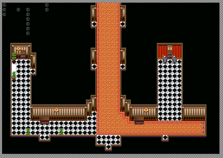
I don't deal with indoor areas very much so...they were always a sore point for me. I'm more used to outdoor areas and caves sadly. So yeah...my indoor area are going to suck. ^^;;
I wasn't sure on the way I handled a couple areas (most notably the left corner part) and wasn't sure on the arches themselves (I can probably nix them in the first floor map too). The carpet though...I never think of using shift mapping because I never actually USED it. I actually just discovered it last night ironically enough. Yes, 5-6 years of using 2k3 and I'm still learning stuff about it. Gods I hate mapping lol...
What? You think the hallway is too big?? But...I thought it'd be the right size and all that. .=.
The issue that I have with making it symmetrical a little is how the first floor map connects to that hallway. I would've done it that way otherwise, but right where the hallway to the rightmost area is is about where the hallway leads to the lobby. I try to make it so that it's easy to tell where the doors are so...well, I guess I COULD extend it a little bit to the right if I need that hallway connector or something. Hmm...
A runner...? Oh, you mean a carpet that goes down the entirety of the hallway??
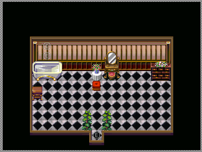
Actually, that's more of a ballroom/living quarters (haven't decided which yet). Originally, when I did this map the first time, it was a perfectly square room. Dunno why I tried to go with the indents and whatnot, felt like some rooms do that (again, I'm not savvy on rooms or indoor areas). The barrels, I can nix completely.
So yeah...this is just me being bad at indoor areas entirely (though Poltergeist Mansion is still my best indoor area thus far I think...). As you can tell by me actually asking on how to do hallways, that should've clued you in on how I don't know HOW to do indoor areas. ^^;;
EDIT - I actually DID use shift mapping a few times, but only for the tables. Never think about it with the carpets myself for some reason...
EDIT #2 - Ok...how about these??
It should be obvious which room is the ballroom/living quarters in the hallway area too. I'm hoping I got the runner right??? I wasn't sure on the ballroom/living quarters per say (this is where one of the keys for the puzzle is, and where you have to fight a specific fairy maid to get, whom is in the big fancy chair in the middle of the room).
I wasn't sure on the way I handled a couple areas (most notably the left corner part) and wasn't sure on the arches themselves (I can probably nix them in the first floor map too). The carpet though...I never think of using shift mapping because I never actually USED it. I actually just discovered it last night ironically enough. Yes, 5-6 years of using 2k3 and I'm still learning stuff about it. Gods I hate mapping lol...
What? You think the hallway is too big?? But...I thought it'd be the right size and all that. .=.
The issue that I have with making it symmetrical a little is how the first floor map connects to that hallway. I would've done it that way otherwise, but right where the hallway to the rightmost area is is about where the hallway leads to the lobby. I try to make it so that it's easy to tell where the doors are so...well, I guess I COULD extend it a little bit to the right if I need that hallway connector or something. Hmm...
A runner...? Oh, you mean a carpet that goes down the entirety of the hallway??
Actually, that's more of a ballroom/living quarters (haven't decided which yet). Originally, when I did this map the first time, it was a perfectly square room. Dunno why I tried to go with the indents and whatnot, felt like some rooms do that (again, I'm not savvy on rooms or indoor areas). The barrels, I can nix completely.
So yeah...this is just me being bad at indoor areas entirely (though Poltergeist Mansion is still my best indoor area thus far I think...). As you can tell by me actually asking on how to do hallways, that should've clued you in on how I don't know HOW to do indoor areas. ^^;;
EDIT - I actually DID use shift mapping a few times, but only for the tables. Never think about it with the carpets myself for some reason...
EDIT #2 - Ok...how about these??
It should be obvious which room is the ballroom/living quarters in the hallway area too. I'm hoping I got the runner right??? I wasn't sure on the ballroom/living quarters per say (this is where one of the keys for the puzzle is, and where you have to fight a specific fairy maid to get, whom is in the big fancy chair in the middle of the room).
The runner doesn't turn corners. Carpets don't turn corners. Remove the corner turn. Have you ever seen a rug or carpet before?
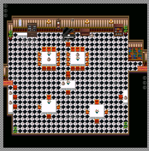
As for the dining area, some chairs are okay. Larger tables would be of aid. Why are books in the dining room? Why is a mirror in there? Why not just one or two long tables instead? Remove the indent on the side where the serving table is. And the one at that top. And the bookshelf one. You don't need to make carpets to show the doors. They're easy to see as breaks in the smooth black edging as it is. Your plant is missing half of itself.
As for the dining area, some chairs are okay. Larger tables would be of aid. Why are books in the dining room? Why is a mirror in there? Why not just one or two long tables instead? Remove the indent on the side where the serving table is. And the one at that top. And the bookshelf one. You don't need to make carpets to show the doors. They're easy to see as breaks in the smooth black edging as it is. Your plant is missing half of itself.
...I don't go out very often for one, and I actually don't go to very many places where rugs are well...there. So, I suppose not?? Ehehe...
Well, it's not a dining room as I said. It's a ballroom/living room/quarters. I suppose I COULD make it one or two long tables (probably two) if it's going to be more of a ballroom area. I doubt the arches would work here too...
Ehhh....don't some rooms actually have those tiny little indents at all?? I know at least in my house there's a couple areas like that. @_@;;
Mm...that is true. And how the hell did I miss THAT with the plant? Oi vey...x_x;;
I have only ever seen indents when there's either an in-built fireplace or cupboard. A mansion does not have a ballroom that is a living room that is a dining room. A mansion has a living room, a ballroom, a formal dining room and a non-formal dining room. They are all separate rooms.
Ballrooms are perfectly fine being large empty spaces BUT they do have an ornamental flair. They have an imposing feel to them, ornamental designs on the floors and walls. They never look like the rest of the house. They also usually have little nooks where people can rest from dancing.
Living rooms are more comfortable and cosy. They have a feeling of a place used often. Usually they're of a small to medium size, have many comfortable pieces of furniture for use, bookshelves, often wood floors with luxurious throw rugs, warm colour scheme and pictures of family adorn empty areas. They will also usually have a clock and a large fireplace.
Dining rooms are usually mid to large rooms, except in smaller mansions. Formal dining rooms will have art and be a colder place in air. They will have a long table with ornate, but comfortable, seating. A side table where the servants may place such things as unused pitchers may be set away from the table, and luxurious carpeting under the table to contrast with the stone or expensive wood floor, but the room will feel a little bare, with not much in the way of decoration bar the art, which leaves an impression on those dining there.
Informal dining areas are where the family usually eats (unless the Head is very pretentious) and usually a lot smaller and more comfortable than the formal dining room. It is warm, welcoming and a place where you can discuss normal family matters and bond. Usually thick carpeting, wooden floors that are warm but not too expensive (since there's bound to be accidents here and there, being used more often).
I guess that room looks like it's trying to incorporate all 3 too much huh? Well blah...guess I have to edit this tileset even further to get the right feeling. @_@;;
Here.
That will give you all Mack chipsets. There are a lot there that you can splice into working chipsets. So much tiles~<3
That will give you all Mack chipsets. There are a lot there that you can splice into working chipsets. So much tiles~<3
:O
Doors...I haven't decided if I wanted to try to make doors that open on their own (I tried before but never understood it for some reason). The curtains look like they could be quite nice too.
I can see some really nice stuff being used for the mansion already. Castle01_b being for bedrooms, the library one being the one I already have, Town04_f for the living quarters/ballroom, heck even some things from the Town ones I could easily splice in if I really wanted to. The only problem is I don't know what would work for the basement out of all those. Any suggestions Lib? @_@;
(I know these are all used quite often and people are probably tired of seeing them but...if they help...^^; )
(The main problem being I'll have to make a looooot of multiple copies of the same tileset because I need to have the same walls and stuff...ugh...)
It's how you use it, not what you use. (hurr hurr)
Go for it. Use the chips. Empower your mapping with necessary tiles. Then show us the results and we'll point out the good and bad. Go go go! ^.^
Go for it. Use the chips. Empower your mapping with necessary tiles. Then show us the results and we'll point out the good and bad. Go go go! ^.^
Will get to that! ...Tomorrow, as it's 4:32 AM and I'm not up to snuff with working now! Got a lot of deciding to do now with these tilesets on what to do with what rooms (I think the hallways are going to continue using the same tileset that I am already using. I see nothing wrong with those. It's the rooms themselves that's gonna be challenging...and I don't know if there's a good bathroom set in here yet. Huh...).
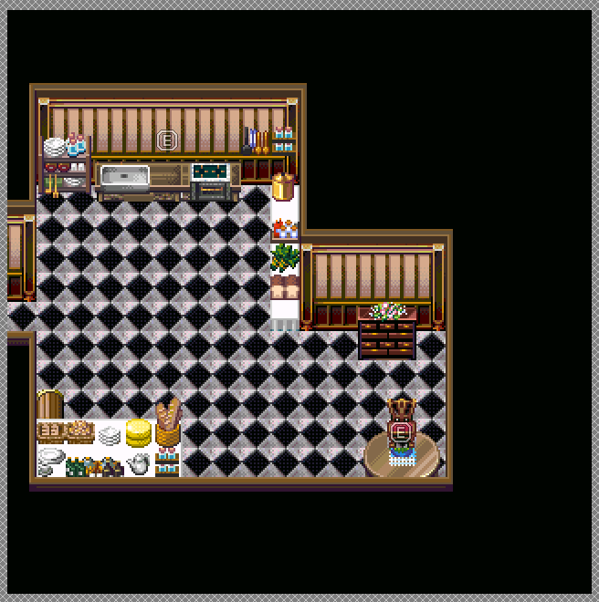
Decided to just make this the living room/quarters. The ballroom will go to the southern door from the living quarters, the kitchen to the north (left side of the hallway that leads up), and a bathroom to the wooden door on the left. That'll be 4 doors out of 8 (well, technically 5 due to having the art/weapon gallery area). Not sure about the other rooms...maybe they can be bedrooms or something. I'm sure mansions have bedrooms on the first floor, right?
Yes, there's some event mapping going on. Yes, you can walk behind the top and middle of the potted plants. This is as good as I'm going to get this tileset I think (this uses the "town04_c" tileset from the Mack thingie that Liberty gave me, in conjunction with another tileset for the floors and walls).
Also of note, that indent is going to stay up in the upper/lower left. Looking around my own house, I see indents like that around here and there (that aren't cupboards or closets) so...
EDIT - Might as well add some new stuff here (man, it's slow here lately huh?)
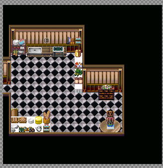
Bathroom:
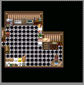
Kitchen:
Why is the bathroom so big? Why does it have carpeting? Have you ever seen or heard of a carpeted bathroom? No? Because water + Carpet = rot. Cut that bathroom down a ton. A fuck ton. Two mirrors? Why are there dressers in the bathroom? And a trunk? Shelves, yes. A chest of drawers... maybe.
Kitchen: Cut the footstool at the door. Move the trunk down two spaces - keep in mind that to be flush with the lower wall there are two spaces hidden behind it. Why the fancy table? Again with fancy drawers? Why not implant some of the other Mack shelves and tiles? Kitchens aren't fancy places. You do not only have to use one chiptset for the whole mansion. Move the sink and stove unit down a tile. Currently it's on the wall.
Kitchen: Cut the footstool at the door. Move the trunk down two spaces - keep in mind that to be flush with the lower wall there are two spaces hidden behind it. Why the fancy table? Again with fancy drawers? Why not implant some of the other Mack shelves and tiles? Kitchens aren't fancy places. You do not only have to use one chiptset for the whole mansion. Move the sink and stove unit down a tile. Currently it's on the wall.
Umm...this is two tilesets spliced together, one for the walls and stuff, and the other for the various objects (from the first and from the second) so...these were the best things for a kitchen that I could go with.
Bathroom: I've seen a couple carpeted bathrooms before. Granted, most tend to have that one mat thing but eh. But no, the size of the bathroom isn't going any smaller. It's a mansion bathroom after all, I'm pretty sure those aren't small. Plus it's already 20x15, I CAN'T go any smaller than that (well, I could but then it'd be stupidly tiny for a mansion bathroom).
Kitchen: For some reason I keep thinking those drawers are something else. I already have the other drawers (the one with plant on top of it) for non-bedrooms so...dunno why I keep using that one. And I'm assuming you're talking about the table with the food and stuff on it? Or the other round table?
I actually had to move the kitchen and stove unit UP in the chipset due to their placement. The way things were placed were...odd. I hate how some things work. >_<
Truth be told, I'm surprised you didn't say the kitchen was too big, what with how apparently a 20x15 room is too big (that's not even using the entire space at that) .=.
Fixes:
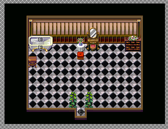
EDIT - Caved in and made bathroom 3 tiles shorter heightwise >_>
Bathroom: I've seen a couple carpeted bathrooms before. Granted, most tend to have that one mat thing but eh. But no, the size of the bathroom isn't going any smaller. It's a mansion bathroom after all, I'm pretty sure those aren't small. Plus it's already 20x15, I CAN'T go any smaller than that (well, I could but then it'd be stupidly tiny for a mansion bathroom).
Kitchen: For some reason I keep thinking those drawers are something else. I already have the other drawers (the one with plant on top of it) for non-bedrooms so...dunno why I keep using that one. And I'm assuming you're talking about the table with the food and stuff on it? Or the other round table?
I actually had to move the kitchen and stove unit UP in the chipset due to their placement. The way things were placed were...odd. I hate how some things work. >_<
Truth be told, I'm surprised you didn't say the kitchen was too big, what with how apparently a 20x15 room is too big (that's not even using the entire space at that) .=.
Fixes:
EDIT - Caved in and made bathroom 3 tiles shorter heightwise >_>

You really should use the three-tile rule. If 3+ tiles in a row looks the same, break it up with something, like a carpet or a piece of furniture or whatever. Or just make the map smaller, since it's still too big (although not ultra huge like the other maps, at least that's something).
And I don't disagree with that entirely. It's just that in some cases, that's just not going to work out. Like...there's literally nothing else that can go in the kitchen itself (also yes, kitchens can be fancy too mind you). Unless you mean the bathroom? In which case, it did get resized by 3 tiles as mentioned:
Updated bathroom (and the kitchen again) at normal size (100%):
Really, what else can go in there? And before saying "Make it smaller", again...mansion stuff. I don't think a small kitchen is going to work when there's generally a crapload of maids that are in said mansion for instance. I mean, I could probably add more to the tileset itself, but I'm kinda out of room already on that one for the kitchen (the bathroom I think is fine now. Not much else to be done there). Also, not sure if that's the right drawer that Liberty was talking about, or the other one was? I think this is the right one...also, that trunk looks terrible where it is now. I understand realistically speaking you could see what it is, but from a gameplay perspective, people are just going to go "Wtf is that?". x_x;
Just for your information, even if you reduced it in size by 50%, it would still be bigger than most kitchens and toilets I've seen in mansions.
If I saw a game with the screenshots you're showing here, I would think it's someone who is making their first game. You keep posting screenshots with the same fault (size), people keep telling you this, and your excuse every time is that it's realistic. It's not. Nobody in real life has 90% empty space in their houses, rich or not. I don't want to have to walk 10 meters to get from my bed to my desk, or half a kilometer to exit my house from my bedroom.
I have a good idea: Make it smaller.
Or if you absolutely refuse to listen to anyone: Add tables, pillars or pots in the middle of the room(s).
Sidenote: Why are half the white in the floor tiles darker?

If you dun wanna smallen the map (because it's a mansion kitchen) then simply add tables to the middle of the kitchen. It doesn't make all that much sense to have a huge empty kitchen, anyways. Tables, stoves, stuff. Don't say that you don't want to add more to the chipset - there are always events.
Also take a peek at other games' kitchens.
EDIT: SnowOwl's post was editted before I submitted mine, making this comment rather redundant
BTW, Castle Guardia is, well, a castle, and it's kitchen is like this:
/Update%2025/7-LPCT-5-23-07--008-d71.png)
Granted, I don't think it's particularily interesting mapping but it's still a lot smaller than your mansion kitchen.
You don't need to make it smaller, just make it meaningful. :3
Also take a peek at other games' kitchens.
EDIT: SnowOwl's post was editted before I submitted mine, making this comment rather redundant
BTW, Castle Guardia is, well, a castle, and it's kitchen is like this:
Granted, I don't think it's particularily interesting mapping but it's still a lot smaller than your mansion kitchen.
You don't need to make it smaller, just make it meaningful. :3

