


THE SCREENSHOT TOPIC RETURNS
Posts

I made it a little less random, thanks TBG~ I was actually kind of afraid I'd end up with tile vomit so I appreciate the heads up. I think I could do a little edit for the beams.
Thanks~<3
Thanks~<3
Never really liked the material from the High Fantasy Pack, but thought I might try parallaxing some of it to see if its worth anything :)


Here, quartz walls/floor/crystals. Also, a part to go under the floating roof tiles.
Also, wall beams. The middle parts will tile correctly~ Best used with shift-mapping when against an actual wall.
Thanks a ton, Libby! You just made my life a lot easier~
@Kory Shouldn't those plants you're using be by water? Hm, no, I suppose there are plants that look like that that don't grow by the water.
That's a pretty solid screenshot!
@Kory Shouldn't those plants you're using be by water? Hm, no, I suppose there are plants that look like that that don't grow by the water.
That's a pretty solid screenshot!

Gourd, use the Autoshadow tool to put shadows on the tiles that the support beams pass over. I know that, logically, there's no light source above those support beams; but it would do wonders to indicate that there's a physical object overhead on those tiles.


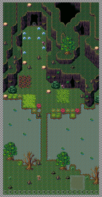
Map here is to basically say what is what (the water by the entrance is a full heal spring,the dark green grass inflicts Poison status to the party, the red plants inflict something I haven't decided on yet, the brambles inflict something, and the blue flowers inflict something). This is the very first area of the Valley of Corpses dungeon (I know! I'm working on a beta5 dungeon! GASP!) and well...it's supposed to be a valley. I wanted to use a different tileset than the Youkai Mountain tileset (which is also shared by the Forest of Magic I do believe as well as Eastern Forest), so I looked around and found this one which feels more swamp-like but...I think it works well! And of course, there's going to be caves. There's ALWAYS caves in this freaking game ehehe...
For reference, the gimmick of this dungeon is that the player cannot use the Item command in-battle (I'd remove all of the items themselves but...that's a lot to keep track of...), while the subgimmick is that there's status tiles in the dungeon. This dungeon is basically to get more use out of status-healing abilities as well as the MP Regen status (which is going to go to 5% instead of 1% recovery per turn in-battle), and to get more mileage out of a couple characters that people may or may not be using at this point in the game.


author=NebelSoft
@ Xenomic - that looks really quite adorbs : )
hmm, testscreen, w/ stuff from a new tileset.
I love the tileset, I think it goes well with the sprite.

@Xenomic
Looks good except for some small stuff:
Try to not have the same small flower sprites 2 in a row. The looong straight grass bridge also looks unnatural, vary the width or angle of it.
Remove the grass tufts growing in deep parts of the river, and try to clump the other ones together a bit more (not too much, remember the flower advice), that's how it looks in nature.
Edit: Here's what I mean.
@Nebelsoft
While the way the shadows fall are alright, apart from at the faucets, the contrast between the light areas and the dark areas is too much. I would smooth it out a bit and make the light areas slightly darker and the dark areas slightly lighter.
Also, why are there rooms that doesn't seem to have any entrance?
Looks good except for some small stuff:
Try to not have the same small flower sprites 2 in a row. The looong straight grass bridge also looks unnatural, vary the width or angle of it.
Remove the grass tufts growing in deep parts of the river, and try to clump the other ones together a bit more (not too much, remember the flower advice), that's how it looks in nature.
Edit: Here's what I mean.

@Nebelsoft
While the way the shadows fall are alright, apart from at the faucets, the contrast between the light areas and the dark areas is too much. I would smooth it out a bit and make the light areas slightly darker and the dark areas slightly lighter.
Also, why are there rooms that doesn't seem to have any entrance?
thank you very much Shadski : )
@SnowOwl
It's a 'work in progress', but if you refer to the lower rooms, it's a japanese style building so, you can slide open a certain part of that what you see as wall basically. The strong contrasts i might use for a rather dark / odd atmosphere i may be aiming for. In that case i will probably still play around with the color saturation / -theme etc.
I'm not sure I understand your answer concerning the lighting, but what I meant by the contrast between light and dark areas was this:

Basically the first one is too light and the 2nd one is too dark.
The rooms I'm refering to are these:
Basically the first one is too light and the 2nd one is too dark.
The rooms I'm refering to are these:

@SnowOwl
Ah, yes I see what you mean now, thank you. : )
As I said, it's just a work in progress or even sample work.
Since I am yet unsure if the map is going to be used in the way you see it, I did not flesh out any concepts on how to get in the bathroom. :P
As for the other 2 "rooms", they are just small wall closets. You wouldn't be able to go in there anyway.
And as was tried to state before, the lighting would still be tempered with anyways, it's just a rough idea really - due to the fact that the shadows are added in photoshop, they wouldn't look exactly like this in a game probably.
author=SnowOwl
@Xenomic
Looks good except for some small stuff:
Try to not have the same small flower sprites 2 in a row. The looong straight grass bridge also looks unnatural, vary the width or angle of it.
Remove the grass tufts growing in deep parts of the river, and try to clump the other ones together a bit more (not too much, remember the flower advice), that's how it looks in nature.
Edit: Here's what I mean.
Hmm...I see. I have noticed in games that they don't usually have things too close to one another, but there are times where it makes sense for them to be even in nature. The grass bridge does need to be changed a bit though aye...a natural land bridge is never THAT straight afaik.
Yeah plants usually spread to areas close by, but it looks weird to have them right next to each other in games where the sprites are the exact same, so you kinda have to put them diagonally and stuff like that.
Also another minor thing I noticed while I whipped up the edit, you should probably make all the tall grass the same ones, it's a bit jarring with 2 types of tall grass that is similar but not the same, especially since one has those really dark areas.
Probably wouldn't hurt to put some plants on the high spots too, weird how nothing grows there, you could probably remove some of the lower ones to not make it look to cluttered.
Understandable there.
Oh, you mean the giant patches of grass? There's a reason for that as stated in the post where the dungeon's gimmicks is status tiles. The dark green version will inflict Poison to the party, while the light green version will not. Blue flower and red flower, I haven't decided on what statuses those could inflict. Clear water at the bottom is full HP/MP/Status recovery (or it may just be Status recovery since you can still use items in the menu, just not in battle).
Oh, you mean the giant patches of grass? There's a reason for that as stated in the post where the dungeon's gimmicks is status tiles. The dark green version will inflict Poison to the party, while the light green version will not. Blue flower and red flower, I haven't decided on what statuses those could inflict. Clear water at the bottom is full HP/MP/Status recovery (or it may just be Status recovery since you can still use items in the menu, just not in battle).


Dont really care for the HUD, I'd maybe consider going back to the drawing board on it, but I like the map. Def need some definition on the grass patches. Needs more jagged tufts of grass poking out sporadically. As is, its too smoooth and almost registers as a hovering slime over the bricks.
this is a bad mockup, but you know what I mean.

this is a bad mockup, but you know what I mean.
@ narcodis
umm.. and the tall mushroom.. is more sideview... weather it's supposed to be like this or topdown, I don't know : )
umm.. and the tall mushroom.. is more sideview... weather it's supposed to be like this or topdown, I don't know : )


