


THE SCREENSHOT TOPIC RETURNS
Posts

I've never trusted fairies, and I never will. I could never forgive them for the death of my boy.
Anyway, the map looks good, though the line between the diagonal and regular walls is pretty obvious, and I think the dark space outside the map should be darker.
Anyway, the map looks good, though the line between the diagonal and regular walls is pretty obvious, and I think the dark space outside the map should be darker.

author=Lucidstillness
Actually, the clash was entirely intentional. It's a throwback to things like the early Final Fantasy and Turbografx 16 games (as well as just Cell-shaded anime in general).
NFGMan's book Character Design for Mobile Devices, Mobile Games, Sprites and Pixel Art puts it better than I could:
"...compare the character design in Final Fantasy VI to that of the enemies encountered during the game. Unlike the player's characters, enemy sprites are intricately detailed static images that are much larger and properly proportioned, a design tactic used since the very first game in the series. The reasoning is pretty simple. Let's say the party is going to fight a huge dragon. The player is already perfectly familiar with the characters in his own party, and provided they're given the proper range of emotions, is likely already quite attached to them. The dragon the player is fighting, on the other hand, is not a character he's going to attempt to empathize with, but rather an enemy he's going to try to defeat in combat...At first, it might sound as if the two styles would jar together-a realistically drawn dragon fighting a bunch of misproportioned, comparatively plain party members. However, this is almost never the case...
...In a way, it's very similar to how a cartoon works. Many cartoons, especially those hailing from Japan, have main characters that are markedly less detailed than their surroundings. This is because a simple design on the characters makes them easier on a psychological level for a viewer to project themselves into. As a general rule, the more realistic a character looks, the more distances he is from the viewer and the less empathy he will inspire, a trick that goes as far back as the earliest Disney cartoons-the good guy always had a big, relatively blank expression. He had large eyes, exaggerated movements and facial features, and a lack of overall detail, while a villain would have small eyes and sharper, less inviting features, and was likely to be much more realistically proportioned."
So the idea of 'cheating' with two different art styles is intended to make it easier to empathize with the heroes of the game, as they do all kinds of emoting and appear often in cutscenes. At first I thought about making the monsters in the same cute anime style, but I found that it made the bad guys less fun to fight. I'm hoping the final aesthetic of the game will be appealing to players for these reasons.
I don't concede the point, but this might be the most well-thought-out rebuttle to anything I've said that I've ever read.
Cool, I wish I'd written that now.
In any event, I'm glad you brought it up, as it made me try an airbrush anime style, which I think meshes better style-wise while still having a bit of the cutesy contrast I'm going for.
In any event, I'm glad you brought it up, as it made me try an airbrush anime style, which I think meshes better style-wise while still having a bit of the cutesy contrast I'm going for.

@Fist : nice little rm2k or 3 dungeon; like those little fairies, maybe the roof could have followed the walls?
Edit : oh, I see the point... yes, diagonal walls, good job, but there's a problem with the roof, well...
Edit : oh, I see the point... yes, diagonal walls, good job, but there's a problem with the roof, well...

PURPLE SKY ALL THE WAY. BUT IF YOU DO THAT, I SUGGEST DARKENING THE "CHAG CITY" ON THAT SIGN. THIS LOOKS REALLY NICE.

author=PentagonBuddy
I SUGGEST DARKENING THE "CHAG CITY" ON THAT SIGN.
I was thinking lighter would be easier to read, closer to the lightest color on the skull.
author=Judeauthor=PentagonBuddyI was thinking lighter would be easier to read, closer to the lightest color on the skull.
I SUGGEST DARKENING THE "CHAG CITY" ON THAT SIGN.
Yes. Yes it would. ^Kp you should listen to this.
LockeZ

I'd really like to get rid of LockeZ. His play style is way too unpredictable. He's always like this too. If he ran a country, he'd just kill and imprison people at random until crime stopped.
5958
The black sky looks like a dark night in the wilderness. The purple sky looks like the end times.
So it depends what you're going for, I guess.
So it depends what you're going for, I guess.

author=PentagonBuddy
PURPLE SKY ALL THE WAY. BUT IF YOU DO THAT, I SUGGEST DARKENING THE "CHAG CITY" ON THAT SIGN. THIS LOOKS REALLY NICE.
does the fully unnecessary capslock help?
What is a Chag, anyway?

Not 100% on the name window.
(everything except the windowskin is 100% custom :D)

LockeZ
I'd really like to get rid of LockeZ. His play style is way too unpredictable. He's always like this too. If he ran a country, he'd just kill and imprison people at random until crime stopped.
5958
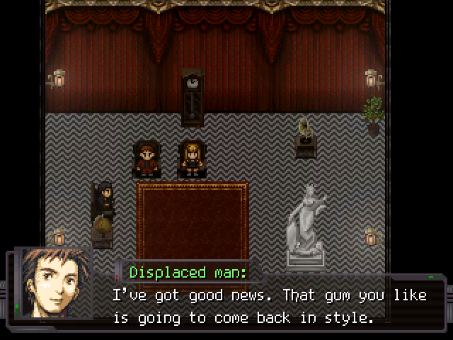
Nemo. Please tell me this is a doublemint joke, and a pair of identical twins is about to enter the room.
I like the tileset, but the room's layout is really awkward and too empty.
I like the tileset, but the room's layout is really awkward and too empty.

author=LockeZ
Nemo. Please tell me this is a doublemint joke, and a pair of identical twins is about to enter the room.
I like the tileset, but the room's layout is really awkward and too empty.
Was going to say the same, The tiles are good but the Room is just an empty rectangle.
Not exactly a screenshot, but what do you think about this ??
I Completely redid the stage, this was the old one:

