


THE SCREENSHOT TOPIC RETURNS
Posts

author=Liberty

@Liberty- I'm not a big fan of that map, either.
I think it is the cobblestone road, it looks really weird in some places, like it doesn't make much sense.
I also see the point of the blue roof in the top left corner.
Then again, it's new RTP, so you probably can't do much with it. idk

One thing that gets to me is the roofs, but one has to say if it's style or not.
The city walls could also use a little bit more detail, but most of it is set.
Onto the cobblestone roads. I think it would look slightly better if you got arid of that no-so-straight pieces of the main road.
(I'm mainly looking at the right part of the map.)
Keep the main cobblestone road as straight as possible, and allow that other cobblestone road (the one that connects the houses to the M=roads) to be a little bit more random.
I dunno if that's nit picky or not. :P
It's still a pretty great map with no overlay hacks.

author=Rave2010
Stuff, stuff, stuff~
Sweetie, the roofing shows overlapping. Behind that roof is a wall, a wall with much responsibility. It keeps up the roof. You can tell this by looking at how there's a different edge to the roofs. If they connected, they'd use the middle part, instead of the part that denotes a roof edge. If I just added a wall there, it'd get rid of my hard work trying to make things look like they're built up against each other... which is what I was going for - a condensed, but still spacey, town map.
I'll change the extra cobblestones, though - they're supposed to represent areas that have been added on after the initial city planning - places where people started to walk and figured out they didn't want to step in dirt and mud all the time because, Hey! becoming a thoroughfare here! - but you're right that the same cobble used is too much. I'll find something. And spice up the walls a bit too. I forgot about them. Thanks! :D
I think it's the straight edges of the cobble that gets me, like in front of entrances and the added pathways, it seems like those would have been removed so it would be a smooth walkway into the house or down the path.
And I understood what you were going for with the roofs(I wasn't complaining about that!) I guess some of them look too long going down, compared to the other roofs around it. (like the yellow/orange roof in the bottom right corner, for example)
And I understood what you were going for with the roofs(I wasn't complaining about that!) I guess some of them look too long going down, compared to the other roofs around it. (like the yellow/orange roof in the bottom right corner, for example)
Yeah, you might be right about that one roof, but cutting it a tile shorter would kinda look like it was built above the wall - just a tad. I'll look at reworking that house at least. And I'd meant to change that part - the straight edge in front of houses, but forgot. >.<; (And yet I remembered the side doors. Silly of me.) Thanks! ^.^
I don't agree with any of the road/roof complaints in Liberty's screenshot. It just seems like nitpicking that boils down to personal taste in my opinion. I think it looks perfectly fine as an RTP map.
Playing with additives in DynRPG with some help from a person at RPG-Atelier.
(Nope, the scene in the background is not from a game of mine)

edit: changed background image on request of the actual developer of the game in previous pic
(Nope, the scene in the background is not from a game of mine)
edit: changed background image on request of the actual developer of the game in previous pic
author=UPRC
I don't agree with any of the road/roof complaints in Liberty's screenshot. It just seems like nitpicking that boils down to personal taste in my opinion. I think it looks perfectly fine as an RTP map.
author=Liberty
Yeah, you might be right about that one roof, but cutting it a tile shorter would kinda look like it was built above the wall - just a tad. I'll look at reworking that house at least. And I'd meant to change that part - the straight edge in front of houses, but forgot. >.<; (And yet I remembered the side doors. Silly of me.) Thanks! ^.^
Yeah, it is nitpicking, sorry about that. The roofs are fine. :)
It would probably look odd if it had the wall there between the roof and the city wall, I get that.
But awesome, glad I could help in some way, even if it was jogging your memory!
I thought I'd just share my opinion anyways, I thought that's the point of this thread, we don't have much to go on besides the screenshot in question. I nitpick my own maps to death. :P
@Liberty- Any plans on some kind of overlay? You should show us this map when it's all pimped out with people and effects and whatnot!
@Kazesui- I love that effect!
I'm not big on overlays in outdoor maps unless it's for mood - like enchanted forest or something like that. Indoor maps can be another matter, depending on the game. No, I prefer to stick to tints instead. And sure, once I edit the map and pimp it out a bit I'll post it up. :)
Kaz: Very nice effect for the lava, though maybe an added tint of some red (not too much, just a bit) would help give off the 'room is lit with lavary goodness' vibe.
Kaz: Very nice effect for the lava, though maybe an added tint of some red (not too much, just a bit) would help give off the 'room is lit with lavary goodness' vibe.
so im lazily working on this "dungeon" when I should've worked on, well everything else. it is very WIP
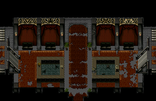
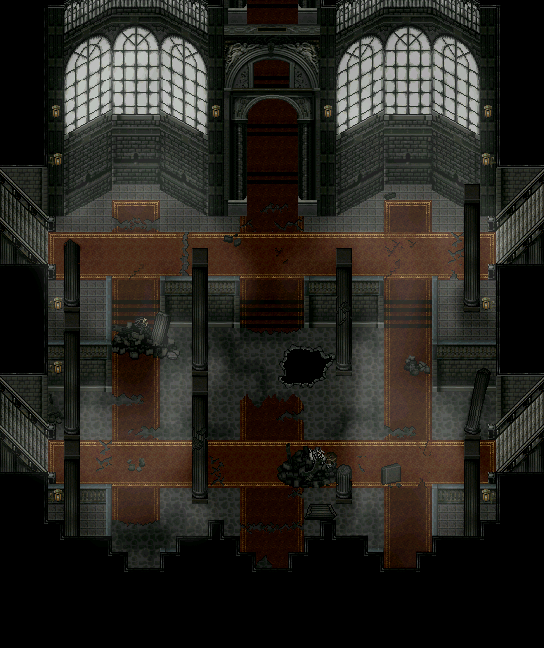
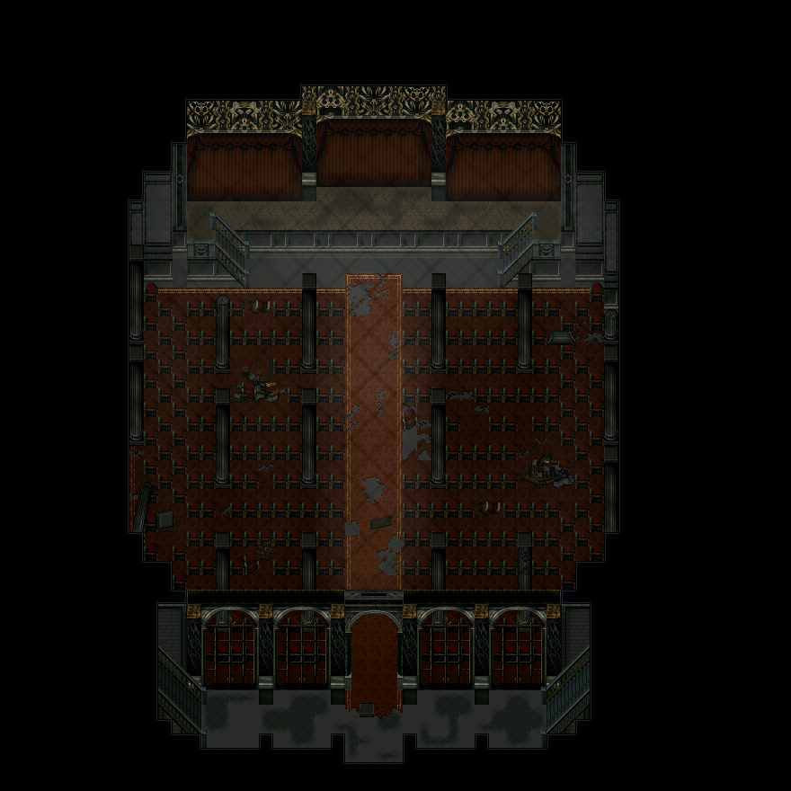
also my monitor hates me, i have no idea if the colors are all screwed up or not
also my monitor hates me, i have no idea if the colors are all screwed up or not
That's beautiful, Mr.Nemo! Although I think the pillars in the 2nd screen look off, maybe it's the spacing. Because they look great in the third.

LockeZ

I'd really like to get rid of LockeZ. His play style is way too unpredictable. He's always like this too. If he ran a country, he'd just kill and imprison people at random until crime stopped.
5958
Oh shit, dude. Keep doing what you're doing.


Looks brighter normally (due to conversion, filesize would explode else) and it has no NPC's, animals and the like yet, just some basic layout.


@Deacon: Those WA tiles are looking spiffy. And the butterflies are so sweet~ Loving the layout, too, though I kinda wish the signs were either centred or hanging from the sides of the buildings.
@Necromus: Firstly, save as png for less quality loss. Secondly, it'd look better if the house walls were two tiles high instead of three. And the roofs on some houses need a bit of work - especially the ones where they look like separate roofs. The general town layout is fine, but try to stay away from squares (as much as you can in VX/A, anyway) when it comes to natural things like the island or river/cliffs. Also, varying cliff heights (having smaller cliffs build up on the taller ones) would be nice to see, but you've done a great job making it more jagged. I'd like to see some more house experimentation, though, instead of just squares.
And now, edited and hot off the presses~

Yes, yes I have done some editing. ^.^
@Necromus: Firstly, save as png for less quality loss. Secondly, it'd look better if the house walls were two tiles high instead of three. And the roofs on some houses need a bit of work - especially the ones where they look like separate roofs. The general town layout is fine, but try to stay away from squares (as much as you can in VX/A, anyway) when it comes to natural things like the island or river/cliffs. Also, varying cliff heights (having smaller cliffs build up on the taller ones) would be nice to see, but you've done a great job making it more jagged. I'd like to see some more house experimentation, though, instead of just squares.
And now, edited and hot off the presses~
Yes, yes I have done some editing. ^.^
@Liberty- Lovely! I can really notice the differences. :)

