


THE SCREENSHOT TOPIC RETURNS
Posts

Nope. Winter.
You know, that Samurai game?
It was pretty cool~
Made by Xeno|Soft.
Sadly, he never finished it. :(
Yes, each of those is a link.
You know, that Samurai game?
It was pretty cool~
Made by Xeno|Soft.
Sadly, he never finished it. :(
Yes, each of those is a link.


Made a comparison screenshot with this town, so it's basically gameboy stylized now. I am using it in this project too so it's not just a test of the graphics.
LockeZ

I'd really like to get rid of LockeZ. His play style is way too unpredictable. He's always like this too. If he ran a country, he'd just kill and imprison people at random until crime stopped.
5958
Hahahaha. That's awesome.

A mini choice game where you attack and evade wolves, but you have do the exact right sequence to hunt in Guardians of The Amethyst in a flashback area involving one of the characters.
@LockeZ The graphics is inspired to FF 13 :) No dialogues, story is different ^^
@Benos Thanks for compliment :)
@Benos Thanks for compliment :)

author=NOACCEPTANCE772
A new titty screen!
Tell me what ya think.

Wow the
-Start-
-Continue-
-Exit-
looks exactly like it was ripped from an old title screen I made in like, 2005?
edit: whoops that was old, i'm bad at forums


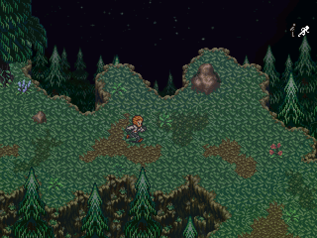
I agree, I really like the perspective. Being able to see the night sky adds a lot to the overall tone.
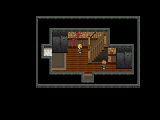
Just a question - what's with the double wall? Also the lockers are pretty damn tall. I do like the stairs, though and the blood is nicely textured, though a bit bright. Is this for a horror game or something? If so, maybe add a darker tint - not too dark, mind, just a tad darker.
Tau - lovely as always~ Those trees <3 They're from Terranigma, right?
Tau - lovely as always~ Those trees <3 They're from Terranigma, right?
Yeah they do seem slightly taller than the actual map. Yeah it's for the Project Viral Remake. This is the staircase without the tint and atmospheric effect. I will probably revamp the lockers then I guess. By the way what do you mean by double wall?
Liberty's talking about how you're using the roof tile twice. If you used it once, it would look like this:

Not sure why you enclosed your map in a box like you did above, but it looks much better without it.
Not sure why you enclosed your map in a box like you did above, but it looks much better without it.

LockeZ
I'd really like to get rid of LockeZ. His play style is way too unpredictable. He's always like this too. If he ran a country, he'd just kill and imprison people at random until crime stopped.
5958
It's not that the lockers are taller than the walls, it's just that they're the same size as a door. That's kind of huge, it's taller and wider than a character. Of course this scale issue applies to the stairs too. The handrail comes up to eye level.
I do realize all these tiles are downloaded, though. I'm using the same lockers in my own game and they probably look just as silly there, haha. If this is the scale you're using for objects throughout the game, it can be passed off as a graphical style quirk - especially since it's so common in so many other games, both indie and professional.
Just for reference, I usually think of each tile as being about 3 1/2 to 4 feet, when I'm paying enough attention to make everything to scale. Which... I'm kind of ashamed to say isn't very often. I wouldn't have noticed it in your screenshot if Liberty hadn't pointed it out.

author=Ocean
Made a comparison screenshot with this town, so it's basically gameboy stylized now. I am using it in this project too so it's not just a test of the graphics.
Awesome!


