


THE SCREENSHOT TOPIC RETURNS
Posts


@Brady, BurningTyger: Thanks, guys! The cracks on the ground is a good idea. Though, I worry that I may have to do the same thing in other maps to keep a sense of consistency in the game (For context: The was whole city was under attack.), and I don't have enough room in most chipsets for the tiles, not to mention I'm lazy. xD But if I keep it just to this map, then I can do it with a bit of 'parallaxing'. ...As for the teleporter not being visible enough, don't worry. Once the 'lighting effects' are in place it will all be more clear.
I'll post an update once I get to work on it some more. ;P
I'll post an update once I get to work on it some more. ;P

author=SanaThere must be some dark yellow outlining on the hair :)
Battle screen that I made today..also finally finished the main character's sprite; woo~ ^o^
Try it and let us see how it turns out.Other than that, the game looks fascinating.Tell me when it is up for download :D
Are my allowed to post screens from a game that is not allowed on this site?
I promise I wont show the sexual or offensive stuff :)

I had to censor her butt-crack because...you know why.
The FPS road scene seems lame but the sprite used there is a place-holder.
I just wanted to show that there will be scenes like that and some where you have to run over priests and nuns.LOL! \m/
That ball of corpses is an Angel.It lost its wings and came crashing down.Ended up mushing everybody.

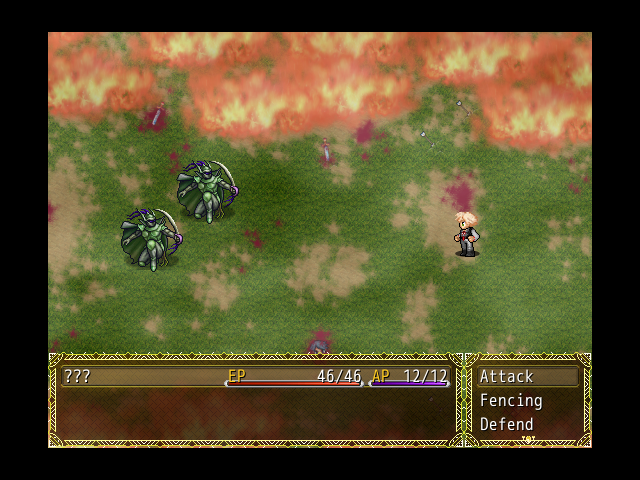
Some battle screens.
These are taken from the "CHAOS" route.I have not did any work on the "LAW" route yet.

I changed the battle2 file because mine, the one before this new one was so sh***y.
I was aiming on making my game look like SMT Strange Journey in the past.
I don't really have to make it so and it would be really hard to do so.
The real reason I was working on it so much was because I wanted to make it feel like something you'd be playing on your Nintendo DS.
Not much progress had happened...because...I swear! I was very busy! :O
(Busy with my holiday since last year May, Busy sleeping, procrastinating "Now is always a good time to decide to do things later", going around Dubai and hard stuff like that! :P)
So...yeah..but I promise it will come soon.After I am done with either my GCSEs or A-levels...
Acceptance, it's always difficult for me to figure out..just what exactly's going on in your screenies~ xD Anyway..about the outline, I wasn't sure whether or not to add one on his hair, since it looked odd when I was spriting, but I'll give him one. :)
author=Sana
Acceptance, it's always difficult for me to figure out..just what exactly's going on in your screenies~ xD Anyway..about the outline, I wasn't sure whether or not to add one on his hair, since it looked odd when I was spriting, but I'll give him one. :)
Try it and let us see :D

I'm attempting to make my own portraits and I want to know if this seems too out of place in an rpg maker game.(I'm absolutely terrible at shading so I kept it really simple, also I forgot to finish her eyes.)

author=DemonLamma
I'm attempting to make my own portraits and I want to know if this seems too out of place in an rpg maker game.(I'm absolutely terrible at shading so I kept it really simple, also I forgot to finish her eyes.)
F*****g hell!
This looks niiiice :)
I always wished there were complete character portraits in RM games as usually they are only until the shoulders :)
Nice art style.
It does not look out of place.
I say this looks perfect :)

Try to do something about those eyes, add details. One-colored eyes doesn't look good. Same with the gem on her neck.
Other than that it looks good.
Other than that it looks good.
author=DemonLamma
I'm attempting to make my own portraits and I want to know if this seems too out of place in an rpg maker game.(I'm absolutely terrible at shading so I kept it really simple, also I forgot to finish her eyes.)
Awesome. Saw it at /vg/ first.

I really like alot of those screens, NOAcceptance. Keep it up!
author=InfectionFiles
I really like alot of those screens, NOAcceptance. Keep it up!
Thanks :D
I will :)


Trying out new fonts for MFD. Looking to get a Paper Mario feel with it, but haven't had much success so far. What do you guys think? Is this style of font legible, or what?
(Note: It isn't Comic Sans. I take font pretty seriously and I know to never use that crap. It's Gosmick Sans right now, though I'll probably change it since it glitches in a couple of places on the menu.)
(Note #2: The text looks grammatically incorrect because it's out of context. Don't point that out, please.)


Procedurally generated dungeon mazes!
I got the very basics of procedurally-generated dungeons down today. Basically, the code places rooms down and connects them semi-intelligently to ensure there's always a path to get to any room.
It's gonna need a lot of tweaking, and as you can see the rooms are pretty empty at the moment... but yea! I want to see if I can make some more interesting features like dead ends without breaking it, but that might be something for the second pass.

So, this is what I could come up with, having the previous suggestions in mind. But it doesn't look nearly as good as it did in my head.
Now I worry that the cracks may help make the map look busier; besides not making much sense... What do you guys think?

Well, you could have multiple small cracks. It'd probably help it look more busy and make more sense. Right now it looks like an earthquake hit, but maybe that's your intention.
You could also have one huge crack going through the middle of the screen and splitting the fountain in two

I don't think there's anything wrong with their size, shape or position. I think the problem is that they're too black. You have a certain colour palette going on there without any outlines or anything; nothing reaches that dark a colour. Then suddenly these cracks are solid black, and it's the only thing the eye can focus on. They'd look better as very dark gray/ground colours, I reckon.

