


THE SCREENSHOT TOPIC RETURNS
Posts


LockeZ

I'd really like to get rid of LockeZ. His play style is way too unpredictable. He's always like this too. If he ran a country, he'd just kill and imprison people at random until crime stopped.
5958
Oh god now the stairs are completely vertical, just painted onto the wall
it's getting worse every time
look just take this one and add two more rows of stair tiles to the bottom end of the stairs, covering the top two rows of that sidewalk
it's getting worse every time
look just take this one and add two more rows of stair tiles to the bottom end of the stairs, covering the top two rows of that sidewalk

I would keep the new one, but remove the middle set of stairs, because making a staircase THAT wide can lead to the "painted onto the wall" impression, whereas two separated 2-tile-wide staircases wouldn't look bad at all.
LockeZ
I'd really like to get rid of LockeZ. His play style is way too unpredictable. He's always like this too. If he ran a country, he'd just kill and imprison people at random until crime stopped.
5958
No it's more that it's literally painted on the wall
If I made a 3D version of that one, the bottom step would be directly below the top one
If I made a 3D version of that one, the bottom step would be directly below the top one

LockeZ
I'd really like to get rid of LockeZ. His play style is way too unpredictable. He's always like this too. If he ran a country, he'd just kill and imprison people at random until crime stopped.
5958
Yeah, that's at least physically possible now.
I liked the building better when it was closer to the wall, honestly. That method saved some space.
I liked the building better when it was closer to the wall, honestly. That method saved some space.
I could move the wall down one tile, if that's better. :)
By the way, does the grass on the right look weird?
By the way, does the grass on the right look weird?

You could extend the roof of the shop to the back and it would look good.
And that grass on the right doesn't look bad, but I think it'd look better if it was even with the grass on the left side, plus it'll give you a little path up to your stairs.
And that grass on the right doesn't look bad, but I think it'd look better if it was even with the grass on the left side, plus it'll give you a little path up to your stairs.


This is how I would have done it:
Also, once you're finished with it; don't forget to add back in your trees and flowers and such :3
EDIT:
the wall behind the building is off-scale: it should be the same height as the wall teh stairs are against. Was sketching over a screencap of the screencap so I kinda confused myeself!

Also, once you're finished with it; don't forget to add back in your trees and flowers and such :3
EDIT:
the wall behind the building is off-scale: it should be the same height as the wall teh stairs are against. Was sketching over a screencap of the screencap so I kinda confused myeself!

Just an intro/mapping showcase of a game you guys will probably never see. Still, I've had fun making it and will probably continue to do so. It's my de-stressing game.


LockeZ
I'd really like to get rid of LockeZ. His play style is way too unpredictable. He's always like this too. If he ran a country, he'd just kill and imprison people at random until crime stopped.
5958
Well if those are my two choices, then go for the physically possible one, aka #2
I would prefer #1 if the wall didn't change heights suddenly mid-wall though. The right half of it is only four tiles tall and the left half is six tiles tall.
I would prefer #1 if the wall didn't change heights suddenly mid-wall though. The right half of it is only four tiles tall and the left half is six tiles tall.
Can't you just make the stairs 4 tiles high? I hate people making them >1 tile higher than they should be. One tile is fine, I guess, especially at the top of the stairs instead of the bottom. Know what's better? Half a tile at the top and half a tile at the bottom.
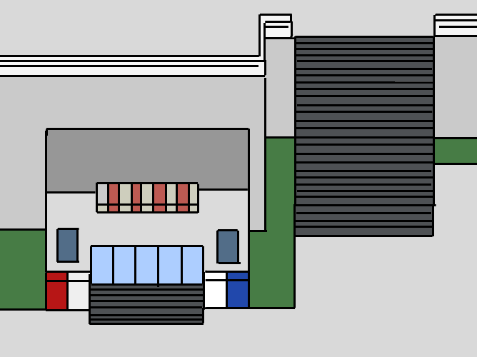
Also, the shop looks odd because the view of the wall is blocked by the machines, so it looks really off. If you got rid of one machine it would show that the wall extends past the machines. Actually, thinking about it, unless the wall stops at the top half of the machines, they should be down a tile or they'd be physically on the wall.
Also, the shop looks odd because the view of the wall is blocked by the machines, so it looks really off. If you got rid of one machine it would show that the wall extends past the machines. Actually, thinking about it, unless the wall stops at the top half of the machines, they should be down a tile or they'd be physically on the wall.
author=Liberty
Can't you just make the stairs 4 tiles high? I hate people making them >1 tile higher than they should be. One tile is fine, I guess, especially at the top of the stairs instead of the bottom. Know what's better? Half a tile at the top and half a tile at the bottom.
Also, the shop looks odd because the view of the wall is blocked by the machines, so it looks really off. If you got rid of one machine it would show that the wall extends past the machines. Actually, thinking about it, unless the wall stops at the top half of the machines, they should be down a tile or they'd be physically on the wall.
The stairs are currently 6 tiles as in the picture. I could remove one tile at the bottom if you like, but I put two because LockeZ suggested it. Although, I don't know how putting one or half a tile on top would make any sense. :)
Just to clarify, that's an entrance for an underground train station. The wall does stop at the top half of the machines. You gave me the "OK" for that building back then, remember? Speaking of train station, which of these is better? :D


@LouisCyphre: http://rpgmaker.net/media/content/games/5061/screenshots/Sanctum_Skills.png
You're probably gonna hate me for this, but I think the orange text is a bit difficult to read. =B The red and green texts stand out well enough. The green text a little too much, I'd say, but since only one thing is colored that way is no big deal. The orange text however is too prominent to be so dull looking. You may want to try a slightly more vibrant shade of orange to balance things out.
@Brady: http://i203.photobucket.com/albums/aa4/Darkbrady/Forest_zpsaa75ef02.png
Is it supposed to be night in this screen? Because I can barely see a thing besides the character and the road. I see the trees, some tree stumps, but I couldn't tell if there are any bushes in there, or tall grass, or any other kind of detail. :s
@Elements: http://static.monstermmorpg.com/images/maps/Clover-Forest.png?201303212
Is that a screen of your game or was it meant to be an example of forests? ...If it is your game, you may consider using a less dark outline for the characters. They stand too much compared to everything else, and you probably don't want that.
@Mr.Detective: http://i33.tinypic.com/r2knl1.png
I like Brady's sketch better, but there are still some details of it missing in your screen, like how he fixed the stairs for the store. Also, I think the roof of the store should be one or two tiles taller. And as for the big stairs, while they make sense now, they still look too tall to me. You should probably add a resting area at the middle of them or maybe even make them more like a stairway.
I gave an okay for that screen because it was miles better than it had been before and I felt that nit-picking would just be cruel. As it stands, since you've gotten better I feel that taking another step up in my critique will help you grow.
The half step would in essence add a full tile of height but look better, more embedded into the picture. Like so:

Now don't that just look a little bit better?~
Also, I like the first better, but it depends if you're going for a more modern look or steam punk. First is modern, second is steam punk.
The half step would in essence add a full tile of height but look better, more embedded into the picture. Like so:
Now don't that just look a little bit better?~
Also, I like the first better, but it depends if you're going for a more modern look or steam punk. First is modern, second is steam punk.

None of those look physically possible, though...? At that rate you might as well make your staircase run up the side of the wall, not directly in to it.

