


THE SCREENSHOT TOPIC RETURNS
Posts

author=LockeZ
That version's definitely less confusing. I might add a few more doodads and a little more ground around the tracks though, since putting them all on the same type of ground tiles did have the side-effect of making the map a little more boring.
Yeah, I'll add more stuff, I just did a quick change like that to show what I meant. Also, I think I'll just stick with how the sprite is now. It's a whole lot easier and he doesn't look so weird on the rail tiles now that they aren't hanging in midair.

author=Amy
Does anybody have any suggestions on how to properly make this airship look like it's embedded into the rocky outcrop? At the moment it's just kinda sitting there like it's part of the thing.
I agree with UPRC as well about making the ground around it pop out a little more, otherwise it looks wicked good!
My only other thought was that I was a little confused by the lighting tint, although it might be what you're going for in context. It's very greenish. It made me think the ship was underwater at first glance.
That ship picture has too much of one colour in my opinion.
Some of the levels might be hard to distinguish because of the mono colourishness.
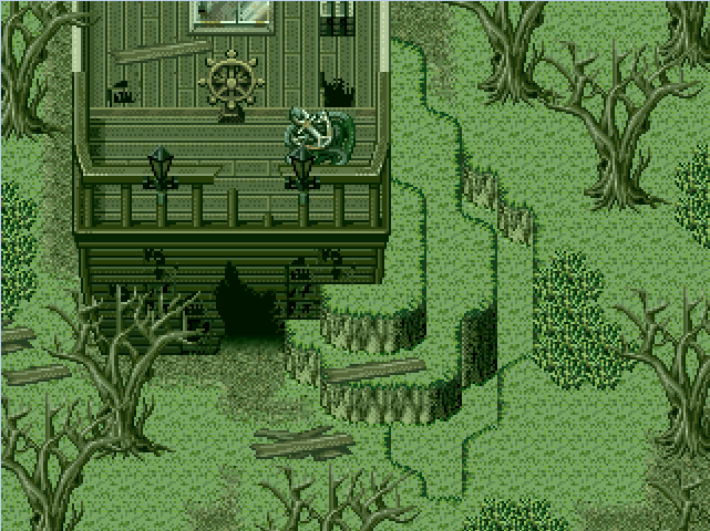
Parallax mapping the inside of a house (Even though it's not really necessary.)


@kory: Yeah, really not necessary. XD The shape of the interior looks a bit odd, imo. They're normally made up of simpler, blockier shapes.

I would tend to keep the irregular shapes for the interiors of caves and stuff.
I would tend to keep the irregular shapes for the interiors of caves and stuff.

@kory It looks a little boring and empty. Maybe try to add more decorations and windows. :P
@Yuna Looks pretty, but isn't it a bit too dark for a store? :O
@Yuna Looks pretty, but isn't it a bit too dark for a store? :O

@yuna21- You should add a candle for a secondary light source, unless there is a reason for the only natural lighting through the windows. Mr. Detective is right anout the darkness. (Though realism isnt a big deal)
@kory_toombs- It is a bit oddly shaped, and I think it would look better more plain, or atleast cut down on some of the corners/edges.
@kory_toombs- It is a bit oddly shaped, and I think it would look better more plain, or atleast cut down on some of the corners/edges.
Ah, I'll lighten it up a bit, then. ( even though I like my dark interiors >:) ). I'll just drop the opacity of the lighting overlay ( since I don't use a lighting script ).
Sooz

They told me I was mad when I said I was going to create a spidertable. Who’s laughing now!!!
5354
author=yuna21
Ah, I'll lighten it up a bit, then. ( even though I like my dark interiors >:) ). I'll just drop the opacity of the lighting overlay ( since I don't use a lighting script ).
If you're really keen on having a dim interior, you could fix things by positioning the light sources on important areas. Part of the problem is that your current screen highlights the floor, some boxes, and some bottles, none of which (I assume) are important. If you switched the left window and the middle display rack, there'd be less of a problem, since the important NPC would then be highlighted.
Using light sources is all about showing the viewer what they're meant to be looking at.

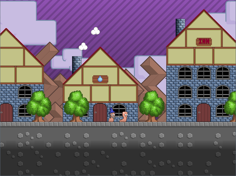
@grindalf- Worms! Looks great.
LockeZ

I'd really like to get rid of LockeZ. His play style is way too unpredictable. He's always like this too. If he ran a country, he'd just kill and imprison people at random until crime stopped.
5958
Worms RPG. I'm terrified.
Use a sheep as the icon for the inn. Because exploding sheep.
Use a sheep as the icon for the inn. Because exploding sheep.

I have what's probably a newbie question: I see people mention "Parallax Mapping." What is that, exactly?
author=unity
I have what's probably a newbie question: I see people mention "Parallax Mapping." What is that, exactly?
I believe it's where you use images, parallaxes, and chipsets in order to deal with Rpg Maker's limitations on mapping.

Pretty sure Parallax Mapping is when you open the Map Properties, set Parallax Background as an image of your map, then use invisible Passable/Not-Passable tiles to facilitate player movement.
author=Dyhalto
Pretty sure Parallax Mapping is when you open the Map Properties, set Parallax Background as an image of your map, then use invisible Passable/Not-Passable tiles to facilitate player movement.
That's what I thought it was.


author=Dyhalto
Pretty sure Parallax Mapping is when you open the Map Properties, set Parallax Background as an image of your map, then use invisible Passable/Not-Passable tiles to facilitate player movement.
Parallax mapping is a technique that's evolved over the years, used to break the grid of in-engine maps. It uses a combination of parallaxes, pictures, tile/chipsets and charactersets/sprites to create a sense of non-alignment within a map. It can range from simple to complex, depending on how it is used and with what extras.
Simple can be something like using a parallax to make the ground tiles a bit more fluid and natural, breaking the grid pattern in the case of paths and grass. It can also be pictures added over the mapping layers to add more detail and clutter to a room.
Complex can be using your own graphics in conjunction with a pixel-based movement script to break the grid-like movement entirely.
It is, in essence, using layers - bottom (parallax), middle (default engine mapping) and top (pictures) - to make your game look as though it was either not made in an RM engine or more detailed than the default mapping system allows.
It's a technique that began in RM2K/3 and has since become much more widely used.
Tile Mapping vs. Parallax Mapping = Tile Mapping is restricted to 32x32 square and to 2 layers. Parallax mapping has no restrictions to the grid and layers are endless.
Currently trying to make parallax mapping relevant inside a house.
See how I put the plants, this is not possible with tile mapping.


