


CREATION CUSTOM CRAFTS: CRAVING CRITICISM
Posts
ゆひかる:
Thanks for the edit of the tree, it looks much better (less flat). I'll also remove the outline of the root of the tree so that it blends better with the background (a hint I got from pixelation).
@LockeZ: You mean on the slime? That's an idea.
@Lucid:
I don't think my stuff looks pro quite yet but thanks for the compliment. The rest of your criticism makes perfect sense, especially the lightning. You might have noticed that's my weakpoint at the moment (that and perspective issues) so hopefully this will improve as I get more practice.
Expect a new gameplay video soon with *loads* of new features. I`m actually pretty excited about it, the gameplay mechanics are almost completely in place and it should be strategic and fun!

No problem. Wanting to improve is a noble goal, and there is always room for improvement, but I have seen professional games with sprite work that isn't as nice as yours. Looking forward to the video!

A few new things:


And a tiny set of furniture (it's for some sort of ''miniature world'' kind of like in Minish Cap):


They're not my best ones to be honest. I'd like some comments, ideas, you know the drill to make them better, especially the cloud.
Merci!
And a tiny set of furniture (it's for some sort of ''miniature world'' kind of like in Minish Cap):
They're not my best ones to be honest. I'd like some comments, ideas, you know the drill to make them better, especially the cloud.
Merci!
Hello guys! :)
I wanted to get some criticism about my chipset. I decided to put everything here instead of creating zillions of threads and spam the forum.
Mushroom:

Bush:

Flowers:

Cloud:

Sign:

Tree Trunk:

Tall grass:

And a little extra, the ''selection'' animation (kind of like the hand in final fantasy). Got the bouncing idea from Pixeldiver. I'm just putting this there even if it's not related with the chipset, I like what I did with the animation (my first ''complex'' animation).

I wanted to get some criticism about my chipset. I decided to put everything here instead of creating zillions of threads and spam the forum.
Mushroom:
Bush:
Flowers:
Cloud:
Sign:
Tree Trunk:
Tall grass:
And a little extra, the ''selection'' animation (kind of like the hand in final fantasy). Got the bouncing idea from Pixeldiver. I'm just putting this there even if it's not related with the chipset, I like what I did with the animation (my first ''complex'' animation).

I like the selection animation a lot. Very spiffy.
I'm not sure why, but the sign seems to be at an awkward angle in comparison with the other sprites.
I'm not sure why, but the sign seems to be at an awkward angle in comparison with the other sprites.
Yeah, I've been told about that before. I think it's about time I do something about it. Thanks for the input.
New status bar, criticism would be nice:

New status bar, criticism would be nice:

I quite like it; it's simple and clean without being oversimplified. The skull is really nice as well. The only thing I don't like as much is the Heart. The shading I don't much care for.
Thanks! I've redone the heart!
A few new things, for the love of the pixel:


I think the apple looks the best. Don't be a stranger, let me know how to improve :). This place is lacking criticism lately ;).
A few new things, for the love of the pixel:
I think the apple looks the best. Don't be a stranger, let me know how to improve :). This place is lacking criticism lately ;).

I like the status bar, but the colors are a bit muted but I like that. The skull could still use a bit more of contrast, though. ...And maybe be made a bit smaller? Since it 'out-weights' the heart, visually speaking...
I like the second bunch of sprites too. You've improved lots since I last peeked at this thread. =) The shapes are ok, but the colors are a lot more vibrant than in previous sprites. (Specially that yellow that is making my eyes bleed!) ...You're not working with a palette, are you? I strongly suggest you develop a palette or grab one somewhere (With permission, of course. Pixel-artists get iffy about their palettes.) So the colors of your sprites are consistent and harmonious throughout the game.
I like the second bunch of sprites too. You've improved lots since I last peeked at this thread. =) The shapes are ok, but the colors are a lot more vibrant than in previous sprites. (Specially that yellow that is making my eyes bleed!) ...You're not working with a palette, are you? I strongly suggest you develop a palette or grab one somewhere (With permission, of course. Pixel-artists get iffy about their palettes.) So the colors of your sprites are consistent and harmonious throughout the game.
Wow, these last ones are pretty good, in general.
On the status bar, I think it would look cooler if you increased the thickness of the kanji's strokes (That is, if you manage to fit it on the icons). Something like this:

This particular one is kind of difficult to read, but it's just an example (I was actually looking for screenshots of a game I played that had calligraphic kanji painted on spheres, but I couldn't remember the title).
That, and the skull and the mini furniture are adorable!
Edit: Typo ^^'
On the status bar, I think it would look cooler if you increased the thickness of the kanji's strokes (That is, if you manage to fit it on the icons). Something like this:
This particular one is kind of difficult to read, but it's just an example (I was actually looking for screenshots of a game I played that had calligraphic kanji painted on spheres, but I couldn't remember the title).
That, and the skull and the mini furniture are adorable!
Edit: Typo ^^'
Thanks to both of you guys. It's good to see you again, ゆひかる, I was wondering where you were. Any chance you'll ever post some of your pixel art?
Actually, the heart is outdated, I did another one because other people told me it sucked more than the skull (and let's face it, it did). I just wasn't satisfied with the shading just yet which is why I didn't post it. Might as well though, it's alright I think.

Notice that the skull is slightly different (it was refused at Pixel Joint so I'm trying to fix it!)
As for the Kanji, I won't lie, it was a bitch to do and make it fit in the heart while keeping it readable. The new version of the heart is bigger so I could mess around to see if I could vary the brush stroke. I agree that it's kind of meh at the moment.
I had this version too, but I thought it wasn't very original:

Fair enough, you might say a heart and a skull is pretty cliché but I don't really have any ideas for a cool original lifebar.
But... but? Yeah, you're right about the heart which is my I inflated it a bit.
Well, if it's making your eyes bleed it's not a good thing. You're talking about the banana? I was told it lacked contrast before so I increased but I might have been a bit too heavy handed with the contrast. I make up might color ramp as I go to be honest. I'd rather not take someone else's palette, feels like I'd be missing out on a good opportunity to learn how to pick my colors.
Thanks for pointing out that my color could be improved upon, I appreciate it.
Actually, the heart is outdated, I did another one because other people told me it sucked more than the skull (and let's face it, it did). I just wasn't satisfied with the shading just yet which is why I didn't post it. Might as well though, it's alright I think.
Notice that the skull is slightly different (it was refused at Pixel Joint so I'm trying to fix it!)
As for the Kanji, I won't lie, it was a bitch to do and make it fit in the heart while keeping it readable. The new version of the heart is bigger so I could mess around to see if I could vary the brush stroke. I agree that it's kind of meh at the moment.
I had this version too, but I thought it wasn't very original:
Fair enough, you might say a heart and a skull is pretty cliché but I don't really have any ideas for a cool original lifebar.
I like the status bar, but the colors are a bit muted but I like that. The skull could still use a bit more of contrast, though. ...And maybe be made a bit smaller? Since it 'out-weights' the heart, visually speaking...
But... but? Yeah, you're right about the heart which is my I inflated it a bit.
I like the second bunch of sprites too. You've improved lots since I last peeked at this thread. =) The shapes are ok, but the colors are a lot more vibrant than in previous sprites. (Specially that yellow that is making my eyes bleed!) ...You're not working with a palette, are you? I strongly suggest you develop a palette or grab one somewhere (With permission, of course. Pixel-artists get iffy about their palettes.) So the colors of your sprites are consistent and harmonious throughout the game.
Well, if it's making your eyes bleed it's not a good thing. You're talking about the banana? I was told it lacked contrast before so I increased but I might have been a bit too heavy handed with the contrast. I make up might color ramp as I go to be honest. I'd rather not take someone else's palette, feels like I'd be missing out on a good opportunity to learn how to pick my colors.
Thanks for pointing out that my color could be improved upon, I appreciate it.
LockeZ

I'd really like to get rid of LockeZ. His play style is way too unpredictable. He's always like this too. If he ran a country, he'd just kill and imprison people at random until crime stopped.
5958
The previous skull looked better. Actually the new one is probably closer in shape to a human skull, while on the first one I thought the teeth were chin-tentacles, like a cthulhu skull or a skull of Davy Jones from the Pirates of the Caribbean movies. But I actually liked that better, you know? Neither version looks like teeth anyway, so it might as well look like tentacles instead. The heart is definitely a major improvement regardless; the bigger size and the extra lighting both improve it a lot.
The coin could use more contrast; I can sort of tell that there's supposed to be something written or pictured on it, but I can't tell what it is supposed to be. Bananas are less curved than that; your banana looks like a moon. And it has a couple random dots on it; is it a bananaflute? The other objects look fine.
The coin could use more contrast; I can sort of tell that there's supposed to be something written or pictured on it, but I can't tell what it is supposed to be. Bananas are less curved than that; your banana looks like a moon. And it has a couple random dots on it; is it a bananaflute? The other objects look fine.
I don't post much, I rarely have useful things to say xD
I liked the new skull, but I thought the other was cute too. Do they tell you why they refuse stuff?
And the heart is way better. Is there a reason for choosing a different light source, though?
About the banana and coin, the contrast is good, but the colors are too saturated. You can reduce the saturation without reducing the contrast.
Also, the problem with the spots on the banana is that they are barely visible. If you want a freckled banana, you should increase the size of the spots. A peeled banana is also a very recognizable shape.

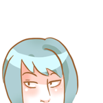
My first attemps at a portrait (first try on the left and last try on the right):


I'd like to know where to progress from the last version please.
I'd like to know where to progress from the last version please.


author=Creation
Thanks Chana, any comments about the anatomy?
Yes, what are those 2 dots on each side of the nose? also the eyebrows could be thinner or rather the hair thicker? finally, the eyes are a bit round.
I love the smoking detective animation, maybe when he takes down his cigarette, his hand should be held up a little with the cigarette upwards or it might go out (I know because I smoke enormously)!


About the portrait, I'm not sure how you want to progress. The only things I have to say is that the face is pretty good, but the hair looks like just one color. I'd say it needs more contrast, since it looks strange against the detailed skin, and the face has a darker outline while the hair doesn't. Also, I feel like she should have hair behind her neck too.
The detective is pretty good too, I like the proportions and the colors. There is a problem with the walking animation, though, mainly the legs. The smoking animation is awesome :D
The detective is pretty good too, I like the proportions and the colors. There is a problem with the walking animation, though, mainly the legs. The smoking animation is awesome :D

