


CREATION CUSTOM CRAFTS: CRAVING CRITICISM
Posts

I like the anatomy, and that smoking animation is definitely cool! It's just the walking that's made weird by one frame:
When he sticks his left leg out, his lower body shifts a pixel to the right to simulate one leg moving back and the other forward. I think if you pulled his left leg in by a pixel, it would get rid of the gap in his legs but it'd look much better. Not that I think many people would focus too heavily on how far apart he kept his legs during gameplay.. You could pretend he has a limp?
The emoticons are nice, really crisp and well animated! I just think they're a little bit dark, making it difficult to see some of the faces.. But that might just be me, I'm kinda blind.
author=Creation
Walking

When he sticks his left leg out, his lower body shifts a pixel to the right to simulate one leg moving back and the other forward. I think if you pulled his left leg in by a pixel, it would get rid of the gap in his legs but it'd look much better. Not that I think many people would focus too heavily on how far apart he kept his legs during gameplay.. You could pretend he has a limp?
The emoticons are nice, really crisp and well animated! I just think they're a little bit dark, making it difficult to see some of the faces.. But that might just be me, I'm kinda blind.

Good point on the walking animation, Caz. I'll look at this once I'm done with the other walking animations.
Good point about the hair yukiharu (drop by more often!).
So I'd like to replace the stat names (i.e. strength and so on) with icons so I'm kind of brainstorming at the moment. Keep in mind that this is for Slimongo so that's why some elements are oriented towards oriental stuff.
Defence stat:

Strength:

Speed:

Chi/Magic:

So do you have any ideas? Things you like, dislike? Do you prefer animated or static? Share your thoughts.
Good point about the hair yukiharu (drop by more often!).
So I'd like to replace the stat names (i.e. strength and so on) with icons so I'm kind of brainstorming at the moment. Keep in mind that this is for Slimongo so that's why some elements are oriented towards oriental stuff.
Defence stat:
Strength:
Speed:
Chi/Magic:
So do you have any ideas? Things you like, dislike? Do you prefer animated or static? Share your thoughts.

The arm on the "strength" looks kinda weird, like it's been snapped? o.o Otherwise the others look okay.
Not sure what you mean by looking snapped. Could you point out exactly what it is which is wrong exactly?
Progress bar for the stats:

Progress bar for the stats:
In between the wrist and the elbow, it looks like it's been snapped in half, or bent weirdly.
Progress bar looks nice btw.
Progress bar looks nice btw.
Thanks!
@yuhikaru:
Better?:

@yuhikaru:
About the portrait, I'm not sure how you want to progress. The only things I have to say is that the face is pretty good, but the hair looks like just one color. I'd say it needs more contrast, since it looks strange against the detailed skin, and the face has a darker outline while the hair doesn't. Also, I feel like she should have hair behind her neck too.
Better?:
I see what ivoryjones means about the arm. The wrist looks too far back and it's almost like it's been broken.
There's also a bit of an issue with the limited area between the shading at the bottom and the definition of the bicep, which makes the arm look segmented.
There's also a bit of an issue with the limited area between the shading at the bottom and the definition of the bicep, which makes the arm look segmented.

Yeah, a much better. But I think it might look better with less saturation. I just edited the hair colors, what do you think?

そですね。。。美しいですよ!
Yeah, it looks better with less saturation and the hair does look better, ゆくはる。
I kind of notice the bar on her chest now and it makes her look like she has pects instead of breasts so I'll need to fix that too.
I've also worked some more on the detective's animation, trying to fix the pixel thing you guys talked about:


I don't know, it's better than before but there's still room for improvement, mostly on the last frame of the side walk anim. What do you guys reckon?
Yeah, it looks better with less saturation and the hair does look better, ゆくはる。
I kind of notice the bar on her chest now and it makes her look like she has pects instead of breasts so I'll need to fix that too.
I've also worked some more on the detective's animation, trying to fix the pixel thing you guys talked about:
I don't know, it's better than before but there's still room for improvement, mostly on the last frame of the side walk anim. What do you guys reckon?
The problem with the down and up animations is that the feet in the first frame (The "standing" frame) really stick out during the walking cycle. Although the side animation is a little unbalanced (Again, because of the stading frame) it actually doesn't look bad and I probably wouldn't notice it if I were playing.
If you want a standing frame and a more complex walking cycle, you can try to use different charsets for idle/movement or look for a script that allow charsets with more frames. I really like this tutorial, in case you haven't seen it yet:
Walking animation for low-res sprites
がんばってね、クリエーションさん :)
If you want a standing frame and a more complex walking cycle, you can try to use different charsets for idle/movement or look for a script that allow charsets with more frames. I really like this tutorial, in case you haven't seen it yet:
Walking animation for low-res sprites
がんばってね、クリエーションさん :)
Thank you, ゆきはる!I'll see what I can do about it once I'm done with the chipset.
New chipset I'm working on for Slimongo:

Remake of an old map I posted way back in the screenshot section.

I'm experimenting at recreating the texture you'd find on a rooftop. It kind of looks like noise at the moment so if you have any ideas as to how to fix this, I'd be more than grateful.
I've included a few of LockeZ suggestions such as the cigarette tops.
New chipset I'm working on for Slimongo:
Remake of an old map I posted way back in the screenshot section.
I'm experimenting at recreating the texture you'd find on a rooftop. It kind of looks like noise at the moment so if you have any ideas as to how to fix this, I'd be more than grateful.
I've included a few of LockeZ suggestions such as the cigarette tops.

I love it BUT shouldn't the wall be much bigger between the two ladders and both walls top right and left or the same size or the big roof lower at the top? also I don't get that grey fuzzy "path" below the right ladder. the oil stains, the corpse and the doors are great.
@Chana: It's supposed to be a rooftop texture:
Ref used:

I'm having trouble with this though, that's why I only did a small patch because I knew there was something odd about it.
EDIT: The sky at the back is definitely not finished, I just wanted to show some progress before going any further.
Ref used:
I'm having trouble with this though, that's why I only did a small patch because I knew there was something odd about it.
EDIT: The sky at the back is definitely not finished, I just wanted to show some progress before going any further.
I put on my good glasses, it's actually not bad, I just have no idea what it would look like if the whole roof was like that, I think it would definitely need to be lighter in any case.
LockeZ

I'd really like to get rid of LockeZ. His play style is way too unpredictable. He's always like this too. If he ran a country, he'd just kill and imprison people at random until crime stopped.
5958
The one that looks like TV static is too... contrasty? That's not a word, but I think you know what I mean. It's going to be extremely hard to make out any objects when the ground is that noisy. Reduce the contrast of those new ground tiles by something like 85% in Photoshop or Gimp and I think they'll look perfect. Though honestly I don't think your old tiles particularly need to be changed. Only reason for really changing them would just be if you already used these cement tiles elsewhere and don't want to repeat them.
Thanks Lockez, that might do it. I'll give it a try and show you how it looks.
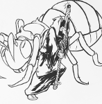
Forgot a couple of characters for the game (my version is on the left):


Forgot a couple of characters for the game (my version is on the left):

You made the mistake of a using a closeup ref when the height of the "camera" in a typical RM game would be like, what? many tens of feet above the closest viewable surface? (if it were real).. Pretty sure even the grainiest texture it gonna start to look pretty much like an almost-flat tone from there.
Interesting aside: printers, at least as far as I was told, (used to?) make shades of grey by alternating black ink with no ink, pixel for pixel (basically dithering). When the viewer looked at it, it would generally appear grey rather than a collection of black and white pixels. Same principle really.
A super-pro 4rt tip is to try squinting at your refs. It lets you see the overall tone and values of the thing you're copying and stops you focusing on details to a detrimental extent.
How nice of you to visit my humble abode, Newblack. You're completely right about the reference.
Here's a new version, I think the ground looks better this way, what do you guys think?

Here's a new version, I think the ground looks better this way, what do you guys think?
LockeZ
I'd really like to get rid of LockeZ. His play style is way too unpredictable. He's always like this too. If he ran a country, he'd just kill and imprison people at random until crime stopped.
5958
Definitely better than the one that looked like television static.
This is the roof, right? I don't think there should be black tiles of void space anywhere. You should show the outer wall and roof instead. As it is, it's not only inconsistent, but it also makes it hard to figure out how the heights line up, since I'm not sure how high the walls and such actually go. The void space tiles on the left aren't even at a consistent height, making it even more confusing.
I'm actually really curious about the fact that someone seems to have drawn an outline of a door on the wall. Is that a police line to mark where a door was killed? >_>

